# how strongly nitrogen and yield move together
cor(trial$fertilizer_kg_ha, trial$yield_bu_acre)
> # how strongly nitrogen and yield move together
> cor(trial$fertilizer_kg_ha, trial$yield_bu_acre)
[1] 0.5807872In this chapter we will start quantifying the relationship between two variables, putting a single number on the relationship that we plotted in the previous chapter.
Figure 22.1 showed fertilizer against yield across the 120 trial fields: an upward-sloping cloud, and a wide one. Two things in that description are separate. The direction is whether the cloud rises or falls. The strength is how tightly the points hug the trend rather than scattering around it.
The correlation coefficient puts both into one number between -1 and +1. Its sign is the direction and its size is the strength.
First, the covariance between two variables \(X\) and \(Y\), for a sample of size \(n\):
\[ \text{Cov}(X, Y) = \frac{1}{n-1} \sum_{i=1}^{n} (x_i - \bar{x})(y_i - \bar{y}) \]
To see this in action, consider the following dataset for five observations of yield and rainfall.
| Yield (bu/ac) | Rainfall (mm) |
|---|---|
| 48 | 170 |
| 58 | 195 |
| 52 | 185 |
| 64 | 230 |
| 58 | 215 |
We first calculate the mean of both variables – for yield it is 56 bu/ac and for rainfall it is 199 mm. Then we calculate the difference between each observation and its mean (I’ve done this in columns three and four below). We then multiply these two differences together (I’ve done this in column five). Finally, we sum these products in column five and divide by n-1 (in this case 4) to get the covariance.
| Yield | Rainfall | \(y_i - \bar{y}\) | \(x_i - \bar{x}\) | \((y_i - \bar{y})(x_i - \bar{x})\) |
|---|---|---|---|---|
| 48 | 170 | -8 | -29 | +232 |
| 58 | 195 | +2 | -4 | -8 |
| 52 | 185 | -4 | -14 | +56 |
| 64 | 230 | +8 | +31 | +248 |
| 58 | 215 | +2 | +16 | +32 |
| Sum | +560 |
Our final result is Cov(yield, rainfall) = 560 / 4 = 140.
Let’s think about why this is positive. It is positive because when yield is above average (i.e., column three is positive), rainfall is also above average (i.e., column four is positive). Similarly, when yield is below average (i.e., column three is negative), rainfall is also below average (i.e., column four is negative). In both cases, the product of the two differences is generally positive. Hence when we sum together all these products we get a positive covariance.
Not every row has to agree. The second field yielded above average on below-average rainfall, so its product is negative. But this negative product (-8) counted little towards the overall sum.
The trouble with covariance is that its size depends on the units of both variables, so there is no scale to read it against.
The (Pearson) correlation coefficient divides the covariance by the two standard deviations, which cancels the units. The formula for the correlation coefficient (\(r\)) is:
\[ r = \frac{\text{Cov}(X, Y)}{s_X \, s_Y} \]
Correlation measures the direction and strength of a linear association. It is defined whenever both variables actually vary; a column holding the same value in every row has no correlation with anything.
Taking the five fields above, the standard deviations are 6.1644 bu/ac and 23.8223 mm, so
\[ r = \frac{140}{6.1644 \times 23.8223} = 0.9534 \]
The correlation coefficient will always be between -1 and +1. It is the absolute value that says how strong the relationship is, and the sign that says which way it runs: -0.9 is a stronger relationship than +0.4. A value near zero means no linear relationship.
The four plots below show what different values of \(r\) look like. All four plot the same two variables in the same units, with the same number of fields; only the strength and direction change.
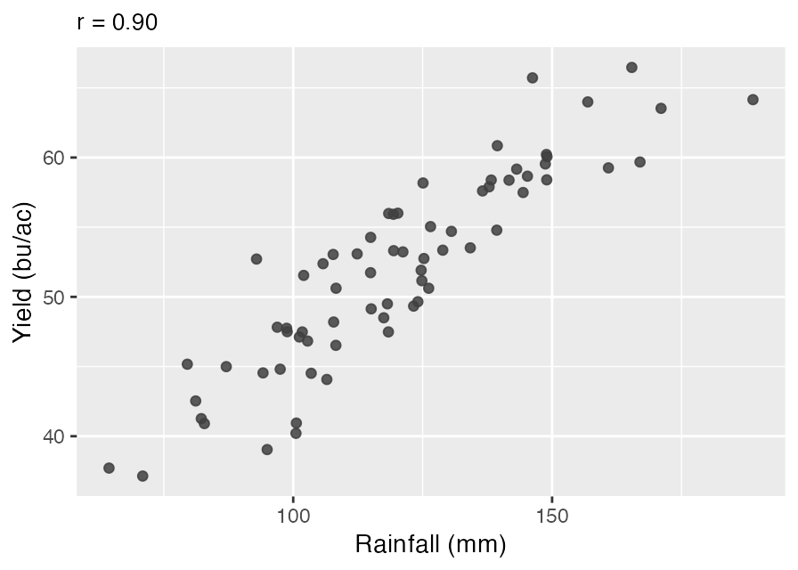
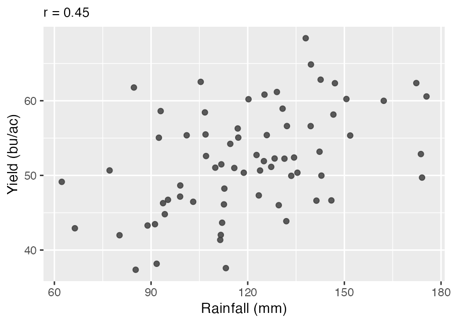
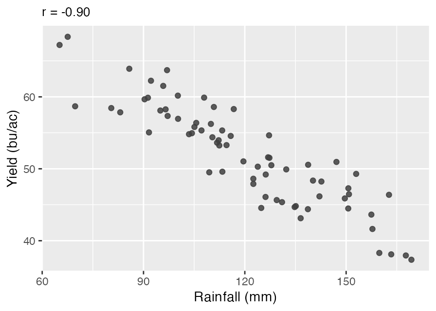
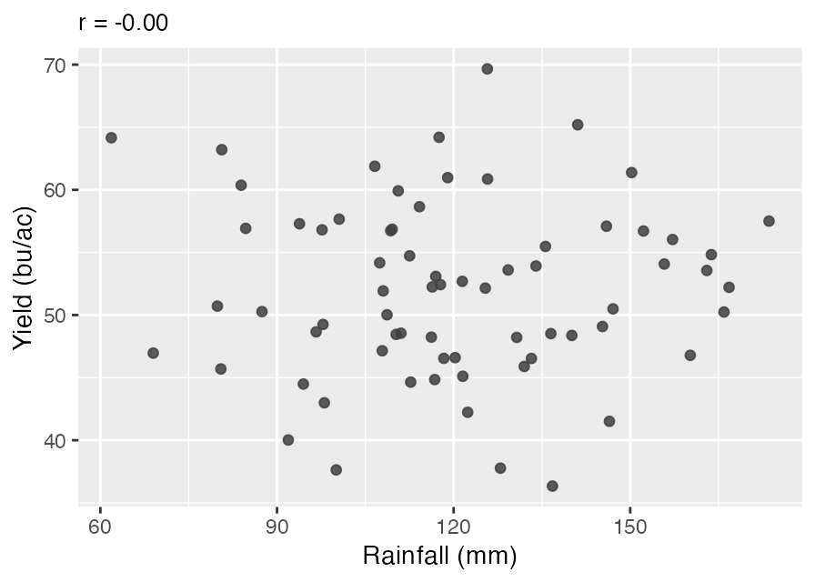
Notice that the weaker positive plot still rises – the direction is the same as the strong one. What differs is how tightly the points hold to that trend.
When: - \(r = +1\): perfect positive linear relationship. - \(r = 0\): no linear relationship. - \(r = -1\): perfect negative linear relationship.
Using our canola trial data, we can calculate the correlation between yields, rainfall and fertilizer in Excel and R. In Excel, we can use the =CORREL() function to calculate the correlation between two variables. For example, to calculate the correlation between yield and fertilizer, we can use the following formula:
=CORREL(Data!B2:B121, Data!E2:E121)Download this workbook · Open online (File → Save a Copy to view formulas and edit) · the Correlation tab.
In R, we use the cor() function to calculate the correlation between two variables. For example, to calculate the correlation between yield and fertilizer, we can use the following code:
# how strongly nitrogen and yield move together
cor(trial$fertilizer_kg_ha, trial$yield_bu_acre)> # how strongly nitrogen and yield move together
> cor(trial$fertilizer_kg_ha, trial$yield_bu_acre)
[1] 0.5807872Or every pair at once:
# every pair in one matrix, rounded to keep it readable

trial |>
    select(fertilizer_kg_ha, rainfall_mm, yield_bu_acre) |>
    cor(use="pairwise.complete.obs") |>
    round(3)
> # every pair in one matrix, rounded to keep it readable
>
> trial |>
+ select(fertilizer_kg_ha, rainfall_mm, yield_bu_acre) |>
+ cor(use="pairwise.complete.obs") |>
+ round(3)
fertilizer_kg_ha rainfall_mm yield_bu_acre
fertilizer_kg_ha 1.000 -0.09 0.581
rainfall_mm -0.090 1.00 0.400
yield_bu_acre 0.581 0.40 1.000The use = "pairwise.complete.obs" argument matters here: three fields in the trial data have no rainfall reading, and without it any correlation involving rainfall comes back NA (similar to how we needed to use na.rm=TRUE when calculating the mean). “Pairwise” means each correlation uses the rows where its own two variables are both present, so the missing rainfall readings are dropped only from the correlations that involve rainfall. Concretely: the fertilizer-yield figure uses all 120 fields, while the two involving rainfall use 117.
In both R and Excel we get the same correlations:
| Fertilizer | Rainfall | Yield | |
|---|---|---|---|
| Fertilizer | 1.000 | -0.090 | 0.581 |
| Rainfall | -0.090 | 1.000 | 0.400 |
| Yield | 0.581 | 0.400 | 1.000 |
The matrix is symmetric, and the diagonal is all ones – every variable correlates perfectly with itself. So there are only three numbers to read here, in the upper corner.
A moderate correlation between fertilizer and yield, and a weak relationship between fertilizer and rainfall. Given that we have trial data, this is what we would expect: the nitrogen rate was assigned rather than chosen, so it should not line up with the weather a field happened to get.
Two variables can be correlated without either one causing the other. There are four usual reasons.
To establish causation, you need a credible research design, such as random assignment, that separates variation in the explanatory variable from other factors affecting the outcome. Rainfall being unpredictable does not by itself make its relationship with yield causal.
When you find two variables are correlated, ask what else could have produced it: chance, the reverse direction, or a third variable sitting behind both.
Correlation measures linear relationships. We generally find that rainfall and yield are positively correlated, but this doesn’t mean that you should irrigate waterlogged fields. If the true relationship between variables is non-linear, then the correlation is essentially measuring the average relationship across the whole range of the data.
Figure 23.5 illustrates a case in which we find a correlation that is close to zero, even though there is a strong positive correlation between the variables when the x variable is low and a strong negative relationship when it is high.
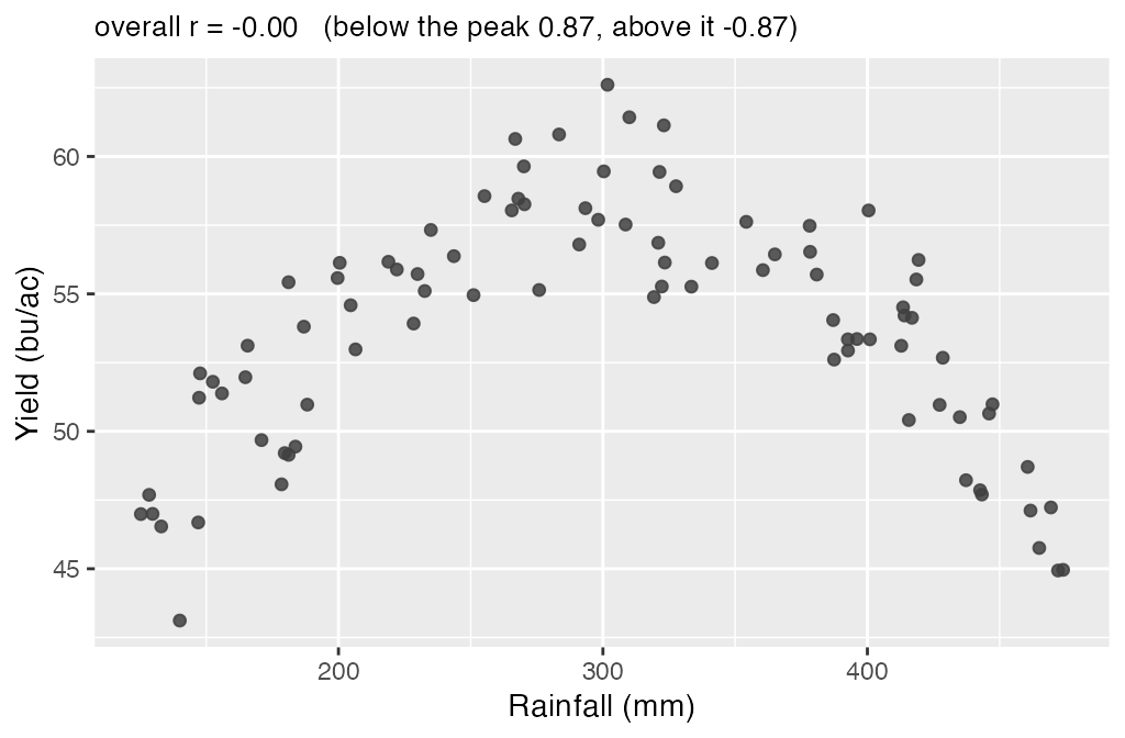
Every field here is telling you something about rainfall, and the correlation reports almost nothing. Split the plot at the peak and the two halves give +0.87 and -0.87; put them together and they cancel. A correlation of zero means no linear relationship, not no relationship, which is the reason to plot the data before you calculate anything.