22Thinking About Modelling Relationships Between Variables
In Modules 1 to 6 we analyzed data one variable at a time: how yield is distributed, what its mean is, how spread out it is. This module is about pairs of variables: does yield change with fertilizer, does price move with quality, do two crops rise and fall together.
The dataset for this chapter is canola_trial.csv. It is a synthetic dataset with 120 canola fields. The file records the following for each field:
nitrogen rate (fertilizer_kg_ha)
growing-season rainfall (rainfall_mm)
the variety grown
yield (yield_bu_acre)
Save it in a data folder beside your script, so that read_csv("data/canola_trial.csv") finds it.
22.1 Plotting the relationship between two variables
In Chapter 10 we learned about using scatter plots to plot our observations in two dimensions. This is often the first step in analyzing a relationship between two variables.
This plot allows us to see the shape of the relationships between two variables – whether one generally increases when the other does, whether the relationship is linear or curved, and whether there are any outliers. It also allows us to see if there are any subgroups in the data that might have different relationships.
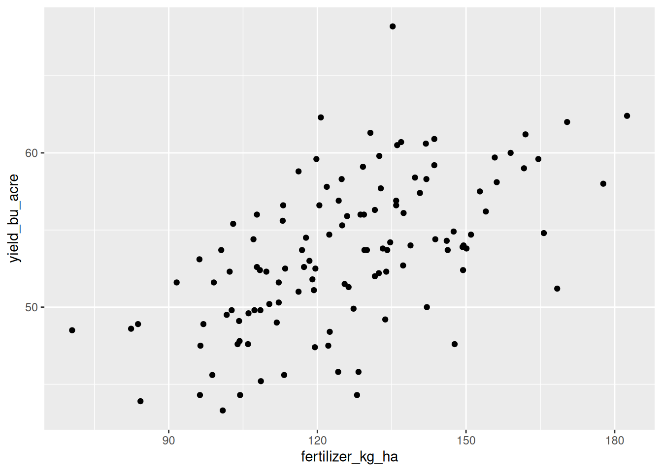
With the canola trial data, we can create a scatter plot of yield against nitrogen rate. In R:
Rows: 120 Columns: 5
── Column specification ────────────────────────────────────────────────────────
Delimiter: ","
chr (2): field_id, variety
dbl (3): fertilizer_kg_ha, rainfall_mm, yield_bu_acre

ℹ Use `spec()` to retrieve the full column specification for this data.
ℹ Specify the column types or set `show_col_types = FALSE` to quiet this message.
ggplot(trial, aes(x = fertilizer_kg_ha, y = yield_bu_acre)) +geom_point()
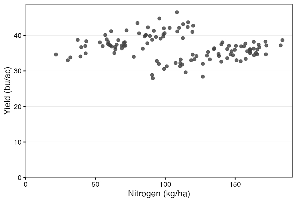
Figure 22.1: Yield against nitrogen rate across 120 canola fields. The cloud rises, and it is wide.
When examining the scatter plot, we can see that there is generally an upward trend in yield as nitrogen rate increases, but the points do not lie exactly on a straight line; there are some points with relatively high nitrogen rates and only moderate yields. This suggests that there are other factors influencing yield beyond nitrogen rate.
More generally, when examining a scatter plot, we can look for the following:
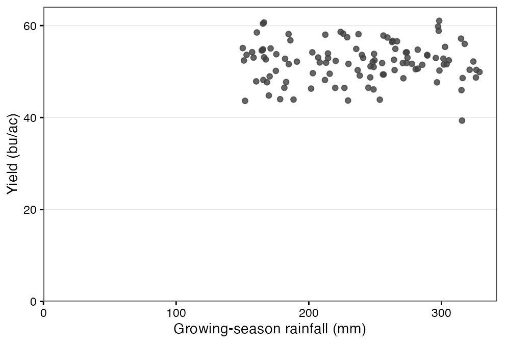
Is there any relationship at all? Sometimes there is nothing there. Figure 22.2 is a cloud with no direction: this plot shows no clear association between a field’s rainfall and its yield. This is a useful answer, and it is worth being willing to report it.
Figure 22.2: No relationship: the cloud has no direction.
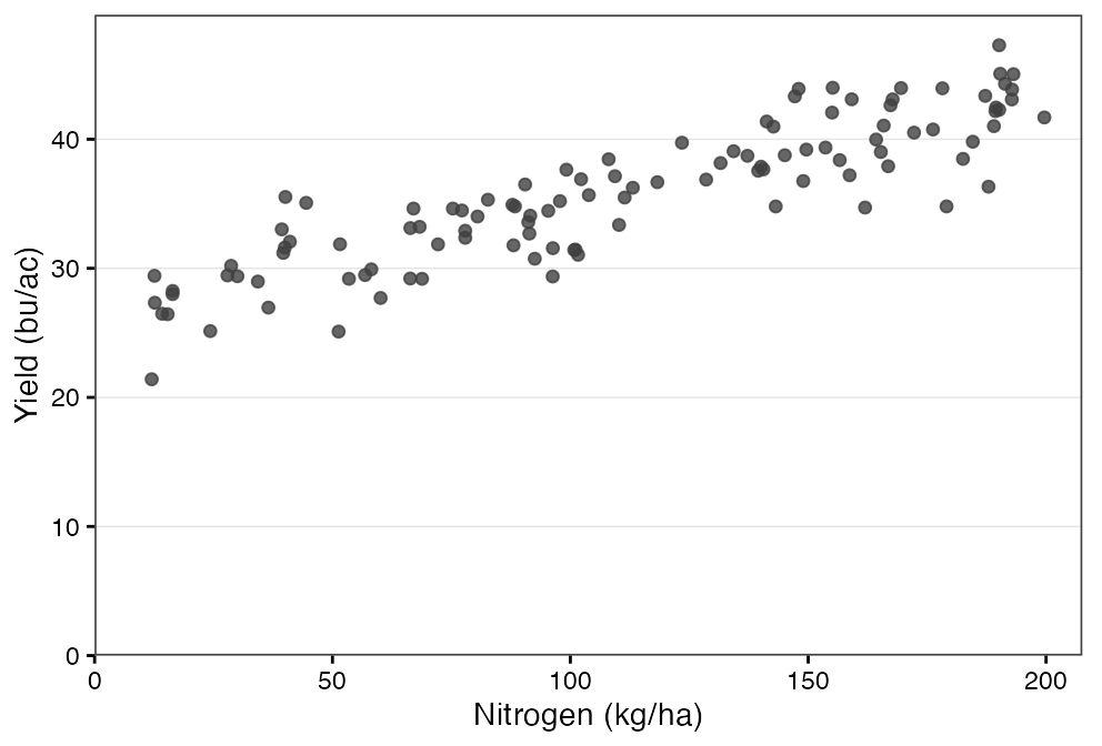
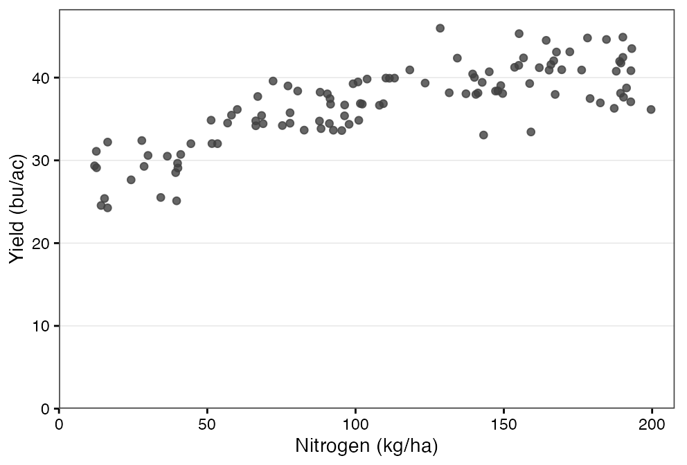
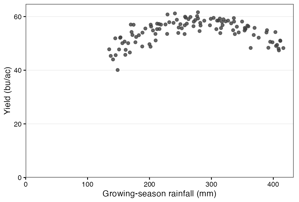
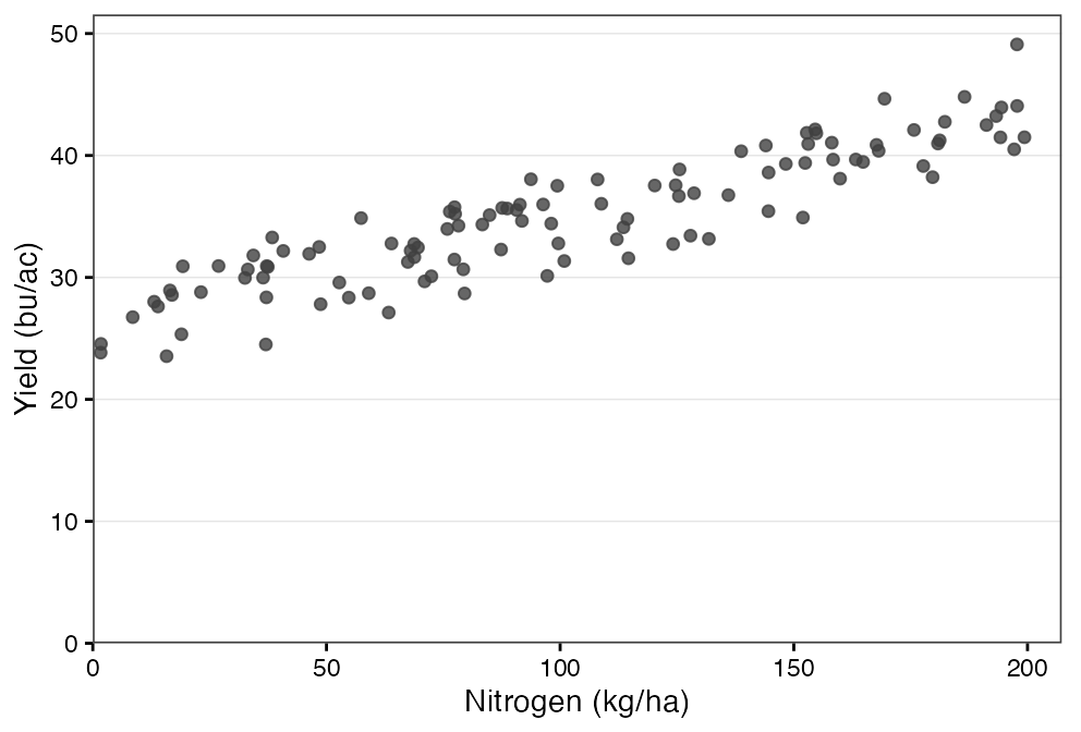
Is it a line, or a curve? Many relationships in agriculture are not linear – additional rainfall helps up to a point, but then becomes harmful as fields get saturated. Similarly, too much nitrogen can reduce yields. We can see this relationship in a scatter plot. Figure 22.3 (a) shows a more or less linear relationship, Figure 22.3 (b) shows one where the relationship becomes weaker at higher values, and Figure 22.3 (c) shows a relationship that is positive in some places and negative in others.
(a) A roughly straight relationship.
(b) The response flattens at higher nitrogen rates.
(c) Yield rises with rainfall to about 300 mm and falls after it.
Figure 22.3: Three shapes a scatter plot can take.
The next chapter measures linear association and the one after it fits a straight line. If the cloud bends, a straight line will still be fitted and it will still report a slope, but that slope is an average of a response that is not constant. In Figure 22.3 (c) it would be close to flat, which would describe no field in the plot.
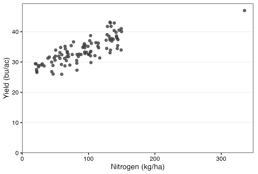
Are there outliers? Some data will have a couple of points that are far away from others. These may be remarkable observations, or they may be data errors. For example, in Figure 22.4 a single field sits far to the right of everything else. A point far out along the x axis has leverage: because it sits at an extreme explanatory value, it has the potential to pull the fitted line towards itself. Leverage is about where the point sits, not how far it is from the line – a high-leverage point that happens to fall near the trend changes little.
Figure 22.4: One field with a nitrogen rate far above the rest.
In subsequent chapters, we will see that unusual observations can affect the estimated relationship between two variables. Find out what the point is before deciding anything. A confirmed error should be corrected where possible, or removed. But a real observation is not a problem to be deleted: a field that yielded 9 bu/ac because it was hailed out genuinely happened, and whether it belongs depends on the question – it is not telling you about fertilizer response, but it is part of what a grower faces. A yield of 340 bu/ac is implausible enough to be worth checking, though its size alone does not prove it was mistyped. Whatever you do, say what you removed and why.
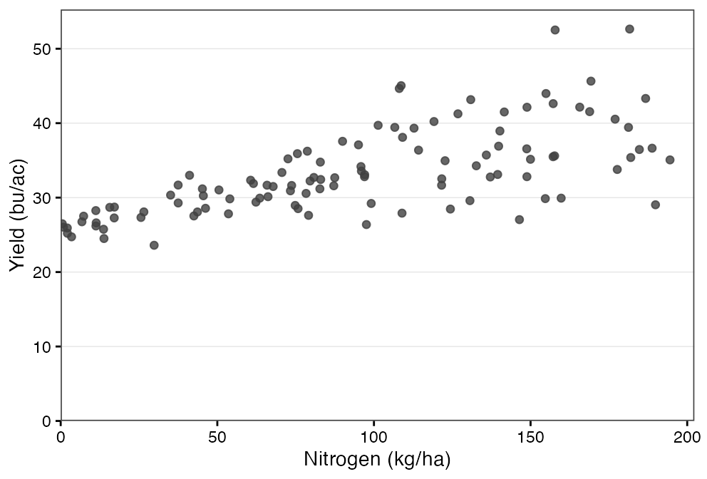
Does the “spread” of the cloud stay the same? Compare how tightly the points hug the trend on the left of the plot with how tightly they hug it on the right. In Figure 22.5 the spread widens from left to right, so yield at high nitrogen rates is much less predictable than at low ones. Figure 22.3 (a) is the contrast: the band is about as wide at one end as the other.
Figure 22.5: The spread widens from left to right.
Figure 22.6: An even band from one end to the other.
A fitted line is still a reasonable summary of a fanning cloud. What becomes unreliable is the uncertainty around it: standard errors are calculated assuming the spread is constant, so when it is not, those figures cannot be taken at face value. We do nothing about that in this course – uncertainty is treated properly in AREC 262 – but notice it and say so.
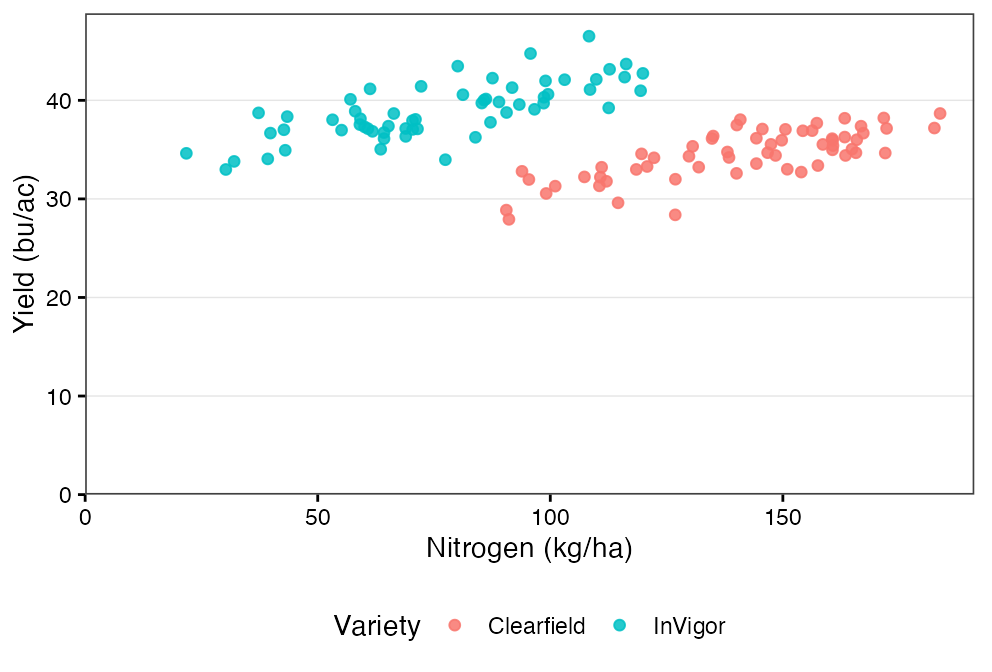
Is the cloud actually two clouds? What looks like one weak relationship is sometimes two tidy relationships sitting at different heights. Figure 22.7 is the plot you would get without knowing the variety; Figure 22.8 is the same points coloured by it.
Figure 22.7: One cloud, and a weak relationship.
Figure 22.8: The same points, coloured by variety.
Two varieties with different yield potential, two soil zones, two years with different weather. A relationship computed across mixed groups can be quite different from the relationship within each one, and occasionally it points the other way. Module 8 puts the grouping into the model itself, which is one way of dealing with it.
22.2 Correlation versus causation
A point I will continue (and continue) to make is that correlation does not imply causation. Just because two variables move together does not mean that one causes the other. In observational data we might see a positive relationship between fertilizer and yield. However, if the producers who use more fertilizer also use different varieties, seeding rates, or have different soil types, then the relationship between fertilizer and yield is confounded by these other factors.
It is up to us as data analysts to understand when we can treat correlation as having a causal interpretation, and when we cannot. Perhaps the simplest example, is if we know that a trial has held all other factors constant, and only varied fertilizer, then we can treat the relationship as causal.