These are the same two files the Excel workbooks in Chapter 11 used.
12.1 Introduction to ggplot2
ggplot2 loads with the tidyverse, and every chart it draws is built from the same three parts:
the data: a data frame with the data to be plotted;
the mapping: aes(), which assigns variables to visual properties – horizontal position, vertical position, colour;
a geom: the mark to draw – geom_col() for bars, geom_line() for lines, geom_point() for points.
The template is always:
data |>ggplot(aes(x = ..., y = ...)) +geom_something() + ...
We can then add other options to the graph with +. For example, we can change the formatting, font size, or axis labels.
If we want an analogy to Excel, we can think of data as the spreadsheet containing our data, aes() as choosing which columns to plot on the x- and y-axes, and the geom as choosing the chart type. Other formatting options are then added using the + operator.
12.2 Bar charts
NoteVideo walkthrough of this section
Let’s again start with a simple example using the barley variety data for 2025. When we read the file in, we also convert the column names to lowercase with clean_names() (Section 8.5), so they are easier to type. We can then plot the acres of all the varieties with the following code.
# Load the tidyverse and janitorlibrary(tidyverse)library(janitor)# One row per barley variety: 2025 acres and average yieldbarley_2025 <-read_csv("data/sask_barley_2025.csv") |>clean_names() # column names to lowercase## Glimpse the dataglimpse(barley_2025)## Create a bar chartbarley_2025 |>ggplot(aes(x = variety, y = acres)) +geom_col()
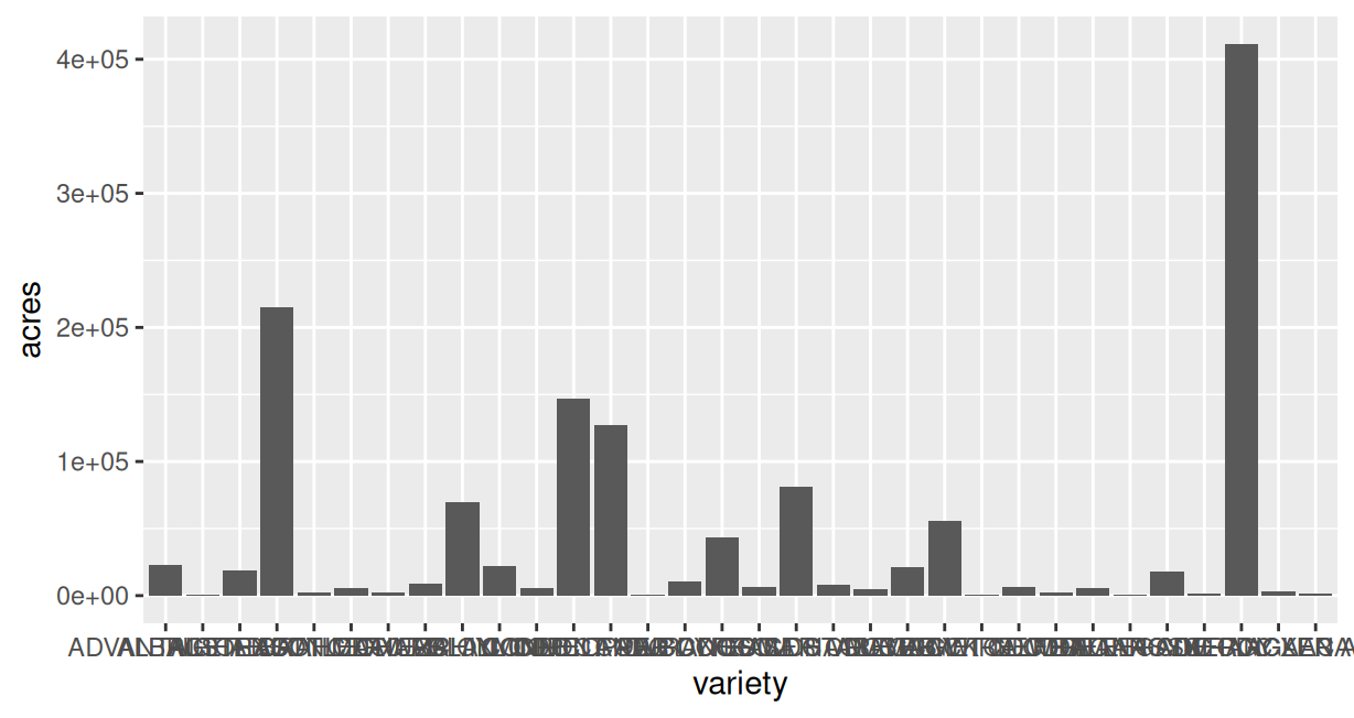
Figure 12.1: The first attempt: every barley variety.
The first few rows of this code read in our packages and data. The last three lines create the chart. The first line specifies the data barley_2025. The second line specifies that we want varieties on the horizontal axis (or x-axis) and acres on the vertical axis (or y-axis). The third line specifies that we want a bar chart: geom_col().
This gives us a graph that looks a lot like the terrible graph that we first made in Excel.
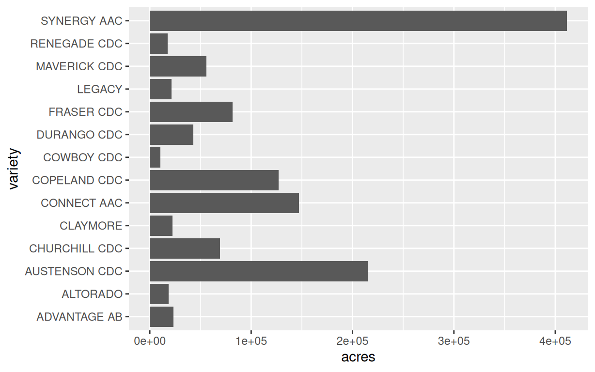
As we did in Excel, let’s filter to only varieties with more than 10,000 acres. We can do this with the filter() function that we learned earlier. We can also flip this to a horizontal bar chart by putting variety on the y-axis (vertical axis) and acres on the x-axis (horizontal axis).
Figure 12.2: Varieties over 10,000 acres, largest at the top.
First, let’s note what we did in the first two lines. Recall that the pipe |> is like saying “then”. So we are saying to R, take barley_2025, then filter it to only include rows where acres is greater than 10,000. Then assign acres to the x-axis and variety to the y-axis. Then draw the bars with geom_col(), which infers that the bars should run along the numeric axis. This is starting to look better.
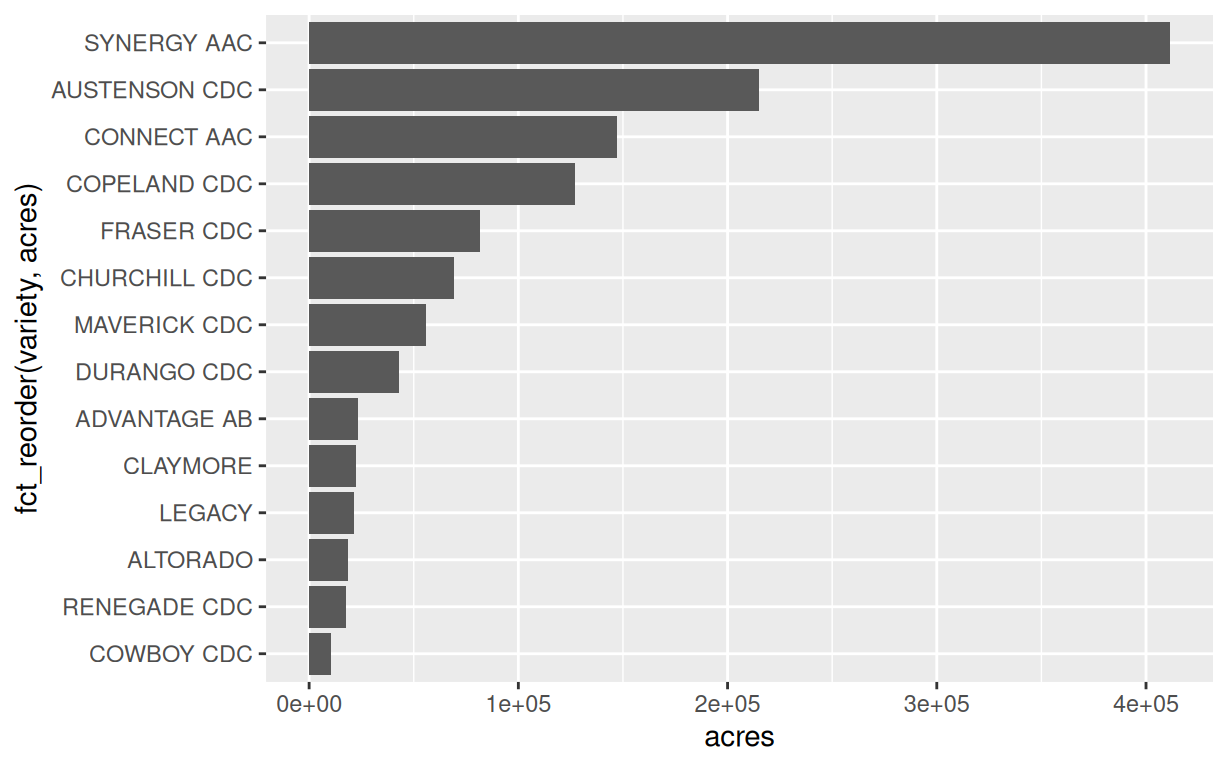
Now we can start adding additional options. First, we want to order the bars by their value, not alphabetically. ggplot puts a text column on the axis in alphabetical order. fct_reorder(variety, acres) converts variety to a factor – R’s data type for categories with a set order – with the varieties ordered by their acres, so the bars plot in that order.
barley_2025 |>filter(acres >10000) |>ggplot(aes(x = acres,y =fct_reorder(variety, acres))) +# order bars by acresgeom_col()
Figure 12.3: The same varieties, ordered by acres.
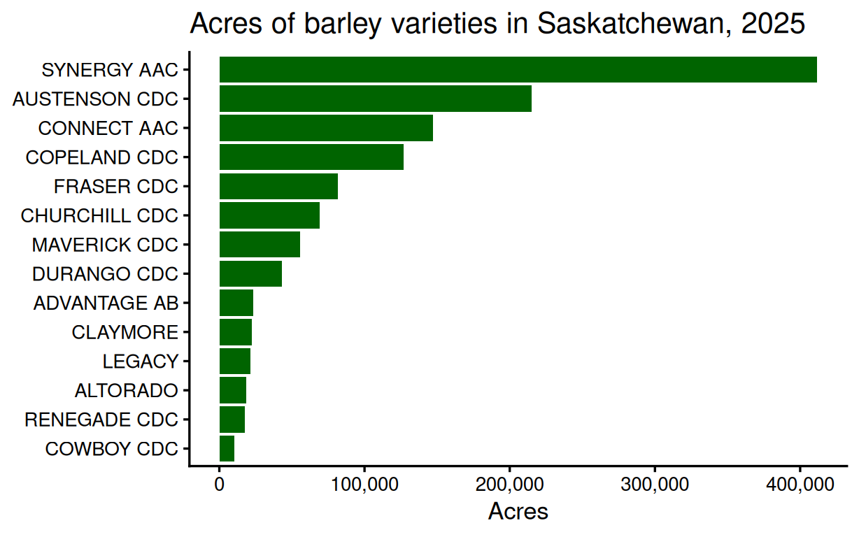
Finally, we can add all of our additional options to the chart – the colour of the bars, a title and axis labels, comma formatting on the axis, and a theme with a larger font – with additional functions and with arguments inside some of the functions.
bar_plot <- barley_2025 |>filter(acres >10000) |>ggplot(aes(x = acres,y =fct_reorder(variety, acres))) +geom_col(fill ="DarkGreen") +# dark green barsscale_x_continuous(labels = scales::comma) +# 400,000 not 4e+05labs(title ="Acres of barley varieties in Saskatchewan, 2025",x ="Acres", y =NULL) +theme_classic(base_size =13)bar_plot
Figure 12.4: The finished bar chart.
Let’s read this code one line at a time: 1. Take the data barley_2025then 2. Filter to only include rows where acres is greater than 10,000 then 3. Assign acres to the x-axis and variety to the y-axis, ordering the bars by acresthen 4. Draw bars with geom_col() and colour them dark green then 5. Change the scale on the x axis so that labels are in comma format (400,000 instead of 4e+05) then 6. Add a title and axis labels then 7. Change the theme to theme_classic() and increase the base font size to 13.
All of this is a bit overwhelming – even for me who has been using R for years. Whereas in Excel you can find the options through a user interface, with R you need to know the functions that you can add on to ggplot and what their arguments are. To be honest, I rarely remember the exact function names or arguments. I used to have to look them up – now I get AI to do that for me – in the next module we will start graphing with AI. For now, it is only important that you understand the very basic graphing commands:
ggplot() to start the graph, and aes() to assign variables to axes and other visual properties.
geom_col() to make a bar chart, geom_line() to make a line chart, and geom_point() to make a scatter plot. If you don’t supply any arguments to these functions, defaults will be used. But you can change things like the colour and size of the bars, lines and points inside them, as we did with fill = "DarkGreen".
labs() to add a title and axis labels.
The theme_*() functions, such as theme_minimal() and theme_classic(), to control the overall look of the chart, including the font size.
12.3 Pie charts
NoteVideo walkthrough of this section
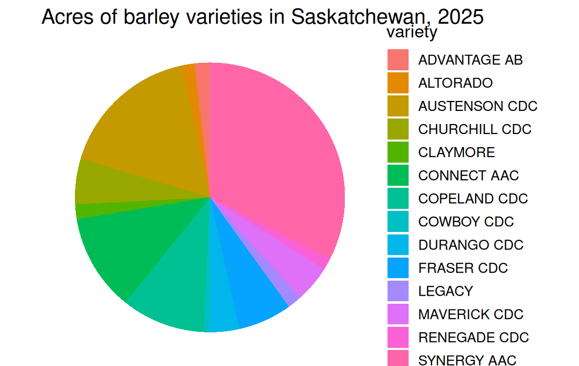
Truth be told, ggplot is not great at producing pie charts. In part, this is because data analysts don’t much like pie charts, so perhaps ggplot developers do not want to encourage their use. But we can still make a pie chart with ggplot by adding +coord_polar(theta = "y"). This is like saying take the bar chart that we had created then wrap it in a circle along the y axis.
When we do exactly this we get the same kind of terrible pie chart as we had in Excel. Note that I removed some of the lines of code from the bar chart code above that don’t apply to the pie chart – the fct_reorder() function, because we don’t want to order the slices, the colour of the bars, and the scale.
barley_2025 |>filter(acres >10000) |>ggplot(aes(x ="", y = acres, fill = variety)) +geom_col() +labs(title ="Acres of barley varieties in Saskatchewan, 2025") +theme_void(base_size =13) +coord_polar(theta ="y")
Figure 12.5: The first attempt: a pie with fourteen slices.
Again, let’s break down this code:
Take the data barley_2025then
Filter to only include rows where acres is greater than 10,000 then
Assign acres to the y-axis and variety to the fill colour, and assign an empty string to the x-axis (this is a bit of a hack since the x-axis does not exist on our pie chart) then
Draw bars with geom_col()then
Add a title with labs()then
Use theme_void() to remove the axes and gridlines then
Wrap the bars into a circle with coord_polar(theta = "y").
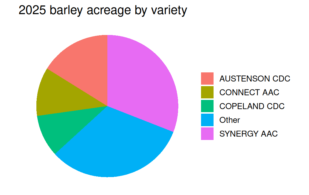
To make this graph interpretable, we likely want to group the small varieties into an “Other” category, as we did in Excel. We can do this through the following code:
# Group the small varieties into "Other", then total the acrespie_data <- barley_2025 |>mutate(variety =if_else(acres >100000, variety, "Other")) |>group_by(variety) |>summarise(acres =sum(acres))pie_data
> # Group the small varieties into "Other", then total the acres
> pie_data <- barley_2025 |>
+   mutate(variety = if_else(acres > 100000, variety, "Other")) |>
+   group_by(variety) |>
+   summarise(acres = sum(acres))
>
> pie_data
# A tibble: 5 × 2
  variety        acres
  <chr>          <dbl>
1 AUSTENSON CDC 215178
2 CONNECT AAC   147017
3 COPELAND CDC  127141
4 Other         429783
5 SYNERGY AAC   411620
Again, let’s break down this code:
Set pie_data equal to barley_2025then
Use mutate() to create a new column variety (this overwrites the existing column) that keeps the original variety value for any row where acres is greater than 100,000, and assigns the value "Other" otherwise then
Group the data by the new variety column then
Summarise the data by calculating the total acres for each group
Now pie_data has five rows: the four largest varieties, plus an Other row with the acreage of all the remaining varieties combined.
When we make a pie chart with the new data we get:
pie_data |>ggplot(aes(x ="", y = acres, fill = variety)) +geom_col(width =1) +coord_polar(theta ="y") +labs(title ="2025 barley acreage by variety",x =NULL, y =NULL, fill =NULL) +theme_void(base_size =13)
Figure 12.6: 2025 barley acreage: the four largest varieties and everything else.
Now this pie looks a bit nicer than our previous one. There are ways of adding labels to the slices and including the percentages in each slice, but we will leave that for another time.
12.4 Line charts
NoteVideo walkthrough of this section
Line charts are (fortunately) much easier to make in ggplot than pie charts. Let’s start by making the same line chart we had in Excel that plots Synergy’s acreage from 2021 to 2025.
We need to start by reading in the risk-zone data, which has one row per zone-variety-year. We again convert its column names to lowercase on the way in. To keep things simple, we start with a single risk zone:
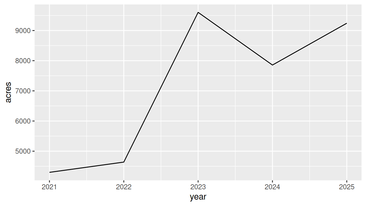
# Risk-zone records for all crops, varieties and yearsvariety_yields <-read_csv("data/sask_variety_yields.csv",show_col_types =FALSE) |>clean_names() # column names to lowercasevariety_yields |>filter(variety =="SYNERGY AAC", risk_zone ==1) |>ggplot(aes(x = year, y = acres)) +geom_line()
Figure 12.7: Acres planted with Synergy barley in risk zone 1.
Breaking this down:
Read the risk-zone file and convert its column names to lowercase then
Filter to the rows where variety is Synergy andrisk_zone is 1 – two conditions in one filter() call keep only the rows that satisfy both then
Assign year to the x-axis and acres to the y-axis then
Draw a line through the points, in year order, with geom_line().
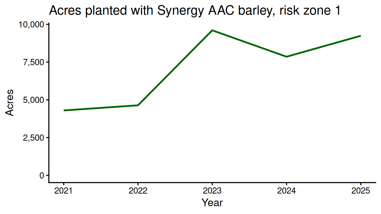
This works, but returns a quite ugly chart. Once again, we can add the same formatting options as we added to the bar chart to make it more readable. One new argument appears here: limits = c(0, NA) inside scale_y_continuous() starts the y-axis at zero, following the zero-baseline principle from Chapter 10, and the NA leaves the upper limit for ggplot to choose from the data.
variety_yields |>filter(variety =="SYNERGY AAC", risk_zone ==1) |>ggplot(aes(x = year, y = acres)) +geom_line(colour ="DarkGreen", linewidth =1) +scale_y_continuous(labels = scales::comma, limits =c(0, NA)) +labs(title ="Acres planted with Synergy AAC barley, risk zone 1",x ="Year", y ="Acres") +theme_classic(base_size =13)
Figure 12.8: The same line with a title, labelled axes and a zero baseline.
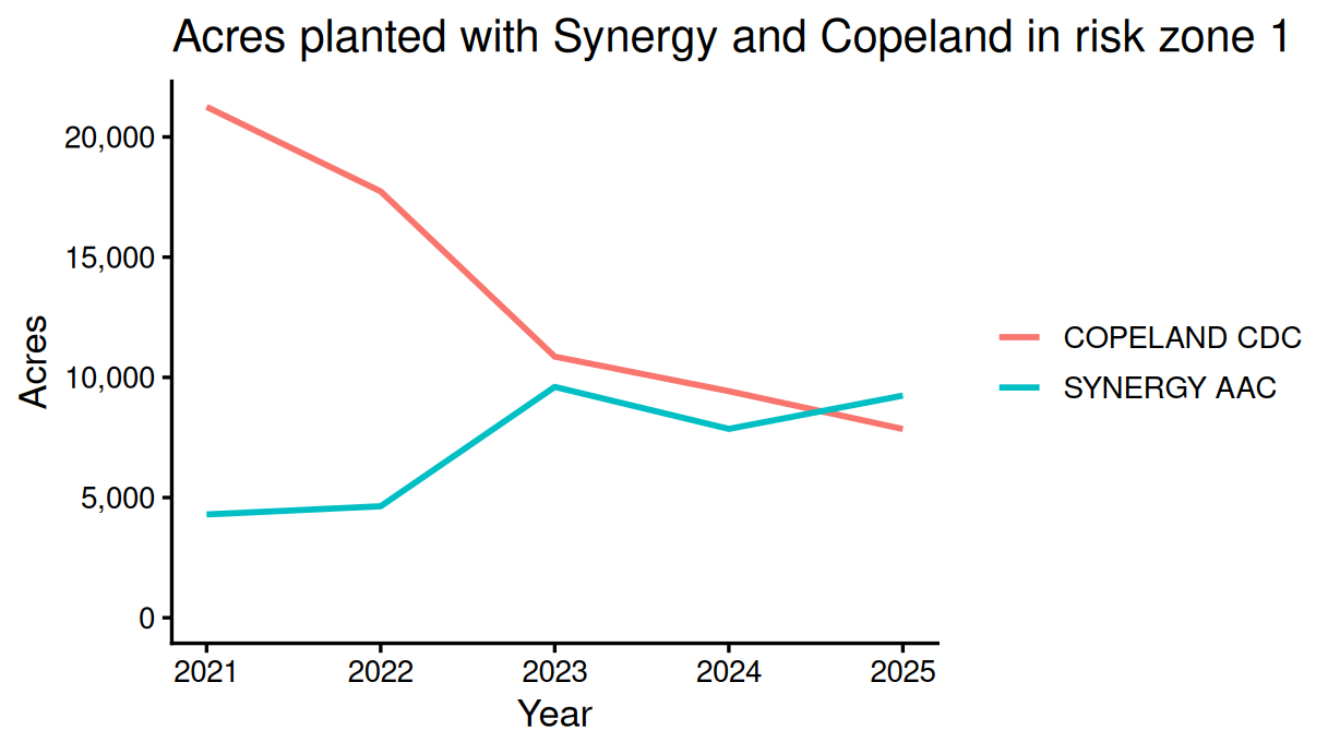
Now let’s add Copeland to the chart. This is actually quite easy – we just adjust the filter to allow both varieties, and then map the variety variable to colour inside aes(). This will draw one line per variety, and add a legend automatically.
variety_yields |>filter(variety %in%c("SYNERGY AAC", "COPELAND CDC"), risk_zone ==1) |>ggplot(aes(x = year, y = acres, colour = variety)) +# one line per varietygeom_line(linewidth =1) +scale_y_continuous(labels = scales::comma, limits =c(0, NA)) +labs(title ="Acres planted with Synergy and Copeland in risk zone 1",x ="Year", y ="Acres", colour =NULL) +theme_classic(base_size =13)
Figure 12.9: Synergy and Copeland in risk zone 1.
Breaking down what changed:
%in% keeps a row when variety matches either name in the list, where == could match only one then
colour = variety is now insideaes(). So what is in aes() now reads – assign year to the x-axis, acres to the y-axis, and give each variety its own colour (i.e., its own line) then
colour = NULL inside labs() removes the legend’s title, since the variety names speak for themselves.
Now we want to add all the varieties to our plot and to sum acreage across risk zones. Our first challenge is to do what the PivotTable effectively did in Excel: sum the acres for each variety and year across risk zones.
# Total acres for each variety and yearbarley_by_year <- variety_yields |>filter(crop =="Barley") |>group_by(variety, year) |>summarise(acres =sum(acres, na.rm =TRUE), .groups ="drop")barley_by_year
> # Total acres for each variety and year
> barley_by_year <- variety_yields |>
+   filter(crop == "Barley") |>
+   group_by(variety, year) |>
+   summarise(acres = sum(acres, na.rm = TRUE), .groups = "drop")
>
> barley_by_year
# A tibble: 165 × 3
   variety       year acres
   <chr>        <dbl> <dbl>
 1 ADVANTAGE AB  2021  2770
 2 ADVANTAGE AB  2022  8420
 3 ADVANTAGE AB  2023 18444
 4 ADVANTAGE AB  2024 23592
 5 ADVANTAGE AB  2025 23235
 6 ALBRIGHT AC   2021     0
 7 ALBRIGHT AC   2022     0
 8 ALBRIGHT AC   2023     0
 9 ALBRIGHT AC   2024     0
10 ALBRIGHT AC   2025   700
# ℹ 155 more rows
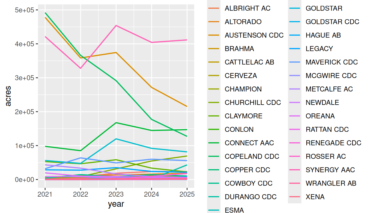
This gives us one row per variety per year. We could create a line chart with one line per variety, using essentially the same code as we used to plot Synergy and Copeland acres above. But, as we can see below, that is virtually unreadable.
barley_by_year |>ggplot(aes(x = year, y = acres, colour = variety)) +# one line per varietygeom_line(linewidth =0.7)
Figure 12.10: One line per variety: too many to read.
As we did for the pie chart, we need to group the small varieties into an “Other” category. This time a variety’s size is its total acres across all five years, so we need to calculate that total before we can rename anything.
##First get the total acreage of each variety across all risk zones and yearsbarley_by_year <- barley_by_year |>group_by(variety) |>mutate(total_acres =sum(acres, na.rm =TRUE)) |>ungroup()## For varieties with less than 150,000 acres across all years, rename them to "Other"barley_by_year <- barley_by_year |>mutate(variety =if_else(total_acres<150000, "Other", variety))# Total acres for each variety and year again -- now all the Others will get added together.barley_by_year <- barley_by_year |>group_by(variety, year) |>summarise(acres =sum(acres, na.rm =TRUE)) |>ungroup()
> ##First get the total acreage of each variety across all risk zones and years
> barley_by_year <- barley_by_year |>
+   group_by(variety) |>
+   mutate(total_acres = sum(acres, na.rm = TRUE)) |>
+   ungroup()
>
> ## For varieties with less than 150,000 acres across all years, rename them to "Other"
> barley_by_year <- barley_by_year |>
+     mutate(variety = if_else(total_acres<150000, "Other", variety))
>
> # Total acres for each variety and year again -- now all the Others will get added together.
> barley_by_year <- barley_by_year |>
+   group_by(variety, year) |>
+   summarise(acres = sum(acres, na.rm = TRUE)) |>
+   ungroup()
`summarise()` has regrouped the output.
ℹ Summaries were computed grouped by variety and year.
ℹ Output is grouped by variety.
ℹ Use `summarise(.groups = "drop_last")` to silence this message.
ℹ Use `summarise(.by = c(variety, year))` for per-operation grouping
  (`?dplyr::dplyr_by`) instead.
Reading this code line by line:
Take the barley records, group them by variety, and use mutate() to create a total_acres column holding each variety’s acres summed across every zone and year. Where summarise() would collapse the groups down to one row each, mutate() after a group_by() keeps every row and attaches the group total to each of them. ungroup() then removes the grouping so later steps work on the whole table then
Use if_else() to rename every variety whose total_acres is under 150,000 – the same threshold we used in the PivotChart filter – to "Other"then
Re-total the acres by variety and year, so "Other" is a single line rather than twenty-five separate ones.
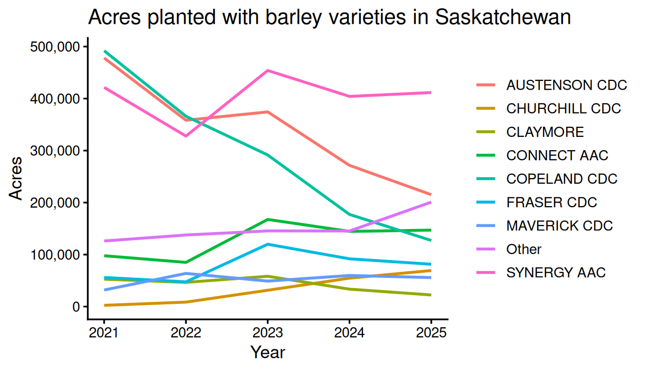
Then the plotting step is the same line chart as before, with variety mapped to colour:
barley_by_year |>ggplot(aes(x = year, y = acres, colour = variety)) +# one line per varietygeom_line(linewidth =1) +scale_y_continuous(labels = scales::comma, limits =c(0, NA)) +labs(title ="Acres planted with barley varieties in Saskatchewan",x ="Year", y ="Acres", colour =NULL) +theme_classic(base_size =13)
Figure 12.11: Acres of the main barley varieties, 2021 to 2025.
12.5 Save the finished chart
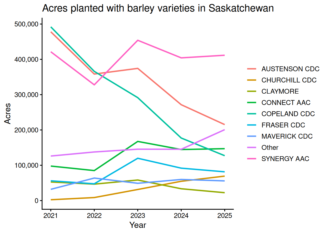
To this point, we have just displayed plots in Positron. We can also save these plots as an object and then save them to a file. The first step is to assign the plot to a name. This means the object is saved in memory and can be displayed again later.
We can then save that object to a file with ggsave(). The first argument is the file name, and the second is the plot object.
## Create plot (as above) and save it as the object variety_line_chartvariety_line_chart <- barley_by_year |>ggplot(aes(x = year, y = acres, colour = variety)) +# one line per varietygeom_line(linewidth =1) +scale_y_continuous(labels = scales::comma, limits =c(0, NA)) +labs(title ="Acres planted with barley varieties in Saskatchewan",x ="Year", y ="Acres", colour =NULL) +theme_classic(base_size =13) ## Visualize variety line chart by printing it in the consolevariety_line_chart# Save the finished line chartggsave("output/variety_line_chart.png",plot = variety_line_chart,width =6.4,height =4.0,dpi =300)# The same chart as a PDF -- ggsave picks the format from the file extensionggsave("output/variety_line_chart.pdf",plot = variety_line_chart,width =6.4,height =4.0)
> ## Create plot (as above) and save it as the object variety_line_chart
> variety_line_chart <- barley_by_year |>
+   ggplot(aes(x = year, y = acres, colour = variety)) +   # one line per variety
+   geom_line(linewidth = 1) +
+   scale_y_continuous(labels = scales::comma, limits = c(0, NA)) +
+   labs(title = "Acres planted with barley varieties in Saskatchewan",
+        x = "Year", y = "Acres", colour = NULL) +
+   theme_classic(base_size = 13)
>
> ## Visualize variety line chart by printing it in the console
> variety_line_chart
>
> # Save the finished line chart
> ggsave(
+   "output/variety_line_chart.png",
+   plot = variety_line_chart,
+   width = 6.4,
+   height = 4.0,
+   dpi = 300
+ )
>
> # The same chart as a PDF -- ggsave picks the format from the file extension
> ggsave(
+   "output/variety_line_chart.pdf",
+   plot = variety_line_chart,
+   width = 6.4,
+   height = 4.0
+ )
ggsave() picks the format from the file extension, so the same plot object saves as either. PNG works for slides and web pages. PDF preserves vector lines and text for publication, and takes no dpi argument because there are no pixels to set. We can also alter the width and height of the image.