11 Graphing in Excel
In this chapter we will work through creating charts in Excel: bar charts, pie charts, line charts, and finally PivotCharts, which can chart many series at once.
The data used in this chapter are:
sask_barley_2025.csv– one row per barley variety, with its 2025 acres and average yield. The bar and pie charts use this data.sask_variety_yields.csv– Saskatchewan Crop Insurance Corporation records by risk zone, crop, variety and year, 2021 to 2025 (Saskatchewan Crop Insurance Corporation 2025). The line charts and PivotCharts use this data.
The workbooks embedded through the chapter already contain the data, so you only need these files if you want to rebuild the charts from scratch.
11.1 Bar charts
Charts in Excel follow the same steps as the histogram in Section 3.4. We can start by making a simple bar chart. The workbook below contains the data and plots that we will create in this section.
To create a bar chart, we can first select the data that we want in the chart – both the barley variety names and the total acres. You can select both columns by holding down the control key (or command key on a Mac) and clicking on the column headers or selecting the data with your mouse. Then we can go to the Insert tab, select Column Chart, and choose the type of bar chart we want.

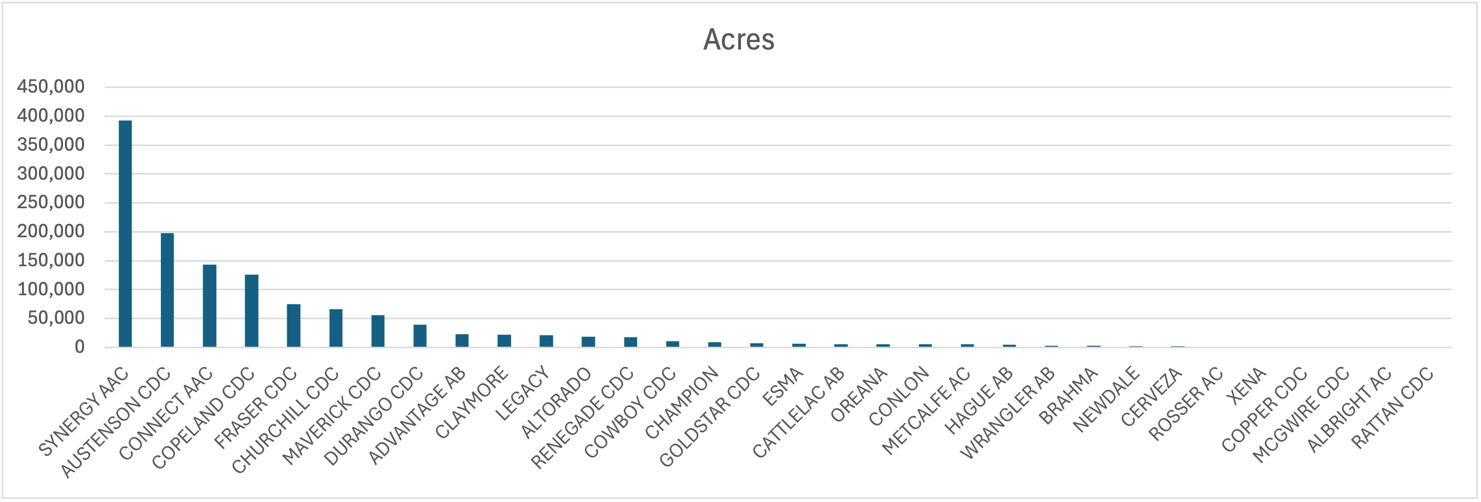
The chart is below, and it has lots of problems! There is too much data in the chart, I’ve sorted the data by total acres but this makes it difficult to find varieties, the chart is so wide there is no way it will fit on a slide or in a document, the axes aren’t labelled, etc.
11.1.1 Restricting the data
The first thing we might want to do is restrict the data so that there aren’t as many varieties in the chart. How much we want to filter will depend on the purpose of the chart. In my case, I am going to restrict the data to varieties that have over 10,000 acres across the province. I can do this with the filter option. As soon as I filter the data the graph updates to show only the varieties that meet the filter criteria.
There are a few different ways to sort the varieties so that the chart is easy to read. One option is to sort varieties alphabetically – this makes it easy to find a specific variety, but it doesn’t show the relative acreage of the varieties. Another option is to sort by acres, which makes it easy to see which varieties are the most and least widely grown, but it makes it difficult to find a specific variety. I’m going to choose to sort by acres. My resulting chart is below.
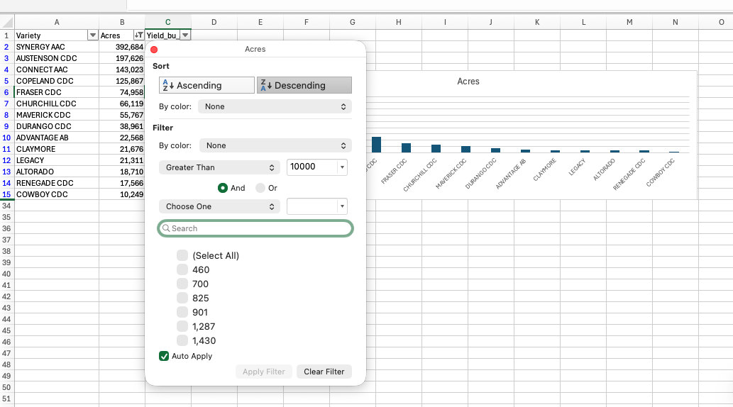
Acres column descending. The chart updates as soon as the filter is applied.
11.1.2 Changing the chart type
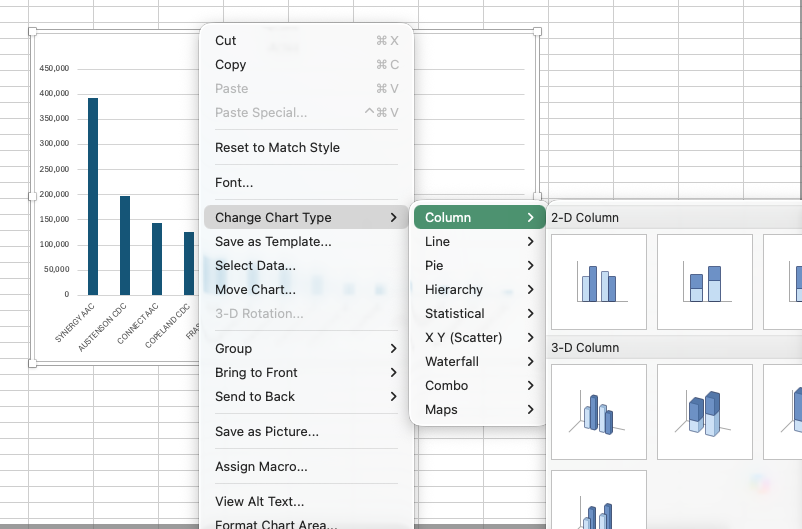
The resulting graph is still fairly wide. As mentioned in the previous chapter, a horizontal bar chart can work better when you have many categories and relatively long category names. One way of accomplishing this is to right click the chart and select Change Chart Type, then choose Bar Chart (there are other ways of doing this in Excel too). Note that the default is to put the first row at the bottom of the bar chart, so I sorted the acres column in ascending, rather than descending order to get the most widely grown variety at the top of the chart.
11.1.3 Add titles and labels
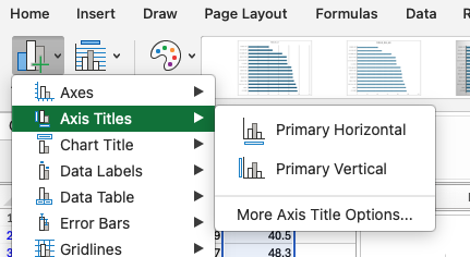
The default title of the chart is the name of the data series (Acres), which is not very informative. We can change the title by clicking on it and typing in a new title. We also need to add horizontal axes labels. We can do this by clicking Add chart element in the Chart Design ribbon, then selecting Axis Titles and typing in the appropriate titles. We can also add data labels to the bars by selecting Data Labels from the same menu. This will add the acreage values to the end of each bar. In this particular case, we likely don’t need a vertical axis label as it is clear that we are referencing barley varieties, but we could add one if we wanted to. We then may want to change the font size of these titles, labels, and axes to make them more readable. I tend to find the default font sizes on charts in Excel are too small.
11.1.4 Changing bar colours and widths
We can also change the appearance of the bars by clicking on one of the bars to select the series. On the right hand of the screen we will then get a menu where we can change both the colour of the bars and the gap between them.
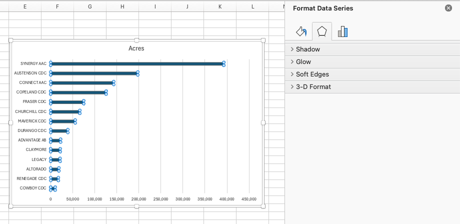
11.1.5 Other options
There are several other options for changing the appearance of the chart, such as changing the numbers displayed on the axes. When you choose Format Axis, you can change the minimum and maximum values, as well as the major and minor tick marks. If the default axis extends well past the longest bar, lowering the maximum can make the chart easier to read.
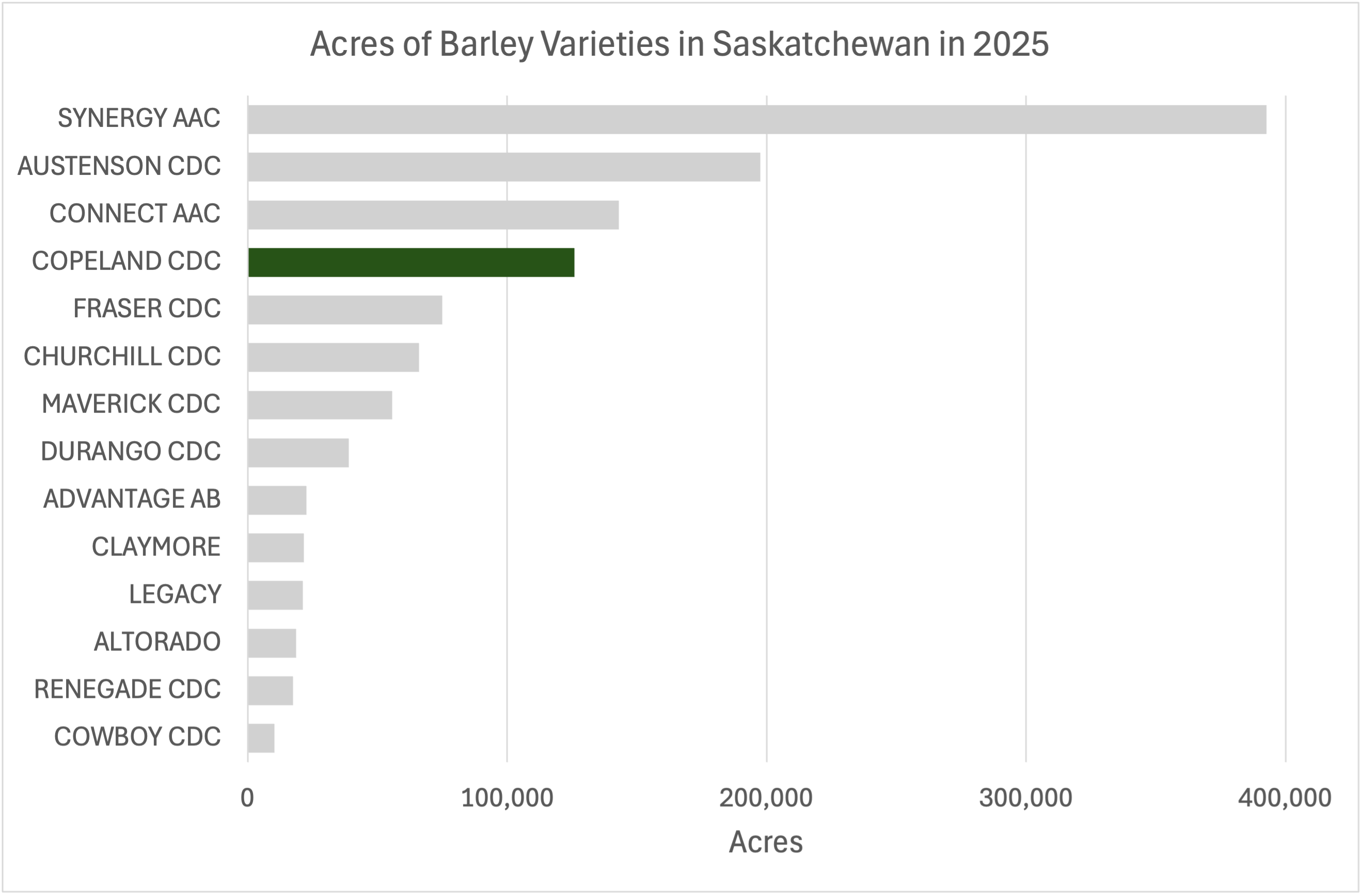
Here is my final version of the chart with Copeland highlighted.
11.2 Pie charts
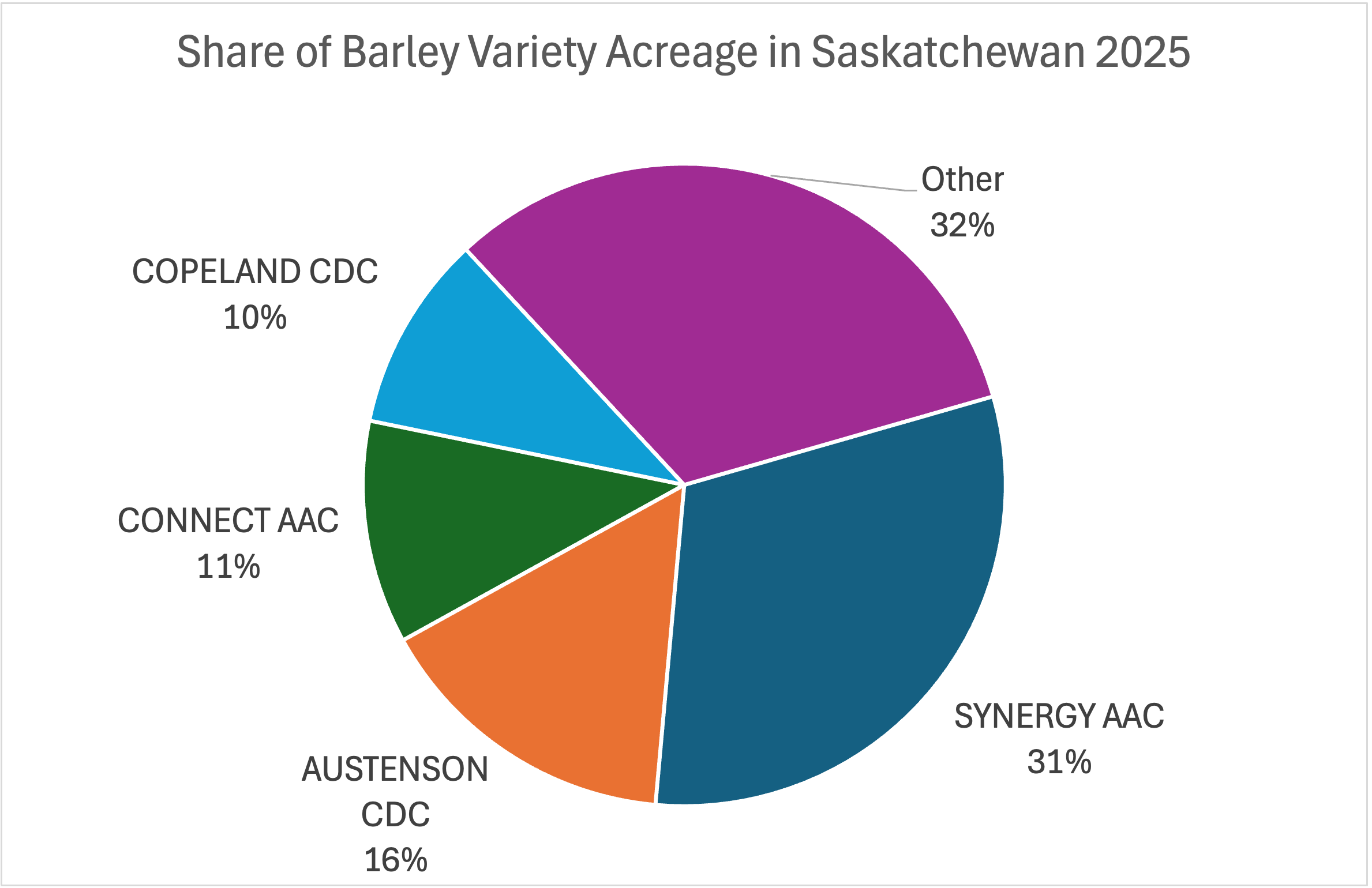
A pie chart shows the shares of a whole, and it works best when there are a small number of slices (Chapter 10 covers when to be wary of them). Suppose we want to show how 2025 barley acreage splits across varieties. We can easily create a pie chart by selecting data the same way as in Figure 11.1 and choosing a pie chart instead of a bar chart. The result below is horrendous.
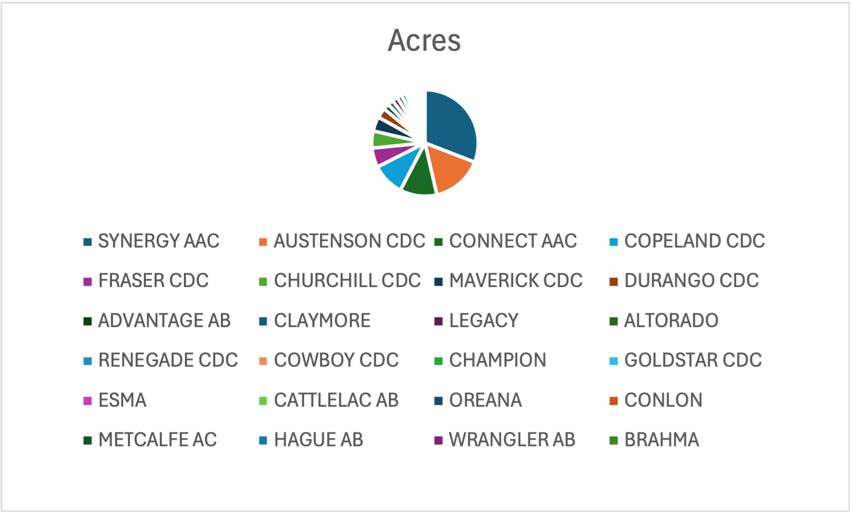
To fix this we can group all varieties except the four largest into an Other category. Five slices is something a reader can actually take in. If we want to show more varieties, a pie chart is definitely not the best option.
After that we need to do the same formatting work as the bar chart: a descriptive title, and data labels through Add chart element > Data Labels. One particularly helpful formatting idea is directly labelling each slice using Data Labels > Inside End as shown in Figure 11.9.
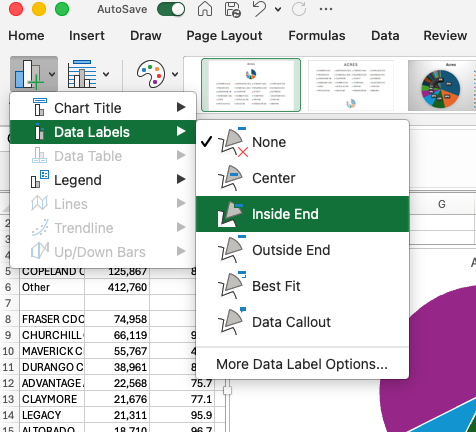
The finished pie chart is in Figure 11.10.
11.3 Line charts
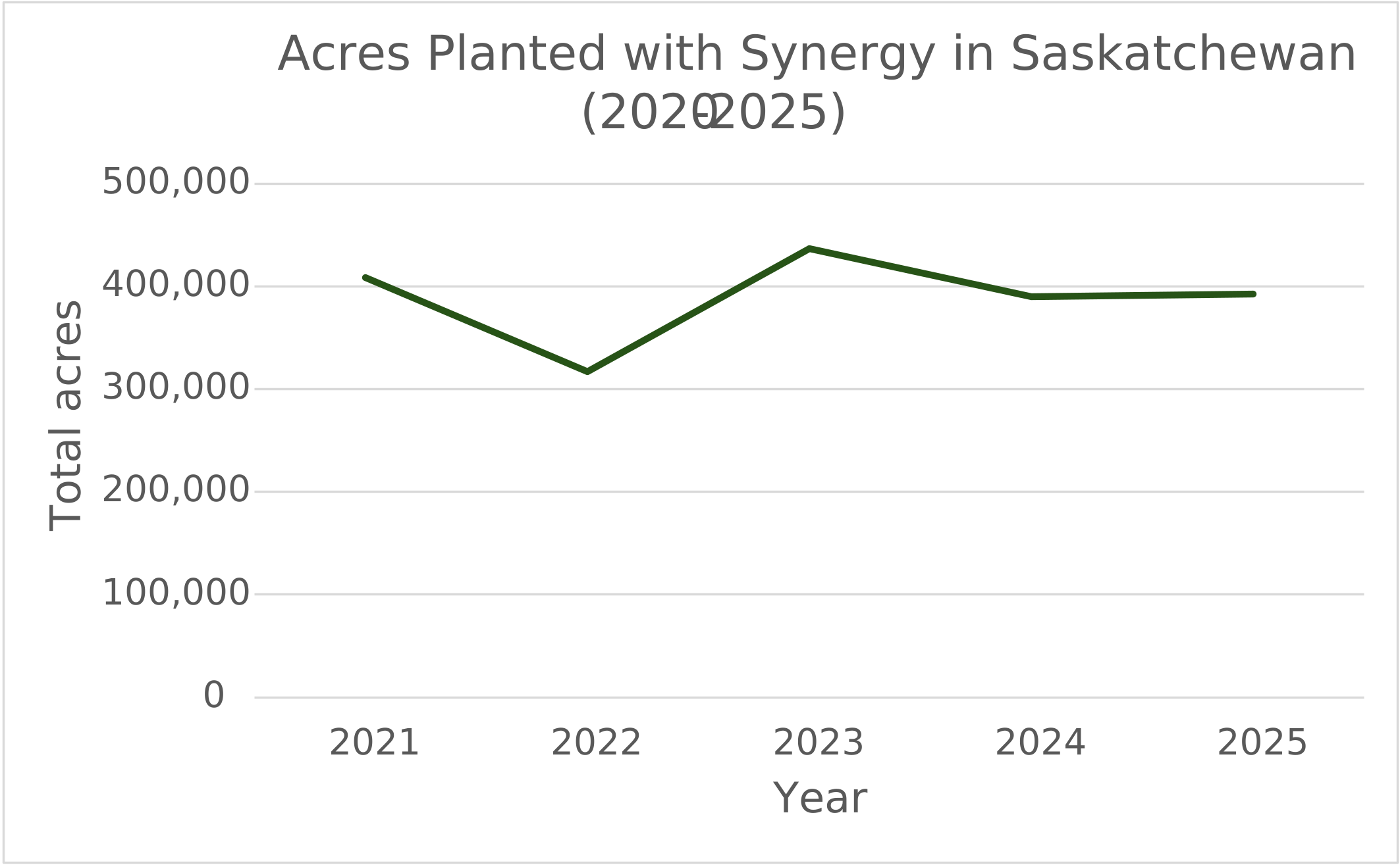
Line charts are useful for when you are plotting data against a continuous variable such as time. For this example, we will use barley data in Saskatchewan. Let’s again work through an example of line charts in Excel. The data we will use has acreage and yield of all varieties of barley in Saskatchewan from 2021 to 2025. I started by making a small summary table with two columns: the year and the acres of Synergy barley in that year. I then selected those two columns. I then went to the Insert tab, selected Line Chart, and chose the type of line chart I wanted.
The resulting chart is below.
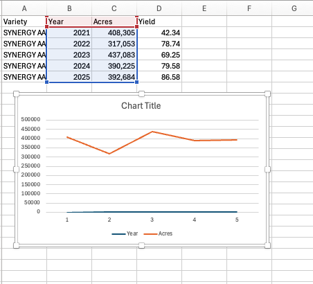
Year and Acres as two data series.
Evidently, this is not correct! It is showing two lines, one with the acres of Synergy and one with the year. I can correct this by right clicking the chart and selecting Select Data. I can then delete the series Year, and include Horizontal category labels for the Acres dataset series.
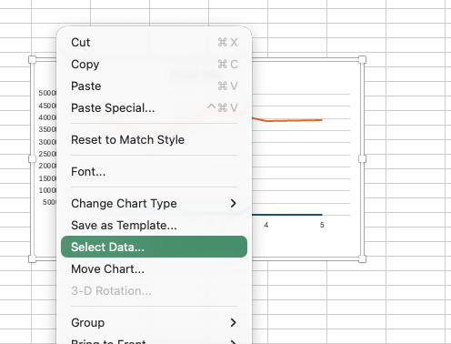
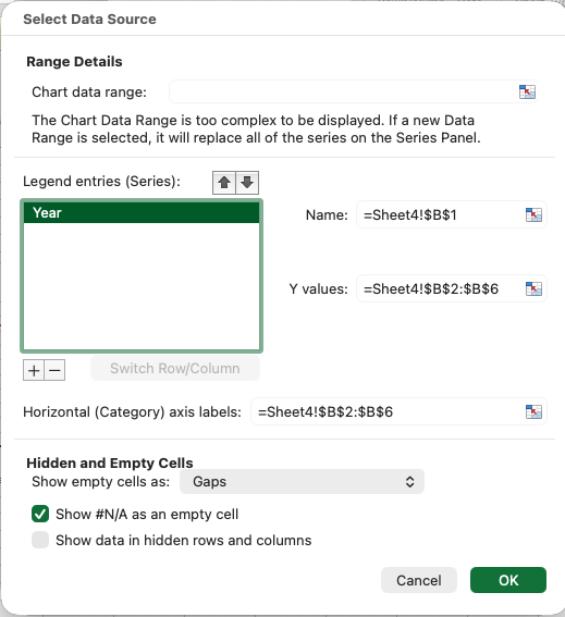
Year series and set it as the category axis labels.
After doing this and fixing titles, axes labels, colours, and gridlines, I have the following chart.
11.3.1 Plotting multiple series
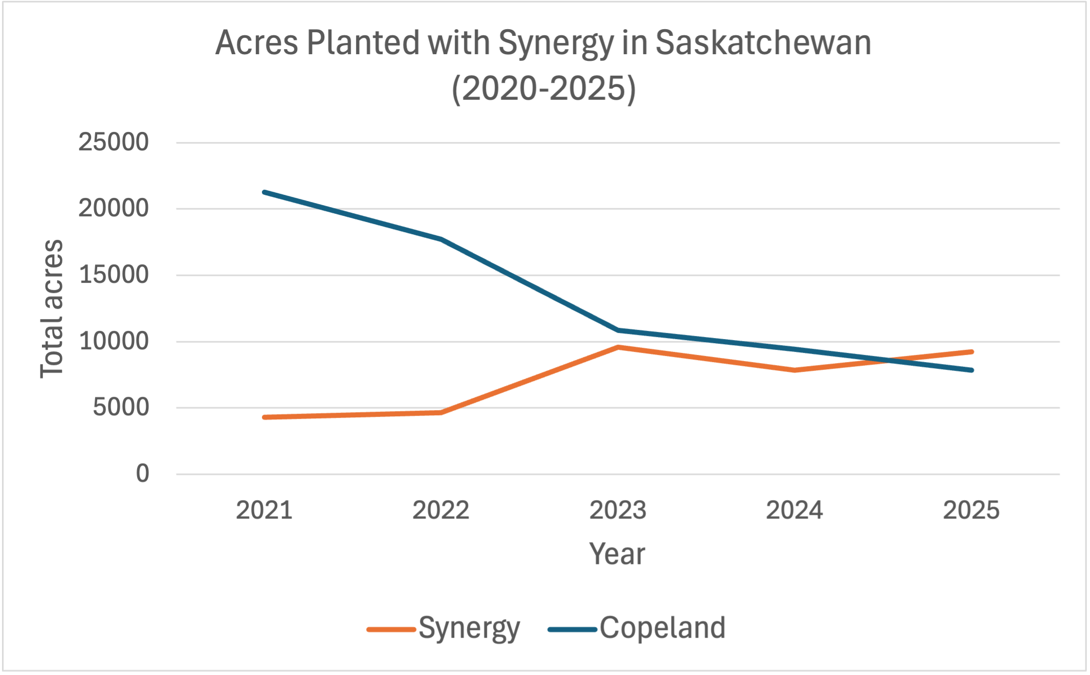
Suppose that we wanted to plot the acreage of two different varieties (for example Synergy and Copeland). We can do this easily by creating a column with each variety’s acreage, by simply copying and pasting numbers for the two varieties into two columns. I then click Select Data again and add a new series for the second variety. Note that I now need the legend to distinguish the two lines.
11.4 PivotCharts
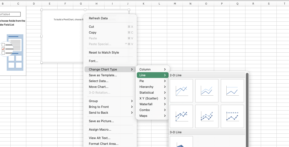
The approach above works for a quick chart with two varieties. But what if we want to add more varieties? Maybe we want all the varieties in the province, perhaps with smaller varieties grouped together. We can accomplish this through a PivotChart. A PivotChart is really just a PivotTable with a chart attached to it. We can create a PivotChart by selecting the data and then clicking Insert > PivotChart. Alternatively, if you already have a PivotTable created you can select the PivotTable and then insert a chart.
After changing the type of chart to a line chart, you can then select the data to be the series and another set of data to be the axes.
The resulting chart is what we wanted but is a bit of a mess.
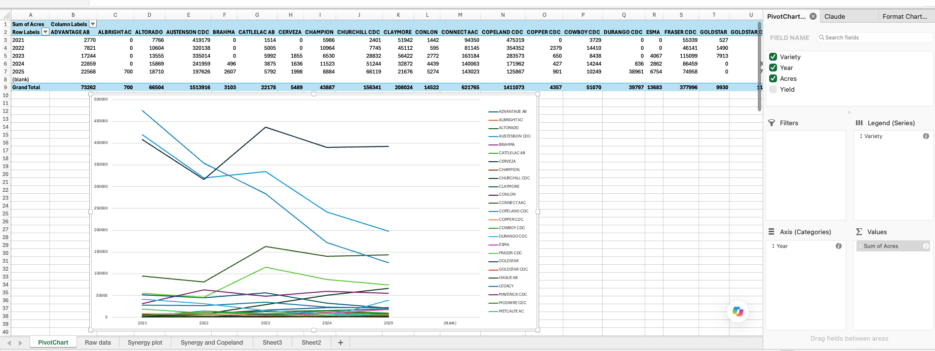
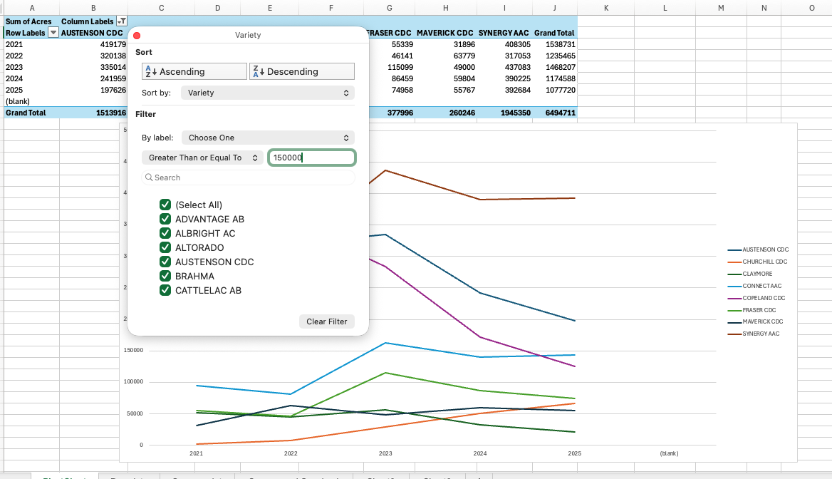
In Figure 11.17 it is clear that we cannot distinguish the lines for the smaller varieties. So it is best to eliminate these. We can do this by filtering out smaller varieties (those whose total acreage across all years is less than some value), as in Figure 11.18:
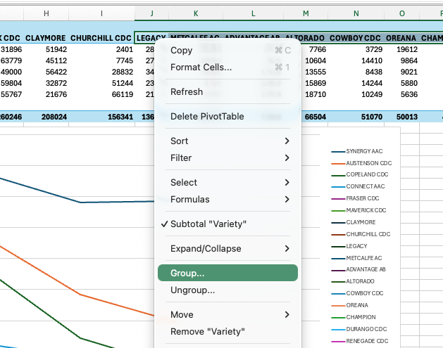
Or we could group all the smaller varieties together, as in Figure 11.19.
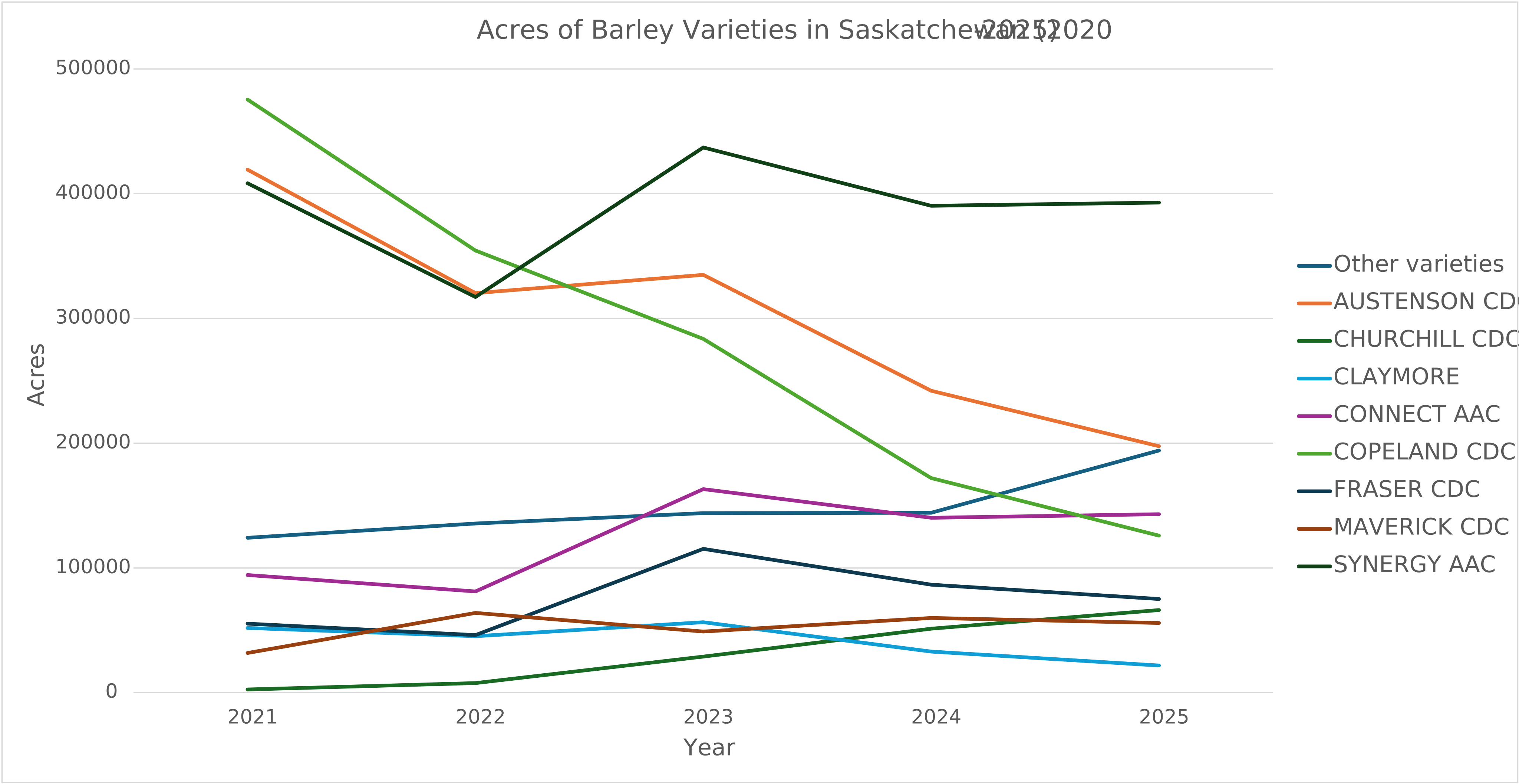
The resulting graph (after some cosmetic changes to fonts, titles and gridlines) is below:
11.5 Managing the data for graphing in Excel
Some additional tips for graphing in Excel:
- Numbers must be stored as numbers and dates as dates. A yield stored as text plots as zero or is skipped without warning, and text dates give a category axis, with the years evenly spaced whatever their values, instead of a true time axis. Put units in the header, as in
Yield (bu/ac); typing them into the cells turns the column into text. - Leave missing values blank. A zero draws a bar of height zero and drags a line down to the floor. A blank leaves a gap, and Select Data > Hidden and Empty Cells controls whether a line bridges it.
- Sort the table in the order you want the bars. Excel plots rows in sheet order, so sorting the summary table descending is the chart-ordering step.
- Chart a small summary table, not the raw data. The charts in this chapter draw on small summary tables, not the fourteen thousand source rows.