3 Describing Data
Most datasets are too large to understand simply by looking at all the observations. Instead, we use summary statistics and charts to describe the data and make its important features easier to see.
We can think about four characteristics of data:
- Centre. Where is the data centred – what is a typical value?
- Position. Where does a particular observation sit relative to the rest pf the data – near the middle, or out toward one end?
- Spread. How spread out are the values – are they tightly clustered or all over the map?
- Shape. What does the distribution of the data look like – is it roughly symmetric, with values balanced on either side of the centre, or is it lopsided, with most observations bunched at one end and a few trailing off toward the other?
In this chapter, we will learn the statistics and charts used to describe these four characteristics, how to interpret them, and how to calculate and create them in Excel using the tools from Chapter 1 and Chapter 2.
3.1 Measures of Central Tendency
NoteVideo walkthrough of this section
Now let’s actually do some data analysis. The most basic question you can ask about a set of numbers is: “what is a typical value?” There are three common answers to that question, and which one is “right” depends on what you mean by “typical.”
Mean
The mean (often called the “average”) is the sum of the values divided by the number of values. If your yields over five years are 48, 52, 47, 55, and 50 bushels per acre, the mean is:
\[ \bar{x} = \frac{48 + 52 + 47 + 55 + 50}{5} = \frac{252}{5} = 50.4 \text{ bu/acre} \]
In Excel: =AVERAGE(A1:A5).
NoteAside: notation
Statistics has a compact notation for referring to data. Each observation is written as \(x\) with a subscript giving its position in the dataset, so our five yields are:
| \(x_1\) | \(x_2\) | \(x_3\) | \(x_4\) | \(x_5\) | |
|---|---|---|---|---|---|
| Yield (bu/acre) | 48 | 52 | 47 | 55 | 50 |
The letter \(n\) stands for the number of observations; here \(n = 5\). To refer to an observation without saying which one, we write \(x_i\), where \(i\) can be any position from 1 to \(n\). In this dataset, \(x_3 = 47\).
The summation sign \(\sum\) means “add up”. The subscript and superscript on it give the starting and ending positions:
\[ \sum_{i=1}^{n} x_i = x_1 + x_2 + x_3 + x_4 + x_5 = 48 + 52 + 47 + 55 + 50 = 252 \]
We write \(\bar{x}\) (pronounced “x-bar”) for the sample mean. The general formula is:
\[ \bar{x} = \frac{1}{n} \sum_{i=1}^{n} x_i \]
The mean is often a good description of a typical value when the data is roughly symmetric and has no extreme outliers. When the data is skewed or contains extreme values, however, the mean can give a misleading impression of what is typical. For example, if you are looking at farm incomes in a region, a handful of large operations can pull the mean way up, so the “average farm income” may be much higher than the income earned by a typical farm. This distinction comes up frequently in news stories and policy debates: a report that “average farm income rose” does not necessarily mean that the income of the typical farm rose by the same amount.
Weighted Average
The ordinary mean treats every value as equally important. But often the values represent things of very different size, and treating them equally gives a misleading answer. When that happens you want a weighted average: each value is counted in proportion to how much it should “count.”
Return to the five wheat fields from the ranges and functions section, with acres in B2:B6 and yields in C2:C6. Suppose you want to answer: what was the average yield across the whole farm?
| A | B | C | |
|---|---|---|---|
| 1 | Field | Acres | Yield (bu/ac) |
| 2 | North | 120 | 52.4 |
| 3 | South | 240 | 48.9 |
| 4 | Creek | 95 | 61.2 |
| 5 | Home | 310 | 55.7 |
| 6 | Rented | 175 | 44.3 |
The tempting move is a plain =AVERAGE(C2:C6), which gives 52.5 bu/ac. But that treats the 95-acre Creek field exactly the same as the 310-acre Home field – as if each field were one “vote.” That is not what “the average yield across the farm” means. A field three times the size should count three times as much.
The right calculation weights each yield by its acres. To do this, multiply each field’s yield by its acres, add those up (that is total production, in bushels), and divide by the total acres:
\[ \bar{x}_w = \frac{\sum w_i\, x_i}{\sum w_i} = \frac{\text{total bushels}}{\text{total acres}} \]
where \(x_i\) is each field’s yield and \(w_i\) is its acres (the weight). Dividing total bushels by total acres in the workbook from Section 1.6 gives exactly this. SUMPRODUCT does the multiplying and adding in one step, which is handy when you have no bushels column:
=SUMPRODUCT(C2:C6, B2:B6) / SUM(B2:B6)This comes out to 52.0 bu/ac, a little below the plain 52.5. The gap is telling you that the bigger fields yielded slightly below the smaller ones, so counting every field equally overstated the farm’s acreage-weighted average yield.
Weighted averages are not specific to agriculture: any time you average numbers that stand for different-sized quantities, you weight. If the midterm is worth 30% and the final 70%, and you score 80 and 90, your grade is the weighted average \(0.30 \times 80 + 0.70 \times 90 = 87\), not the plain average 85. Grade-point averages (weighting each course’s grade by its credit hours), price indexes, and portfolio returns all work the same way.
Median
The median is the middle value when the data is sorted. If you have an odd number of observations, it is literally the middle one. If you have an even number, it is the average of the two middle ones.
For our yields (sorted: 47, 48, 50, 52, 55), the median is 50. In Excel: =MEDIAN(A1:A5).
The median is often a better description of a typical value when your data is skewed or has extreme outliers. To return to our previous example of farm incomes, if there are a handful of very large operations, the median income may give a better answer to the question “what does a typical farm earn?”
A classic example: suppose the average wealth of the customers in a bar is $100,000. Elon Musk walks in. The average wealth is now hundreds of millions of dollars. The median barely budges.
Comparing the Mean and Median
You now have two answers to “what is a typical value?” – and comparing them can tell you something about the data. The reason is that the mean is pulled toward unusually high or low values, while the median is much less affected by them. So the gap between the mean and median gives you a clue about whether the data is skewed – stretched farther in one direction than the other.
- Mean ≈ median. The data may be roughly symmetric: unusually high and low values are not pulling the mean strongly in either direction. In this case, the mean and median tell a similar story.
- Mean noticeably above median. The distribution may be right-skewed, with some unusually high values pulling the mean upward. Think of farm incomes with a small number of very high-income farms, or field sizes with a few enormous fields – the mean can be substantially higher than the value for a typical observation.
- Mean noticeably below median. The distribution may be left-skewed, with some unusually low values pulling the mean downward. Think of crop yields when a small number of badly drought-hit fields have very low yields – those fields can pull the mean below what a typical field produced.
So when summarizing data, always compute both statistics and look at how they differ.
Mode
The mode is the most frequently occurring value. In Excel: =MODE.SNGL(A1:A5) for a single mode, or =MODE.MULT(A1:A5) if you want all of them (for data with multiple modes).
The mode is most useful for categorical data (“what is the most common crop in this region?”) or for discrete numeric data with repeated values. For continuous measurements like yields, the mode is usually less useful because exact values may rarely repeat.
The Centre tab of the workbook below computes all four of these on 32 Saskatchewan barley varieties. Column D holds production (acres × yield), which is what the weighted average needs.
Download this workbook · Open online (File → Save a Copy to view formulas and edit) · the Centre tab. The workbook includes a practice sheet for each topic.
TipOther resources — measures of central tendency
- OpenStax, Introductory Statistics 2e – §2.5 “Measures of the Center of the Data”. Free, thorough treatment of mean, median, and mode with worked examples.
- Excel for Dummies – Microsoft 365 Excel for Dummies, the chapter on statistical functions (
AVERAGE,MEDIAN,MODE). Also see Microsoft Excel Data Analysis for Dummies (3rd ed.) for descriptive statistics. - Microsoft Support – the official function references: AVERAGE, MEDIAN, MODE.SNGL.
- Video (concept) – Khan Academy, Statistics intro: mean, median, & mode. Clear and beginner-friendly, no Excel required.
- Video (Excel) – Average, Median and Mode functions in Excel. A hands-on walkthrough of the three functions on a dataset.
3.2 Measures of Location: Percentiles and Quartiles
NoteVideo walkthrough of this section
The mean and median tell you about the centre of the data. Sometimes, however, we want to know the position of a particular value relative to the rest of the data. That is what percentiles are for.
The \(p\)-th percentile is the value at or below which about \(p\%\) of the observations fall. The 50th percentile is the median. The 25th percentile is the value below which a quarter of the observations lie; the 75th percentile is the value below which three-quarters lie. These three values – the 25th, 50th, and 75th percentiles – are called the first, second, and third quartiles (\(Q_1\), \(Q_2\), \(Q_3\)).
Note that when we have a small amount of data, the percentile does not always land exactly on one of our data points, and different software uses slightly different rules to fill the gap. Excel’s .INC method (the one we use in this course) places the percentile at position \(1 + (n-1)p\) in the sorted data. For example, with ten values the 25th percentile lands at position \(1 + 9 \times 0.25 = 3.25\) – one-quarter of the way from the 3rd-smallest value to the 4th, so Excel interpolates between them. With larger datasets these interpolation details rarely matter.
In Excel:
=PERCENTILE.INC(A1:A100, 0.9)– the 90th percentile.=QUARTILE.INC(A1:A100, 1)– the first quartile (\(Q_1\)).=QUARTILE.INC(A1:A100, 3)– the third quartile (\(Q_3\)).
Percentiles are used whenever we want to describe where an observation stands relative to others. Standardized test scores are often reported as percentiles, economists use income percentiles to compare households across the income distribution, and agricultural analysts might ask whether a farm’s yield falls in the bottom 10% or whether a variety performs in the top quartile.
The Location tab computes the quartiles and the 10th and 90th percentiles on the same barley data.
Download this workbook · Open online (File → Save a Copy to view formulas and edit) · the Location tab. The workbook includes a practice sheet for each topic.
TipOther resources — percentiles and quartiles
- OpenStax, Introductory Statistics 2e – §2.3 “Measures of the Location of the Data” (percentiles, quartiles, and the IQR).
- Excel for Dummies – Microsoft Excel Data Analysis for Dummies (3rd ed.), the descriptive-statistics chapter covering percentiles and quartiles.
- Microsoft Support – PERCENTILE.INC and QUARTILE.INC.
- Video (concept + Excel) – Percentiles and quartiles explained and demonstrated with Excel.
- Video (Excel how-to) – How to calculate quartiles, deciles, and percentiles in Excel.
3.3 Measures of Spread: Variance and Standard Deviation
NoteVideo walkthrough of this section
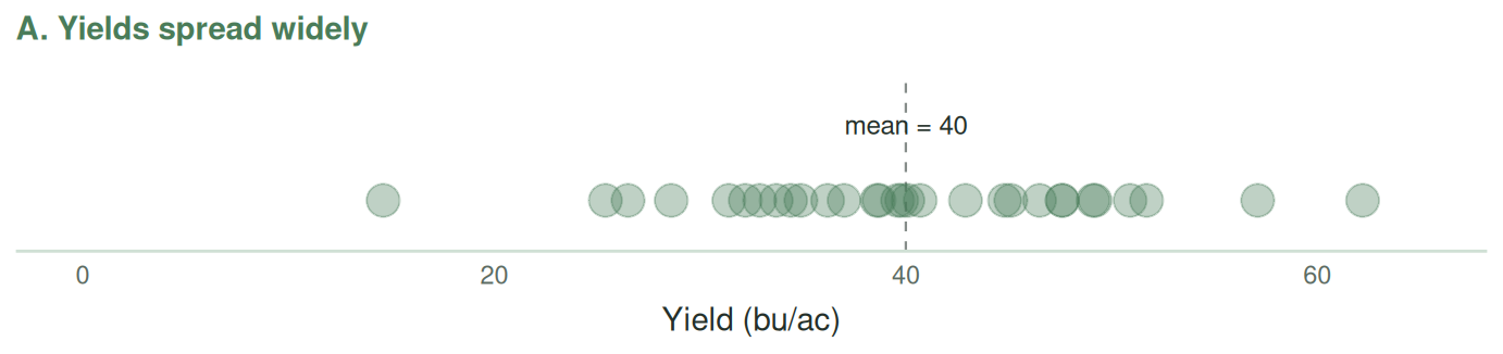
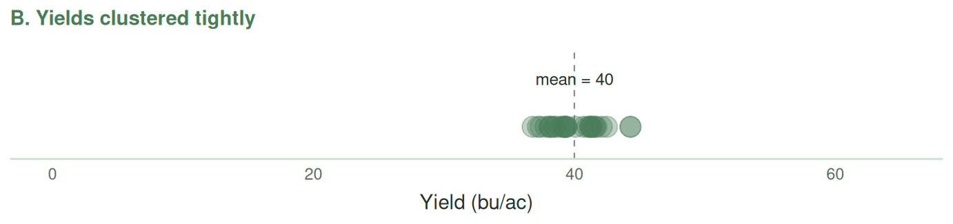
Two datasets can have the same mean but look very different. Consider the two sets of 30 hypothetical farm yields in Figure 3.1. Both have a mean of exactly 40 bushels per acre, but in panel A the yields are very spread out, while in panel B they are clustered tightly together.
For a data analyst, the spread is very informative. If the values are spread out then we should be curious about what causes this spread. If these fields are far away from each other then maybe the spread is due to weather. But if they are in the same Township, with reasonably similar weather, then it may be due to management practices such as varietal choice, nitrogen application rates, or seeding dates. When we are dealing with large datasets it can be difficult to just look at how spread out points are on a one-dimensional graph. It is therefore handy to be able to distill the spread of data into a single number. In this section, we will examine several different measures of spread, each of which has its strengths and weaknesses.
Range
The simplest measure of spread is the range: the maximum value minus the minimum value. In Excel: =MAX(A1:A100) - MIN(A1:A100). The range is easy to understand, but it is very sensitive to extreme values – a single unusual observation can change it dramatically.
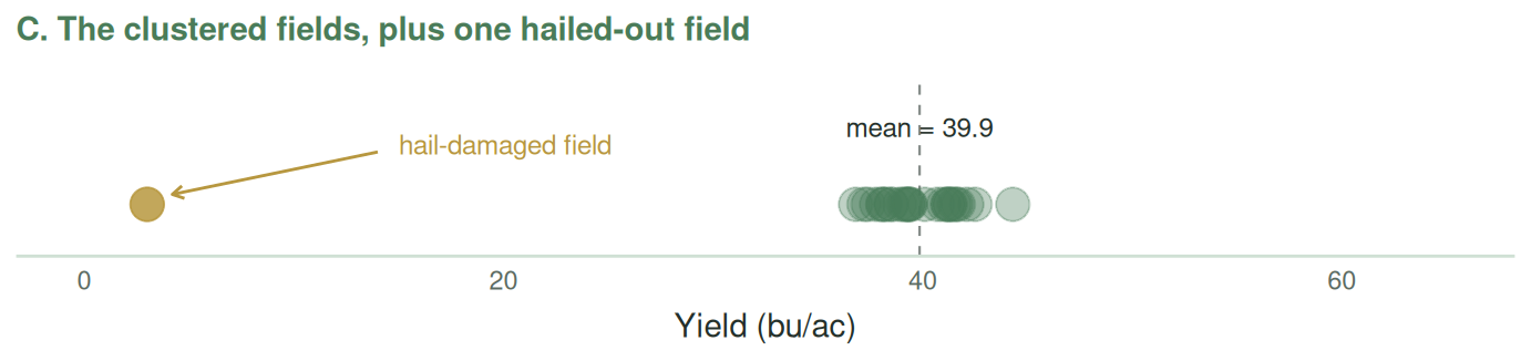
Suppose, for example, that one of the tightly clustered fields in Figure 3.2 experiences a hailstorm that wipes out its crop. That single field increases the range from 7.5 to 41.3 bu/ac – more than five times larger – even though only one of the 30 fields has changed.
A potentially more useful measure is the interquartile range or IQR, which measures the difference between the first and third quartile. In other words, half the data lie within the interquartile range. In Excel: =QUARTILE.INC(A1:A100, 3)-QUARTILE.INC(A1:A100, 1). However, whereas the range was too sensitive to outliers, the IQR might not tell us enough about data in the tail of the distribution.
Mean absolute deviation
A better way to measure the spread of the data is to examine how far each observation is from the mean. That is to say for each observation we could calculate \(x_i-\bar{x}\), add them all up and divide by \(n\). However, if we did this we would find that some of the deviations are negative and others are positive. By the definition of a mean, they would all cancel out, giving us zero.
A more useful approach is to calculate the absolute value of these differences – this is called the mean absolute deviation (MAD):
\[ \text{MAD} = \frac{\sum_{i=1}^{n} |x_i - \bar{x}|}{n} \]
Note that the straight lines in the equation above denote absolute value – that is to say if a negative number is between these lines, we treat it as a positive number. If our data is very spread out (panel A of Figure 3.1) we would get a large MAD; if it is tightly clustered (panel B) we would get a small one. If we find a MAD of 8 bu/acre then this means that on average a farm’s yields are 8 bu/acre different (either higher or lower) than the mean. Of course, some farms will have yields that are closer to the mean and others will have yields that are farther.
There is no simple command to calculate the MAD in Excel – you would need to first calculate the mean, then the absolute difference between each observation and the mean, and then sum these absolute values.
Variance
Another way to prevent positive and negative deviations from cancelling out is to square them. Squaring has the additional effect of giving more weight to observations that are far from the mean. The average of these squared deviations is called the variance.
We denote the variance of a population as \(\sigma^2\) and the variance of a sample as \(s^2\). For technical reasons that we won’t get into in this class, when we calculate the variance of a sample we divide by \(n-1\) rather than \(n\):
\[ s^2 = \frac{1}{n-1} \sum_{i=1}^{n} (x_i - \bar{x})^2 \]
In Excel: =VAR.S(A1:A5) for a sample and =VAR.P(A1:A5) for a full population. Use VAR.S unless you are working with a complete population.
Variance is extremely useful in statistics, but it has an awkward interpretation. Because we squared the deviations, the variance is also measured in squared units. If yield is measured in bu/acre, for example, its variance is measured in \((\text{bu/acre})^2\). To get back to the original units, we take the square root of the variance – which gives us the standard deviation.
Standard Deviation
The standard deviation is the square root of the variance:
\[ s = \sqrt{s^2} = \sqrt{\frac{1}{n-1} \sum_{i=1}^{n} (x_i - \bar{x})^2} \]
Now the units match the original data, and we can say things like “yields in this region average 50 bu/acre with a standard deviation of 8 bu/acre.” That is a statement someone can actually interpret: a typical field in the region yields within about 8 bu/acre of that 50.
In Excel: =STDEV.S(A1:A5) for a sample, =STDEV.P(A1:A5) for a population.
Standard deviation will show up everywhere in the rest of this course.
Coefficient of Variation
A sometimes helpful, but sometimes misleading, measure of spread is the coefficient of variation (CV), which is the standard deviation divided by the mean:
\[ CV = \frac{s}{\bar{x}} \]
I say it is helpful because it can compare the spread of two datasets with very different means. Suppose barley averages 55 bu/ac with a standard deviation of 11 (CV = 11/55 = 0.20), while wheat averages 40 bu/ac with a standard deviation of 10 (CV = 10/40 = 0.25). Wheat’s standard deviation is smaller in absolute terms (10 vs 11), yet relative to its own average, wheat is more variable (CV 0.25 vs 0.20).
However, in other contexts – particularly when the mean of the data is zero or negative – the CV can be misleading. Suppose we wanted to compare the variability of farm income in a “good” year to farm incomes in a “bad” year. In a bad year, the mean of income might be close to zero or negative. In that case, the CV would explode to infinity or become negative.
The Spread tab works through the five measures Excel computes directly on the barley varieties, so you can see how each responds to the same data.
Download this workbook · Open online (File → Save a Copy to view formulas and edit) · the Spread tab. The workbook includes a practice sheet for each topic.
TipOther resources — variance, standard deviation, and CV
- OpenStax, Introductory Statistics 2e – §2.7 “Measures of the Spread of the Data” (variance and standard deviation).
- Excel for Dummies – Microsoft Excel Data Analysis for Dummies (3rd ed.), the descriptive-statistics chapter covering variance and standard deviation.
- Microsoft Support – STDEV.S and VAR.S.
- Video (concept) – Khan Academy, Range, variance and standard deviation as measures of dispersion.
- Video (Excel how-to) – How to calculate standard deviation in Excel (STDEV).
- On the coefficient of variation: there is no single go-to video, but the idea is simple – it is just the standard deviation divided by the mean (a unitless measure of relative spread), covered in the text above.
3.4 Visualizing the Distribution of the Data
NoteVideo walkthrough of this section
The distribution of data describes how the observations are spread across different values – which values are common, which are rare, and the overall shape they form. A distribution can reveal things that no single summary number can, because very different-looking datasets can share the same summary statistics. Figure 3.3 shows two sets of 60 farm yields with identical means (40 bu/ac) and identical ranges (26 to 54 bu/ac), yet they look nothing alike. In panel A, the observations sit in two separate clusters; in panel B, they are concentrated in the middle and thin out toward either edge.
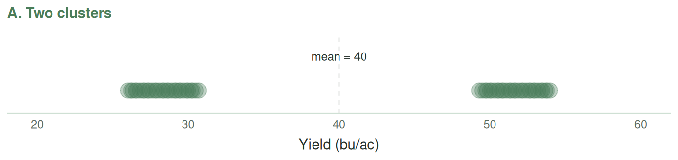
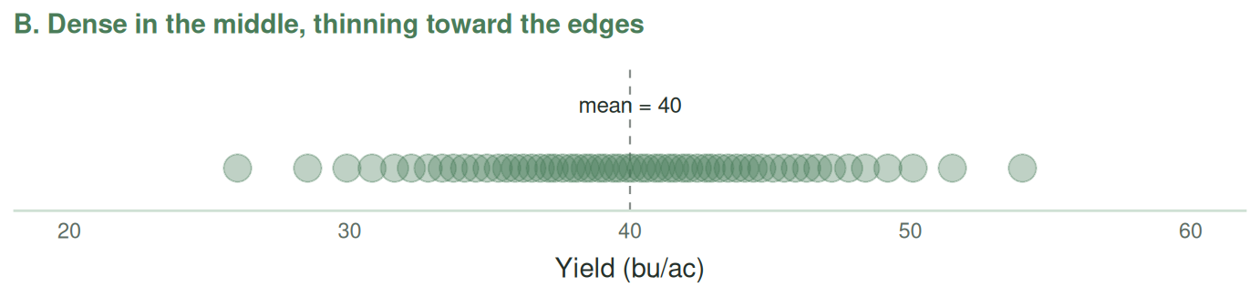
The two clusters in panel A are quite informative about the data: perhaps those farms differ in variety, soil zone, or seeding date, and what looks like one population is really two. Note also that the mean of 40 bu/ac in panel A describes a yield that almost no farm actually achieved – a good reminder that a summary statistic is not a substitute for looking at your data.
Perhaps the simplest way to visualize the shape of a distribution is with a histogram. A histogram divides the range of the data into bins and uses bars to show how many observations fall into each one. It lets you see at a glance whether the data is roughly symmetric (balanced around the centre), skewed (stretched farther in one direction than the other, as we discussed in Section 3.1), or contains outliers (a few observations sitting far from the rest).
How to make one in Excel: select the data, then choose Insert → Statistical Chart → Histogram. Right-click the horizontal axis and choose Format Axis to control the bin width. (The video for this section shows you exactly how to do this).
The number of bins you choose for a histogram matters. Too few bins can hide important features of the distribution; too many can make random variation look important. As a rough starting point, try about \(\sqrt{n}\) bins, where \(n\) is the number of observations. Then try a few different bin widths and check whether the main features of the distribution remain visible.
The Histogram tab contains three histograms. In my view the first one has a reasonable number of bins. The next two have too many and too few.
Download this workbook · Open online (File → Save a Copy to view formulas and edit) · the Histogram tab. The workbook includes a practice sheet for each topic.
TipOther resources — histograms
- OpenStax, Introductory Statistics 2e – §2.2 “Histograms, Frequency Polygons, and Time Series Graphs”.
- Video (histogram in Excel) – Histogram chart & box and whisker chart in Excel.
- Video (histograms, concept) – StatQuest with Josh Starmer, Histograms, clearly explained.