Every dataset in the book so far has arrived as a tidy table with sensible column names. Data does not normally show up that way. It shows up as an Excel workbook somebody emailed you with the numbers starting on row 8, as a CSV behind a link on a government dashboard, as a folder of monthly files, or as the answer a server sends back when a program asks it a question.
Getting the data is part of the analysis. Done well, it is repeatable, it leaves the original untouched, and it records enough that somebody else could fetch the same thing later. The chapter follows that order: decide what you need, find a source, fetch it, keep a raw copy, read it in, check it, write down where it came from. The tools differ between Excel and R; the order does not.
The data used in this chapter are:
elevator_tickets.csv – twenty grain-delivery tickets, with identifier columns that spreadsheets like to mangle.
The chapter’s other data does not come as a file: the RM yields are downloaded directly from a Government of Saskatchewan URL, and the weather and Statistics Canada examples fetch their data through APIs.
7.1 Start With the Table You Need
Do not start by downloading the biggest file you can find. Start by describing the table that would answer the question. For the question that runs through this module, whether Saskatchewan canola yields move with growing-season rain, that is:
One row per rural municipality per year.
Columns for canola yield and for May to August precipitation.
Saskatchewan, roughly 2015 onward.
Yield in bushels per acre, precipitation in millimetres.
Something to identify each row: an RM number, a year, and whatever identifies a weather station.
Written out like this, the description says what to search for and whether a candidate file fits. It also shows that the yield and the rain will come from different agencies and will need a common identifier, which is the problem Chapter 9 solves.
When you find a candidate, read its documentation before you read the data. What does one row represent? Who produced it, and is it measured, surveyed, or modelled? What are the units and the reference period? How are missing, suppressed or preliminary values marked? Is it revised after release? Is there a licence or attribution requirement? A file that opens without trouble can still be the wrong file.
7.2 Where Agricultural Data Comes From
Some data you make yourself: a field trial, a survey, a sensor, the records from your own farm or business. Some is sent to you, usually as a spreadsheet. The rest has to be found, and for agriculture a lot of it is in the public domain. A short list of the places you can find data:
Statistics Canada. Crop area, production and yield, livestock, prices, farm income, trade, the Census of Agriculture. The starting point for almost any Canadian question.
Weather.Environment and Climate Change Canada has daily observations from every station it has run, some going back to the 1880s. Open-Meteo serves modelled weather for any latitude and longitude, which is useful where there is no station, with the caveat that it is a model estimate and not a gauge.
Outside Canada. USDA’s QuickStats for the US, FAOSTAT for the world, the World Bank for anything macroeconomic.
It is best practice to obtain data directly from the agency that produces it. A chart in a news story is a good way to discover that a dataset exists; the agency’s table is the thing to download.
One source worth knowing about now, though it waits for Module 6: AAFC’s Annual Crop Inventory, a satellite classification of what grew in every 30-metre cell of Canadian farmland, every year since 2009.
7.3 Downloading Data
We can obtain data in a few different ways. The simplest is to directly download data or have data sent to you in a .csv, .xlsx or some other file. This is how we have approached data so far in this class, and we have been reading in data that is already fairly “clean”. Not all data is this simple. In this chapter, we will overview some common issues with loading data.
We will also discuss obtaining data directly through R code. Many data providers have an API (application programming interface) that allows you to request data directly from their server. Using the API directly is a more advanced topic. However, we will learn to use R packages that use APIs to download data – in particular we will learn about the openmeteo package that allows the user to download weather data and the cansim package that allows the user to download data from Statistics Canada.
7.4 Opening data files in Excel
Excel’s native file format is .xlsx. But it can also open .csv, .tsv, .txt and other file formats. One issue with Excel opening these files is that it can try to convert the data to formats that are not intended.
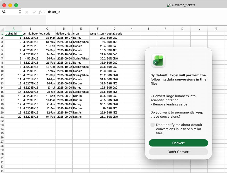
For example, download elevator_tickets.csv – twenty grain-delivery tickets – and open it in Excel. The following message pops up, warning that excel will convert large numbers to scientific notation and remove leading zeros. This is a problem because the data contains identifiers that are not meant to be treated as numbers. It also has silently converted the lot codes to dates.
Figure 7.1: Excel warns that it will remove leading zeros and convert large numbers to scientific notation.
7.4.1 Power Query
NoteVideo walkthrough of this section
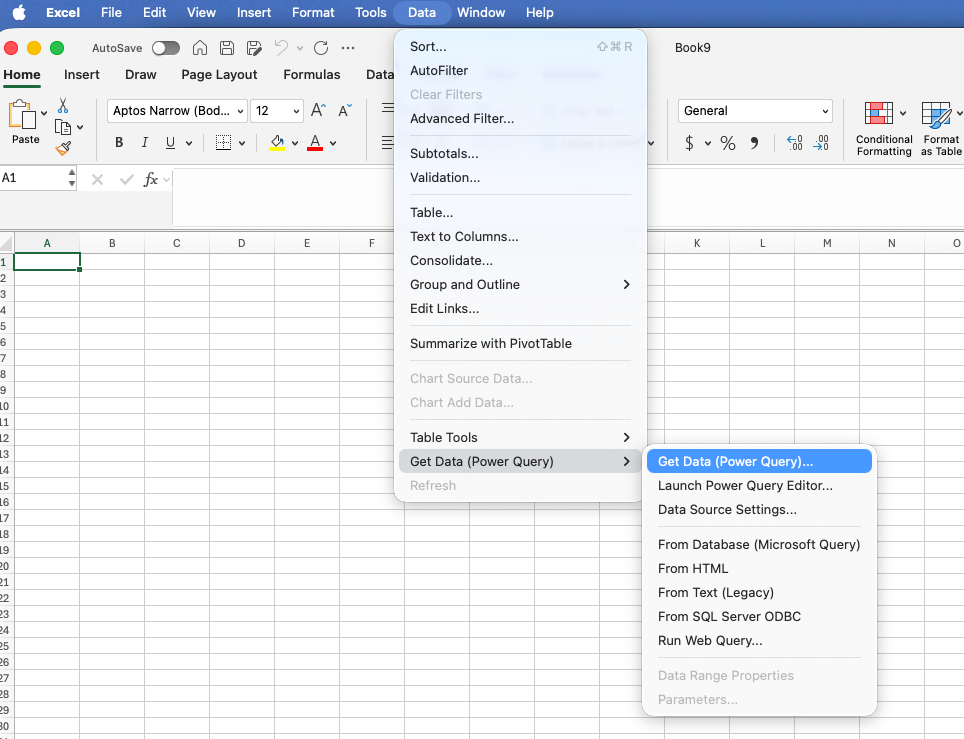
A better – though much more involved – way of importing data into Excel is to use Power Query. Power Query is found under Data > Get Data. We will use it more in the coming chapters. It reads a source, shows a preview, lets you fix the columns, and loads the result onto a sheet. For the tickets file:
Choose Data > Get Data > From Text/CSV (on a Mac, Data > Get Data (Power Query); the wording moves around between versions) and select the file.
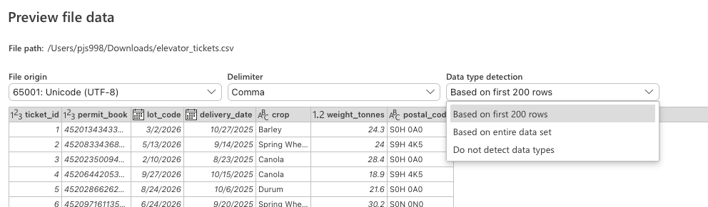
In the preview, set Data Type Detection to Do not detect data types. This matters: once 00001 has been converted to the number 1, changing it back to Text cannot restore the zeros.
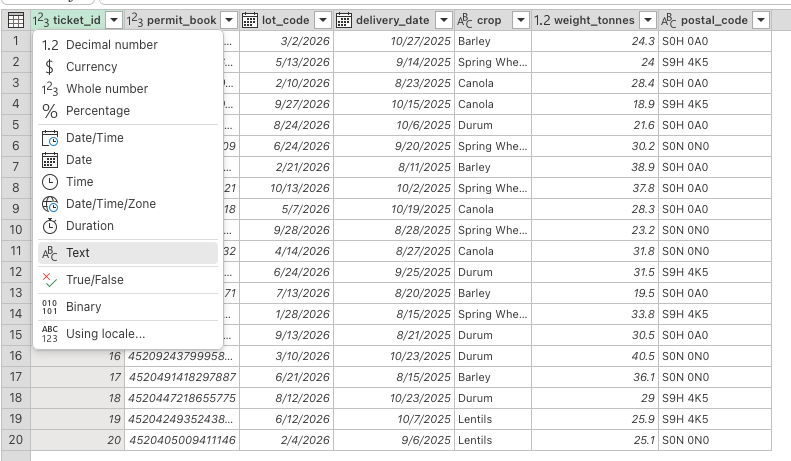
Press Transform Data rather than Load. In the editor, use each column header’s type icon to set ticket_id, permit_book and lot_code to Text, delivery_date to Date, and weight_tonnes to Decimal Number.
Choose Close & Load. Save the workbook as .xlsx, which keeps the query; saving as CSV throws it away.
NoteScreenshots of these steps
Figure 7.2: On Excel for Mac, the Power Query import starts under Data > Get Data (Power Query).
Figure 7.3: Set Data type detection to Do not detect data types before transforming the file.
Figure 7.4: In the Power Query editor, change identifier columns such as ticket_id to Text.
After loading, check it. The number of rows and columns is what you expected; the identifiers kept their zeros and all their digits; the dates cover the right period; the numbers are numbers; blanks did not become zeros.
TipWorkbook: elevator_tickets_correct.xlsx after importing with Power Query
In R the whole acquisition is a script: the path or address, the parameters, the column types, the checks. Rerunning the script reruns the acquisition.
7.5.1 CSV, TSV and other delimited files
The tidyverse functions come from readr. The file used here is the same one used in the Excel examples above:
# Load the tidyverse packageslibrary(tidyverse)# Read the comma-delimited ticket filetickets <-read_csv("practice/data/elevator_tickets.csv")# Print the first six rowshead(tickets)
> # Load the tidyverse packages
> library(tidyverse)
── Attaching core tidyverse packages ──────────────────────── tidyverse 2.0.0 ──
✔ dplyr     1.2.1     ✔ readr     2.2.0
✔ forcats   1.0.1     ✔ stringr   1.6.0
✔ ggplot2   4.0.3     ✔ tibble    3.3.1
✔ lubridate 1.9.5     ✔ tidyr     1.3.2
✔ purrr     1.2.2
── Conflicts ────────────────────────────────────────── tidyverse_conflicts() ──
✖ dplyr::filter() masks stats::filter()
✖ dplyr::lag()    masks stats::lag()
ℹ Use the conflicted package (<http://conflicted.r-lib.org/>) to force all conflicts to become errors
>
> # Read the comma-delimited ticket file
> tickets <- read_csv(
+   "practice/data/elevator_tickets.csv"
+ )
Rows: 20 Columns: 7
── Column specification ────────────────────────────────────────────────────────
Delimiter: ","
chr  (4): ticket_id, lot_code, crop, postal_code
dbl  (2): permit_book, weight_tonnes
date (1): delivery_date

ℹ Use `spec()` to retrieve the full column specification for this data.
ℹ Specify the column types or set `show_col_types = FALSE` to quiet this message.
>
> # Print the first six rows
> head(tickets)
# A tibble: 6 × 7
  ticket_id permit_book lot_code delivery_date crop    weight_tonnes postal_code
  <chr>           <dbl> <chr>    <date>        <chr>           <dbl> <chr>
1 00001         4.52e15 3-2      2025-10-27    Barley           24.3 S0H 0A0
2 00002         4.52e15 5-13     2025-09-14    Spring…          24   S9H 4K5
3 00003         4.52e15 2-10     2025-08-23    Canola           28.4 S0H 0A0
4 00004         4.52e15 9-27     2025-10-15    Canola           18.9 S9H 4K5
5 00005         4.52e15 8-24     2025-10-06    Durum            21.6 S0H 0A0
6 00006         4.52e15 6-24     2025-09-20    Spring…          30.2 S0N 0N0
In a CSV file, a comma delimits fields. Other text files may use a different delimiter. Use read_delim() for these files and specify the delimiter with its delim argument.
Much like Excel, read_csv() guesses each column’s type from the first thousand values. In the console above, ticket_id kept its zeros and lot_code stayed as text. However, permit_book was read as a number, printed as 4.52e15, and has already lost its last digits. We can state the types in read_csv() using the col_types argument. cols() creates a named list in which each column name is paired with the type that column should have.
# Read the ticket file and state the important column typestickets <-read_csv("practice/data/elevator_tickets.csv",col_types =cols(# Keep ticket identifiers as textticket_id =col_character(),# Keep permit-book identifiers as textpermit_book =col_character(),# Keep lot codes as textlot_code =col_character(),# Read dates in year-month-day orderdelivery_date =col_date("%Y-%m-%d") ))# Print the first six rowshead(tickets)
> # Read the ticket file and state the important column types
> tickets <- read_csv(
+   "practice/data/elevator_tickets.csv",
+   col_types = cols(
+     # Keep ticket identifiers as text
+     ticket_id = col_character(),
+     # Keep permit-book identifiers as text
+     permit_book = col_character(),
+     # Keep lot codes as text
+     lot_code = col_character(),
+     # Read dates in year-month-day order
+     delivery_date = col_date("%Y-%m-%d")
+   )
+ )
>
> # Print the first six rows
> head(tickets)
# A tibble: 6 × 7
  ticket_id permit_book   lot_code delivery_date crop  weight_tonnes postal_code
  <chr>     <chr>         <chr>    <date>        <chr>         <dbl> <chr>
1 00001     452013434330… 3-2      2025-10-27    Barl…          24.3 S0H 0A0
2 00002     452083343683… 5-13     2025-09-14    Spri…          24   S9H 4K5
3 00003     452023500946… 2-10     2025-08-23    Cano…          28.4 S0H 0A0
4 00004     452064420536… 9-27     2025-10-15    Cano…          18.9 S9H 4K5
5 00005     452028662625… 8-24     2025-10-06    Durum          21.6 S0H 0A0
6 00006     452097161135… 6-24     2025-09-20    Spri…          30.2 S0N 0N0
Columns not named in cols() are still guessed. We can read Excel files directly in R using the readxl package.
Two other arguments come up often enough to be worth knowing. The first is skip. Files exported from a ticket system or an elevator’s software often have a title, an export date and a blank line sitting above the real header. read_csv() treats the first line it sees as the column names, so it reads the title as a header and everything below it as data. skip tells it how many lines to ignore first.
# The first three lines are notes and a blank line, not datatickets <-read_csv("data/tickets_with_notes.csv", skip =3,col_types =cols(ticket_id =col_character(),permit_book =col_character(),lot_code =col_character()))# Print the first three rowshead(tickets, 3)
> # The first three lines are notes and a blank line, not data
> tickets <- read_csv("data/tickets_with_notes.csv", skip = 3,
+                     col_types = cols(ticket_id = col_character(),
+                                      permit_book = col_character(),
+                                      lot_code = col_character()))
>
> # Print the first three rows
> head(tickets, 3)
# A tibble: 3 × 9
  ticket_id permit_book  lot_code delivery_date crop  weight_tonnes moisture_pct
  <chr>     <chr>        <chr>    <date>        <chr>         <dbl>        <dbl>
1 00501     45209456230… 5-9      2025-10-11    Spri…          32.6          8.7
2 00502     45209279203… 8-9      2025-10-12    Cano…          25.1         10.6
3 00503     45201105135… 8-4      2025-11-28    Spri…          21.5         15.4
# ℹ 2 more variables: elevator <chr>, postal_code <chr>
The second is na. A column of numbers will sometimes hold a code where a number should be – a blank, an NA, a -99, or a tester's shorthand like tr for a trace reading. One such value makes the whole column text, because a column can only have one type.
# One moisture reading was typed as "tr", so the column arrives as texttickets <-read_csv("data/tickets_trace.csv", show_col_types =FALSE)class(tickets$moisture_pct)# Naming "tr" as a missing value gives a numeric columntickets <-read_csv("data/tickets_trace.csv", na =c("", "NA", "tr"),show_col_types =FALSE)class(tickets$moisture_pct)# The mean now works, if we tell it to ignore the missing valuemean(tickets$moisture_pct, na.rm =TRUE)
> # One moisture reading was typed as "tr", so the column arrives as text
> tickets <- read_csv("data/tickets_trace.csv", show_col_types = FALSE)
> class(tickets$moisture_pct)
[1] "character"
>
> # Naming "tr" as a missing value gives a numeric column
> tickets <- read_csv("data/tickets_trace.csv", na = c("", "NA", "tr"),
+                     show_col_types = FALSE)
> class(tickets$moisture_pct)
[1] "numeric"
>
> # The mean now works, if we tell it to ignore the missing value
> mean(tickets$moisture_pct, na.rm = TRUE)
[1] 12.26842
7.5.2 Direct download
To this point, where we have used read_csv(), we have used a path on our computer as the file name. We can also use a URL in place of a path. For example, the average RM yields that we have been using in this course can be directly downloaded from the Government of Saskatchewan’s website.
# Store the direct download URLrm_yields_url <-"https://dashboard.saskatchewan.ca/export/rm-yields-data/4950.csv"# Read the CSV directly from the webrm_yields <-read_csv(rm_yields_url)# Save a dated snapshot of the data in the project data folderwrite_csv(rm_yields, "data/rm_yields_2026-08-22.csv")# Print the first six rowshead(rm_yields)
> # Store the direct download URL
> rm_yields_url <- "https://dashboard.saskatchewan.ca/export/rm-yields-data/4950.csv"
>
> # Read the CSV directly from the web
> rm_yields <- read_csv(rm_yields_url)
Rows: 26197 Columns: 18
── Column specification ────────────────────────────────────────────────────────
Delimiter: ","
dbl (18): Year, RM, Winter Wheat, Canola, Spring Wheat, Mustard, Durum, Sunf...

ℹ Use `spec()` to retrieve the full column specification for this data.
ℹ Specify the column types or set `show_col_types = FALSE` to quiet this message.
>
> # Save a dated snapshot of the data in the project data folder
> write_csv(rm_yields, "data/rm_yields_2026-08-22.csv")
>
> # Print the first six rows
> head(rm_yields)
# A tibble: 6 × 18
   Year    RM `Winter Wheat` Canola `Spring Wheat` Mustard Durum Sunflowers
  <dbl> <dbl>          <dbl>  <dbl>          <dbl>   <dbl> <dbl>      <dbl>
1  1938     1             NA     NA              4      NA    NA         NA
2  1939     1             NA     NA              9      NA    NA         NA
3  1940     1             NA     NA             12      NA    NA         NA
4  1941     1             NA     NA             18      NA    NA         NA
5  1942     1             NA     NA             20      NA    NA         NA
6  1943     1             NA     NA             21      NA    NA         NA
# ℹ 10 more variables: Oats <dbl>, Lentils <dbl>, Peas <dbl>, Barley <dbl>,
#   `Fall Rye` <dbl>, `Canary Seed` <dbl>, `Spring Rye` <dbl>,
#   `Tame Hay` <dbl>, Flax <dbl>, Chickpeas <dbl>
Note that when we download the data it is best to always store a copy of the data on our computer. This saves us from having to download the data multiple times, and protects us against the data provider altering their url or removing the data completely. There are some issues with these data. For example, Winter Wheat contains a space, so R prints the name in backticks. We will standardize names in Section 8.5.
7.5.3 Downloading data via an R package
NoteVideo walkthrough of this section
Many data providers allow their data to be downloaded through an API (application programming interface). Essentially, the data is kept on a server and a request can be sent to the server to ask for certain data. For example, we could ask the Statistics Canada API for average wheat yields in Saskatchewan from 2020-2025. Querying APIs directly is a more advanced topic. Fortunately, R packages exist that will make these API calls for you, once you provide the information that you need. Let’s look at two of these packages:
openmeteo package is one example. When you load this package you can use the function weather_history() to directly download data. As with all functions, if you want to understand the arguments that you need to supply to weather history type ?weather_history in your console. In this case you will see that you need to supply the location, a start and end date, and either an hourly or a daily variable.
cansim package allows you to download data from Statistics Canada. The function get_cansim() allows you to download data from a specific table, such as the nitrogen fertilizer price index (Table 18-10-0258-01) or the field crops table we use below.
To use the openmeteo package, we first need to install it. This is a bit of a special package as it doesn’t live on CRAN, but rather on GitHub. To install it we first need to install the remotes package from CRAN, and then use that to install openmeteo from GitHub.
# Install remotes from CRANinstall.packages("remotes")# Install openmeteo from GitHubremotes::install_github("tpisel/openmeteo")
After installation, we can use the weather_history() function to download data. This function takes the following arguments:
Location (in latitude and longitude)
The start date/time of the data you want
The end date/time of the data you want
One of either hourly or daily, depending on the time scale of the data you want. For these arguments you must specify the variable that you want: temperature_2m or windspeed_10m for hourly data, precipitation_sum for daily, and so on.
You can also specify the timezone of the data you want. The default, timezone = "auto", uses the local time at the location you asked for. We will specify "America/Regina" explicitly, so the script says what it means.
For example,
# Load the Open-Meteo API wrapperlibrary(openmeteo)# Request hourly precipitation for Saskatoon, May 1-5, 2024, in the America/Regina timezonesaskatoon_rain_package <-weather_history(c(52.13, -106.67),start ="2024-05-01",end ="2024-05-05",hourly ="precipitation",timezone ="America/Regina")# Print the returned data framesaskatoon_rain_package
> # Load the Open-Meteo API wrapper
> library(openmeteo)
>
> # Request hourly precipitation for Saskatoon, May 1-5, 2024, in the America/Regina timezone
> saskatoon_rain_package <- weather_history(
+   c(52.13, -106.67),
+   start = "2024-05-01",
+   end = "2024-05-05",
+   hourly = "precipitation",
+   timezone = "America/Regina"
+ )
>
> # Print the returned data frame
> saskatoon_rain_package
# A tibble: 120 × 2
   datetime            hourly_precipitation
   <dttm>                             <dbl>
 1 2024-05-01 00:00:00                  0.4
 2 2024-05-01 01:00:00                  0.4
 3 2024-05-01 02:00:00                  0.4
 4 2024-05-01 03:00:00                  0.5
 5 2024-05-01 04:00:00                  0.3
 6 2024-05-01 05:00:00                  0.1
 7 2024-05-01 06:00:00                  0.2
 8 2024-05-01 07:00:00                  0.2
 9 2024-05-01 08:00:00                  0.5
10 2024-05-01 09:00:00                  0
# ℹ 110 more rows
7.5.3.1 The cansim package
The cansim package downloads any Statistics Canada table by its table number. It installs from CRAN:
# Install cansim from CRANinstall.packages("cansim")
The main function is get_cansim(), which takes the table number as its only required argument. Statistics Canada table 32-10-0359-01 holds seeded area, production and yield for field crops by province, and it arrives as a data frame in one call:
# Load the Statistics Canada wrapperlibrary(cansim)# Download table 32-10-0359-01 (seeded acres, production and yield)field_crops <-get_cansim("32-10-0359-01")# Print the dimensions of the tabledim(field_crops)
> # Load the Statistics Canada wrapper
> library(cansim)
>
> # Download table 32-10-0359-01 (seeded acres, production and yield)
> field_crops <- get_cansim("32-10-0359-01")
Accessing CANSIM NDM product 32-10-0359 from Statistics Canada
Parsing data
>
> # Print the dimensions of the table
> dim(field_crops)
[1] 393079     24
get_cansim() returns the whole table – every province, crop, year and harvest disposition – so it is large, and the numbers sit in a column named VALUE. The functions from Chapter 6 cut it down to the piece you want:
# Keep Saskatchewan canola seeded acres since 2015sask_canola_acres <- field_crops |>filter( GEO =="Saskatchewan", # Saskatchewan only`Type of crop`=="Canola (rapeseed)", # canola only`Harvest disposition`=="Seeded area (acres)", # seeded acresas.numeric(REF_DATE) >=2015# 2015 onward ) |>select(REF_DATE, GEO, VALUE) # keep three columns# Print the resultsask_canola_acres
The table number records exactly what was downloaded, and rerunning the script fetches the current version of the table. get_cansim() also caches the download, so a script that reads the same table twice only fetches it once.
7.6 A final note on saving data
When building your project folder it is best practice to keep data separate from code. It is also best to store raw data separately from cleaned and processed data. The raw data is never edited by you.
project/
  data/
    raw/          files exactly as retrieved, never edited
    processed/    written by scripts
  R/
  README.md
Then in the README.md you can log the provenance of each dataset.