A file that opens without an error may still contain duplicate rows, inconsistent names, mixed units and missing values recorded as ordinary text. Data cleaning takes up a large part of most data analysis projects. Unfortunately, it is also the dullest part of the job. This chapter is about finding common problems and recording what you did about them.
The data used in this chapter are:
rm_yields_2015_2024.csv – one row per RM per year, with one column per crop. The reshaping examples pivot this table between wide and long.
field_records_messy.csv – a season of spring wheat field records constructed to contain the data-quality issues this chapter is about. The cleaning examples work through it.
8.1 Data shape
The R packages we use for data cleaning are part of the tidyverse, which is organized around the idea of tidy data. The same idea matters in Excel. A dataset is tidy when:
Every variable has its own column.
Every observation has its own row.
Every value has its own cell.
The definition is simple, but deciding what counts as a variable or an observation is not always obvious. Consider the RM yield data used in the previous chapter. In the original file, one row represents an RM in one year, while the yields for six crops occupy six columns.
Year
RM
Spring Wheat
Durum
Canola
Barley
Oats
Peas
2015
1
34.32
29.18
28.65
50.96
56.36
37.7
2016
1
40.50
38.40
32.10
68.10
75.70
26.2
2017
1
45.97
39.19
85.82
43.4
2018
1
50.00
39.20
76.00
96.00
42.0
We could make the data even wider. One row could represent an RM, with a separate column for every crop-year combination: Canola_2015, Canola_2016, Barley_2015 and so on.
RM
Canola_2015
Canola_2016
Canola_2017
Canola_2018
Barley_2015
Barley_2016
…
1
28.65
32.10
39.19
39.20
50.96
68.10
…
Or we could make the data longer, with one row for each RM-year-crop combination and separate columns for RM, year, crop and yield_bu_ac.
Year
RM
crop
yield_bu_ac
2015
1
Spring Wheat
34.32
2015
1
Durum
29.18
2015
1
Canola
28.65
2015
1
Barley
50.96
2015
1
Oats
56.36
2015
1
Peas
37.70
2016
1
Spring Wheat
40.50
…
…
…
…
None of these shapes is always right or wrong. The useful shape depends on what you want to do. The long version works well for PivotTables because crop can be placed in the Rows, Columns or Filters area. In R, the same crop column can be filtered, grouped or mapped to a graph. A wider table may be easier for a person to read or for presenting a small number of results.
When you open a table, write down what one row represents and what each column represents. This usually makes the shape problem visible.
TipOther resources – tidy data
R for Data Science (2nd ed.) – Chapter 5, “Data tidying” develops the tidy-data idea and shows how to reshape datasets between long and wide forms.
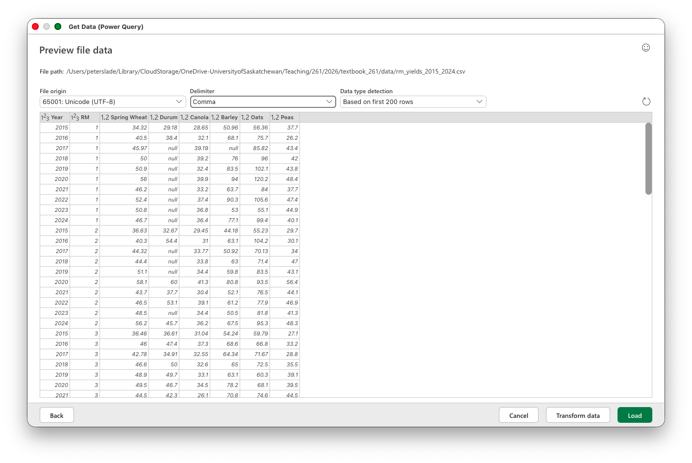
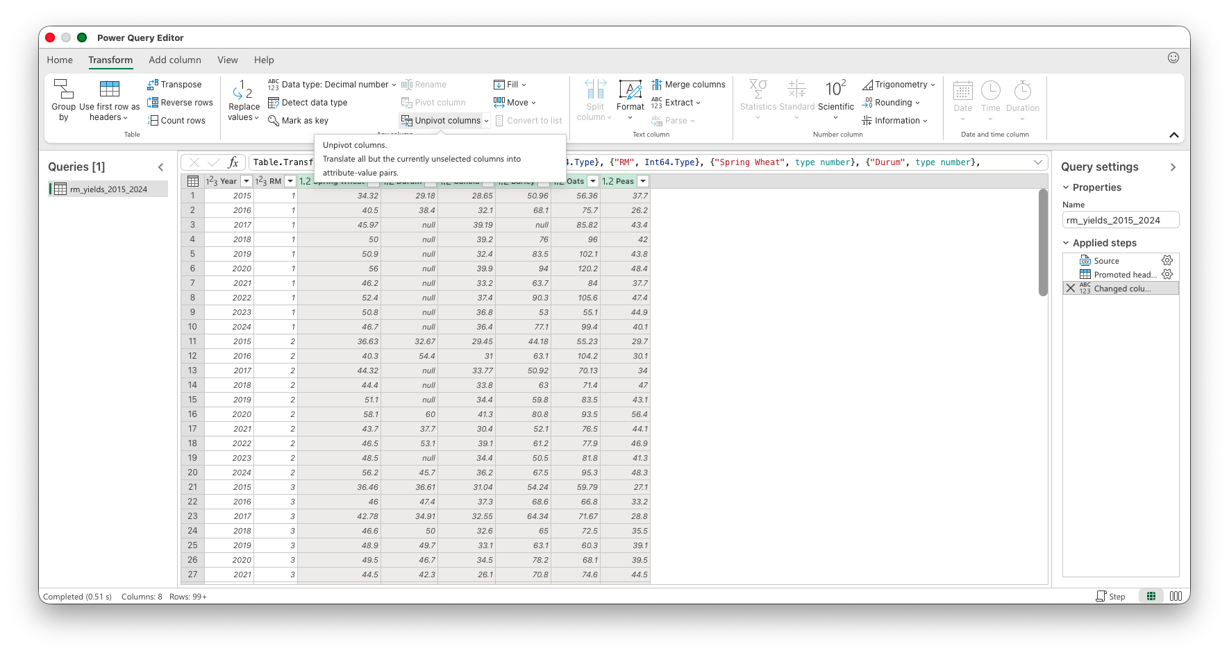
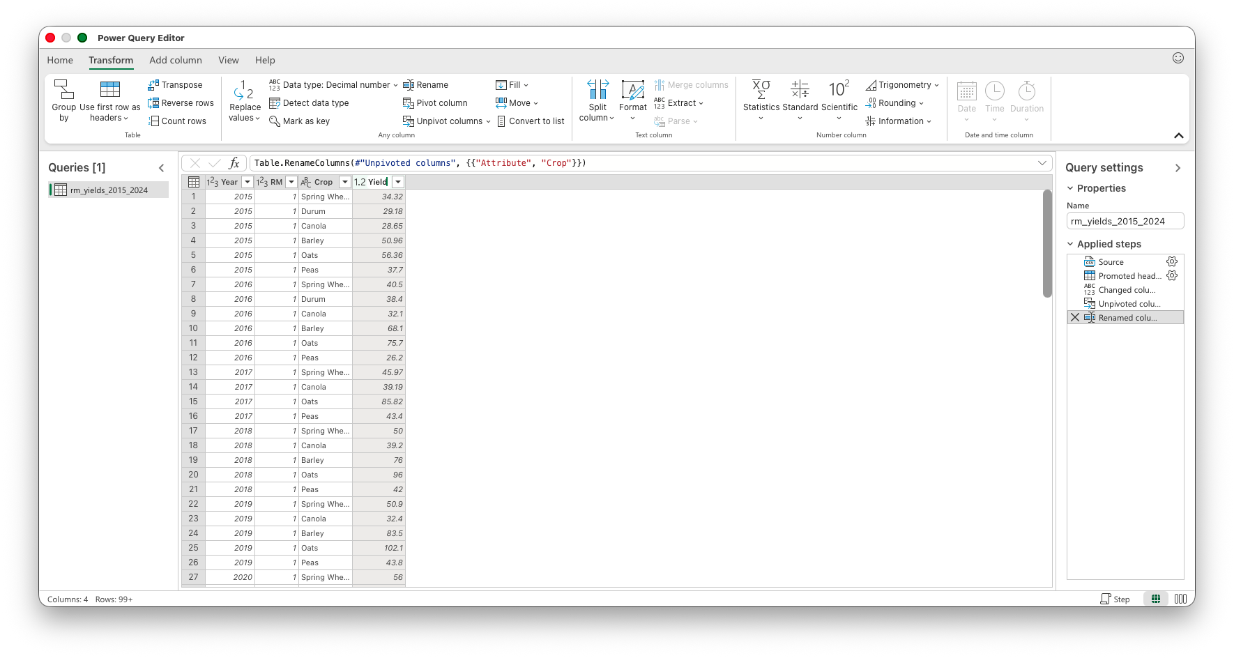
The RM yields file (rm_yields_2015_2024.csv, the 2015–2024 extract used through this module) is wide, with one column for each crop. Power Query calls the wide-to-long operation Unpivot. Import the CSV with Data > Get Data > From Text/CSV, choose Transform Data, select Year and RM, and then choose Transform > Unpivot Columns > Unpivot Other Columns. Rename the two new columns crop and yield_bu_ac before loading the result.
Power Query returns 15,478 rows because Unpivot Other Columns drops source cells containing null. The R example below keeps those cells as NA and therefore returns 17,700 rows; add values_drop_na = TRUE to pivot_longer() when you want the two results to agree. The reverse operation is Pivot Column in Power Query or a PivotTable on a worksheet.
Importing the CSV with Data > Get Data > From Text/CSV. The preview shows the wide table, one column per crop. Choose Transform Data to open the Power Query Editor.
In the Power Query Editor, select the Year and RM columns, then choose Transform > Unpivot Columns > Unpivot Other Columns.
After unpivoting, the crop names sit in one column and the yields in another. Rename them crop and yield_bu_ac before loading.
8.1.2 Data shape in R
NoteVideo walkthrough of this section
pivot_longer() does the same job as Unpivot. It takes several columns, puts their names in one column and puts their values in another. Here is the RM yields table:
# Load packageslibrary(tidyverse)# Read the wide tableyields_wide <-read_csv("data/rm_yields_2015_2024.csv")# Print the wide datayields_wide# Put the crop names and yields into columnsyields_long <- yields_wide |>pivot_longer(cols =-c(Year, RM),names_to ="crop",values_to ="yield_bu_ac" )# Print the long datayields_longnrow(yields_long)
> # Load packages
> library(tidyverse)
── Attaching core tidyverse packages ──────────────────────── tidyverse 2.0.0 ──
✔ dplyr     1.2.1     ✔ readr     2.2.0
✔ forcats   1.0.1     ✔ stringr   1.6.0
✔ ggplot2   4.0.3     ✔ tibble    3.3.1
✔ lubridate 1.9.5     ✔ tidyr     1.3.2
✔ purrr     1.2.2
── Conflicts ────────────────────────────────────────── tidyverse_conflicts() ──
✖ dplyr::filter() masks stats::filter()
✖ dplyr::lag()    masks stats::lag()
ℹ Use the conflicted package (<http://conflicted.r-lib.org/>) to force all conflicts to become errors
>
> # Read the wide table
> yields_wide <- read_csv("data/rm_yields_2015_2024.csv")
Rows: 2950 Columns: 8
── Column specification ────────────────────────────────────────────────────────
Delimiter: ","
dbl (8): Year, RM, Spring Wheat, Durum, Canola, Barley, Oats, Peas

ℹ Use `spec()` to retrieve the full column specification for this data.
ℹ Specify the column types or set `show_col_types = FALSE` to quiet this message.
>
> # Print the wide data
> yields_wide
# A tibble: 2,950 × 8
    Year    RM `Spring Wheat` Durum Canola Barley  Oats  Peas
   <dbl> <dbl>          <dbl> <dbl>  <dbl>  <dbl> <dbl> <dbl>
 1  2015     1           34.3  29.2   28.6   51.0  56.4  37.7
 2  2016     1           40.5  38.4   32.1   68.1  75.7  26.2
 3  2017     1           46.0  NA     39.2   NA    85.8  43.4
 4  2018     1           50    NA     39.2   76    96    42
 5  2019     1           50.9  NA     32.4   83.5 102.   43.8
 6  2020     1           56    NA     39.9   94   120.   48.4
 7  2021     1           46.2  NA     33.2   63.7  84    37.7
 8  2022     1           52.4  NA     37.4   90.3 106.   47.4
 9  2023     1           50.8  NA     36.8   53    55.1  44.9
10  2024     1           46.7  NA     36.4   77.1  99.4  40.1
# ℹ 2,940 more rows
>
> # Put the crop names and yields into columns
> yields_long <- yields_wide |>
+   pivot_longer(
+     cols = -c(Year, RM),
+     names_to = "crop",
+     values_to = "yield_bu_ac"
+   )
>
> # Print the long data
> yields_long
# A tibble: 17,700 × 4
    Year    RM crop         yield_bu_ac
   <dbl> <dbl> <chr>              <dbl>
 1  2015     1 Spring Wheat        34.3
 2  2015     1 Durum               29.2
 3  2015     1 Canola              28.6
 4  2015     1 Barley              51.0
 5  2015     1 Oats                56.4
 6  2015     1 Peas                37.7
 7  2016     1 Spring Wheat        40.5
 8  2016     1 Durum               38.4
 9  2016     1 Canola              32.1
10  2016     1 Barley              68.1
# ℹ 17,690 more rows
>
> nrow(yields_long)
[1] 17700
The column selection -c(Year, RM) means every column except Year and RM. Those two columns continue to identify the observation, while the six crop columns become values in the new crop column. The result has one row per RM-year-crop and six times as many rows as the wide table.
pivot_wider() goes in the other direction. names_from supplies the new column names and values_from supplies the values placed under them:
# Return the crop column to six separate crop columnsyields_long |>pivot_wider(names_from = crop,values_from = yield_bu_ac )
> # Return the crop column to six separate crop columns
> yields_long |>
+   pivot_wider(
+     names_from = crop,
+     values_from = yield_bu_ac
+   )
# A tibble: 2,950 × 8
    Year    RM `Spring Wheat` Durum Canola Barley  Oats  Peas
   <dbl> <dbl>          <dbl> <dbl>  <dbl>  <dbl> <dbl> <dbl>
 1  2015     1           34.3  29.2   28.6   51.0  56.4  37.7
 2  2016     1           40.5  38.4   32.1   68.1  75.7  26.2
 3  2017     1           46.0  NA     39.2   NA    85.8  43.4
 4  2018     1           50    NA     39.2   76    96    42
 5  2019     1           50.9  NA     32.4   83.5 102.   43.8
 6  2020     1           56    NA     39.9   94   120.   48.4
 7  2021     1           46.2  NA     33.2   63.7  84    37.7
 8  2022     1           52.4  NA     37.4   90.3 106.   47.4
 9  2023     1           50.8  NA     36.8   53    55.1  44.9
10  2024     1           46.7  NA     36.4   77.1  99.4  40.1
# ℹ 2,940 more rows
There is no single correct shape for every purpose. Analysis is often easier with long data, while a wider table can be useful for presenting results.
8.2 Data cleaning
Before cleaning a new dataset, check what arrived. A file can contain the wrong units, missing records and duplicate observations without producing an error. A short inspection at the beginning can save a great deal of confusion later.
These checks can find problems, but they cannot prove that every value is correct. A yield of 55 bu/ac may be perfectly plausible and still belong to the wrong field. We need to understand the source as well as inspect the values.
Know what the values mean
Data cleaning relies on your ability to spot values that do not make sense. This means you need some idea of what the data should look like. A crop yield between 0 and 100 may be plausible when it is measured in bushels per acre, while the same crop measured in tonnes per acre will have much smaller values. The number alone is not enough.
Before looking for errors, answer a few questions:
What does one row represent?
What population and time period does the file cover?
What units are used?
Which column or columns should identify one observation?
How are missing values and categories coded?
Has the file already been filtered, cleaned or aggregated?
This information may be in a data dictionary, a README file or the page from which the data were downloaded. If it is not documented, you may need to ask the person who created the file.
Take a first look
Start with the basic structure:
Count the rows and columns.
Inspect the column names and data types.
Look at several rows from the beginning and end of the file.
Check whether numbers or dates were imported as text.
Count repeated values of any column, or combination of columns, that should identify one row.
An unexpected row count or repeated identifier may mean that records are missing, duplicated or stored at a different level than you expected. Looking at the first few rows is useful, but it will not reveal a problem near the bottom of a large file.
Check each variable
For a numeric variable:
Count the observed and missing values.
Examine the minimum, quartiles, median, mean and maximum.
Plot a histogram or box plot.
Look for impossible values, extreme observations, several clusters and suspicious concentrations at zero.
The useful limits depend on the subject. A negative crop yield is impossible, while a yield of 100 bu/ac may be unusual but real. Investigate an extreme value rather than automatically deleting it.
For a categorical variable:
Count the distinct values and their frequencies.
Look for inconsistent capitalization, spelling and extra spaces, such as Canola, canola and Canola.
Check whether blank strings or codes such as -99, N/A and unknown represent missing values.
Investigate rare categories rather than assuming that they are mistakes.
For a date variable:
Check the earliest and latest dates.
Look for dates outside the period covered by the data.
Check for gaps, repeated dates and dates stored as text.
Check variables together
Some problems appear only when two or more variables are compared:
Seeding should occur before harvest.
Percentages should normally fall between 0 and 100.
Reported production should be consistent with acres and yield.
Category and location codes should agree with their documentation.
A scatter plot can reveal an odd relationship between two numeric variables. A line plot can expose gaps or abrupt changes over time. Summaries grouped by year, region or source can show whether missing values or unusual measurements are concentrated in one part of the dataset.
Investigate before changing
When something looks wrong:
Return to the source record or documentation if possible.
Flag the observation rather than immediately deleting it.
Keep the raw file unchanged.
Record any correction, conversion or exclusion in a reproducible cleaning step.
If the correct treatment remains uncertain, report that uncertainty and compare the results with and without the questionable observations.
8.3 Common data quality issues
These are the issues I most commonly encounter with datasets:
Awkward column names. In R, you will refer to column names constantly, so consistency matters. If you sometimes use SpringWheat, other times Spring Wheat, and still other times spring-wheat, you will continually have to remember which convention you chose.
A common best practice is snake case: use lowercase letters and replace spaces with underscores. For example, use spring_wheat.
Column names should be descriptive without becoming unnecessarily long. Whether you choose yield or yield_bu_ac depends on the dataset. If it contains several yield measures, names such as yield_bu_ac and yield_kg_ha clearly distinguish their units. If there is only one yield column, the simpler name yield may be sufficient.
Text in a numeric column. Sometimes units or other text are included with numeric values. For example, a weight column might contain 38.2 t, 42.1 t, and 37.8 t.
Excel or R will usually interpret such a column as text, preventing you from performing calculations such as finding the mean or standard deviation. You will need to separate the units from the values and convert the values to numbers. Ideally, the units should be recorded in the column name—for example, weight_t.
Duplicate observations. A dataset may contain duplicate rows. These can arise from data-entry mistakes, combining files more than once, or recording the same observation in multiple systems.
Duplicates are often data-quality problems, but identical rows are not necessarily errors. Two producers, fields, or transactions may legitimately have the same recorded values. Before removing duplicates, determine what uniquely identifies an observation and investigate why the duplication occurred.
Missing values. Ideally, missing values are stored as blank cells or as NA. However, they may instead be represented by codes such as -99, N/A, missing, or 9999.
You need to identify these codes and convert them to a consistent missing-value representation. Be careful: a code such as 0 may indicate a missing value in one dataset but a genuine observation in another. Consult the dataset’s documentation whenever possible.
Impossible or implausible values. A dataset may contain values that are impossible, such as negative yields, or highly implausible, such as a wheat yield of 1,250 bu/acre.
Examining the minimum and maximum of each numeric variable is a quick way to identify potential problems. Histograms and other graphs can also reveal unusual observations. These values should be investigated before being corrected or removed; an unusual value is not necessarily an error.
Mixed units. A column may contain values recorded in different units. For example, some weights might be reported in tonnes and others in kilograms.
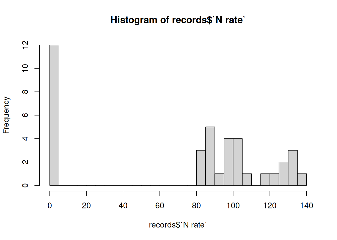
A histogram can help identify mixed units. Suppose you plot nitrogen application rates and find that 30% of observations fall below 1 while the remaining 70% are above 100. This pattern may indicate that some producers recorded tonnes per hectare while others recorded kilograms per hectare.
Once you identify mixed units, convert all observations to a common unit and record that unit clearly in the column name or dataset documentation.
Inconsistent categories. Data based on individual reporting often contain categories recorded in inconsistent ways. For example, the same wheat variety might appear as Brandon, AAC Brandon, Brandon AAC, and Brndon.
Listing the unique categories and counting the number of observations in each is a useful way to find these inconsistencies. You can then standardize the different versions under a single category, such as AAC Brandon.
All of these issues appear together in field_records_messy.csv, a season of spring wheat field records constructed for practice. The first ten rows:
Field ID
VARIETY_NAME
Acres
Yield (bu/ac)
harvest weight
N rate
Moisture %
F001
AAC Viewfield
160
67.6
297.7 t
97.1
12.4
F002
Brandon
320
54.9
476.0 t
96.2
14.7
F003
CDC Landmark
120
54.4
172.6 t
0.081
12.3
F002
Brandon
320
54.9
476.0 t
96.2
14.7
F004
Brandon AAC
320
-99
642.5 t
116.7
15.4
F005
CDC Landmark
320
65.8
561.5 t
89.9
12.3
F006
Brndon
160
50.8
222.8 t
0.113
N/A
F005
CDC Landmark
320
65.8
561.5 t
89.9
12.3
F007
AAC Viewfield
80
-12
138.6 t
135.9
14.5
F008
AAC Brandon
160
60.3
264.0 t
127.3
12.4
Column names have spaces, capitals and special characters
The same variety appears as Brandon, Brandon AAC, Brndon and AAC Brandon
Some yields are reported as -99 (a typical missing value code)
F007 has a yield of -12, which is impossible
Harvest weight has its unit typed into the cell
About a third of the nitrogen rates (F003 and F006 in the excerpt above) sit below 1 while the rest sit near 100 – tonnes against kilograms per hectare
F002 and F005 each appear twice, identically
If we summarize the numeric columns, we see the following. Note that the last row forces the moisture column to numeric, which converts any text to an NA value.
Column
Min
Max
Mean
Median
Yield (bu/ac)
-99
1250
74.5
55.8
N rate
0.08
135.9
71.5
89.9
harvest weight
-
-
-
-
Moisture %
-
-
-
-
Moisture % (forced to numeric)
11.6
9999
299.3
14.7
There are impossibly high yields of 1,250
Moisture has issues with text in the column – when not forced to numeric it doesn’t return any summary statistics.
NA values for moisture are coded as 9999, which is outside the plausible range of 0 to 100.
8.4 Data cleaning in Excel
NoteVideo walkthrough of this section
The following Excel workbook shows some steps in checking and then cleaning the data. In the DataSummary worksheet, the numeric variables are summarized, getting the mean, median, minimum and maximum and a histogram is plotted. For the categorical variables, the UNIQUE() function is used to list the distinct values and the COUNTIF() function is used to count how many times each distinct value appears. Finally, we counted the number of rows using =ROWS(RawData!A2:A39) and the number of distinct rows using =ROWS(UNIQUE(RawData!A2:G39)). The difference between these two counts is the number of duplicate rows.
After diagnosing these issues, the best way to clean the data is through a Power Query which creates a transparent and reproducible workflow. The output of the Power Query is in the workbook and the video at the top of this section explains the steps taken to clean the data.
Data cleaning is – in my view – easier in R than in Excel. We can write an R script that can be applied to any dataset. In R the whole job fits in one script: read the raw file, check it, apply the cleaning rules and write the cleaned copy somewhere else. The script is the record of what was done, and when a new version of the raw file arrives it can be rerun from the top.
Diagnosing data issues in R
We can diagnose data issues in R using many of the functions we have already learned, like glimpse() and summary(). Three new functions will be useful:
hist() draws a histogram of a numeric column.
count() counts the number of rows in each category of a column.
distinct() returns the data with any duplicate rows removed.
# ---# Title: Diagnosing the field records# Description:# Reads data/field_records_messy.csv and checks it for data-quality# issues before any cleaning.# ---# Load packageslibrary(tidyverse)# Read the filerecords <-read_csv("data/field_records_messy.csv")# Column names and types as they arrivedglimpse(records)## This reveals a first set of issues: harvest weight and moisture are text when they should be numeric. Moreover, column names are a mess.# Summary of every columnsummary(records)## This reveals further issues with the minimum and maximum of yield, and the minimum and 1st quartile of the nitrogen rate. We might want to plot the histogram of the nitrogen rate to visualize the issue.hist(records$`N rate`, breaks =20)# Count the categories: the same variety appears under four spellingsrecords |>count(VARIETY_NAME, sort =TRUE)# Count the rows, then the distinct rows: the difference is the duplicatesnrow(records)nrow(distinct(records))
> # ---
> # Title: Diagnosing the field records
> # Description:
> #   Reads data/field_records_messy.csv and checks it for data-quality
> #   issues before any cleaning.
> # ---
>
> # Load packages
> library(tidyverse)
>
> # Read the file
> records <- read_csv("data/field_records_messy.csv")
Rows: 38 Columns: 7
── Column specification ────────────────────────────────────────────────────────
Delimiter: ","
chr (4): Field ID, VARIETY_NAME, harvest weight, Moisture %
dbl (3): Acres, Yield (bu/ac), N rate

ℹ Use `spec()` to retrieve the full column specification for this data.
ℹ Specify the column types or set `show_col_types = FALSE` to quiet this message.
>
> # Column names and types as they arrived
> glimpse(records)
Rows: 38
Columns: 7
$ `Field ID`       <chr> "F001", "F002", "F003", "F002", "F004", "F005", "F006…
$ VARIETY_NAME     <chr> "AAC Viewfield", "Brandon", "CDC Landmark", "Brandon"…
$ Acres            <dbl> 160, 320, 120, 320, 320, 320, 160, 320, 80, 160, 160,…
$ `Yield (bu/ac)`  <dbl> 67.6, 54.9, 54.4, 54.9, -99.0, 65.8, 50.8, 65.8, -12.…
$ `harvest weight` <chr> "297.7 t", "476.0 t", "172.6 t", "476.0 t", "642.5 t"…
$ `N rate`         <dbl> 97.100, 96.200, 0.081, 96.200, 116.700, 89.900, 0.113…
$ `Moisture %`     <chr> "12.4", "14.7", "12.3", "14.7", "15.4", "12.3", "N/A"…
>
> ## This reveals a first set of issues: harvest weight and moisture are text when they should be numeric.  Moreover, column names are a mess.
>
> # Summary of every column
> summary(records)
      Field ID     VARIETY_NAME     Acres       Yield (bu/ac)
 Length   :38   Length   :38    Min.   : 80.0   Min.   : -99.00
 N.unique :36   N.unique : 6    1st Qu.:160.0   1st Qu.:  51.55
 N.blank  : 0   N.blank  : 0    Median :160.0   Median :  55.85
 Min.nchar: 4   Min.nchar: 6    Mean   :191.6   Mean   :  74.47
 Max.nchar: 4   Max.nchar:13    3rd Qu.:240.0   3rd Qu.:  61.58
                                Max.   :320.0   Max.   :1250.00
   harvest weight     N rate             Moisture %
 Length   :38     Min.   :  0.0800   Length   :38
 N.unique :36     1st Qu.:  0.1293   N.unique :25
 N.blank  : 0     Median : 89.9000   N.blank  : 0
 Min.nchar: 7     Mean   : 71.5021   Min.nchar: 3
 Max.nchar: 7     3rd Qu.:104.0500   Max.nchar: 7
                  Max.   :135.9000   NAs      : 1
>
> ## This reveals further issues with the minimum and maximum of yield, and the minimum and 1st quartile of the nitrogen rate.  We might want to plot the histogram of the nitrogen rate to visualize the issue.
> hist(records$`N rate`, breaks = 20)
>
> # Count the categories: the same variety appears under four spellings
> records |>
+   count(VARIETY_NAME, sort = TRUE)
# A tibble: 6 × 2
  VARIETY_NAME      n
  <chr>         <int>
1 CDC Landmark     13
2 AAC Viewfield     6
3 Brandon           6
4 Brandon AAC       5
5 AAC Brandon       4
6 Brndon            4
>
> # Count the rows, then the distinct rows: the difference is the duplicates
> nrow(records)
[1] 38
> nrow(distinct(records))
[1] 36
Cleaning data in R
To clean the data there are also four new functions that we need to learn:
clean_names() converts every column name to snake case, which fixes issue 1. For example, VARIETY_NAME becomes variety_name. This function requires the janitor package in R.
rename() if we are still not happy with just using clean_names(), we can rename columns to whatever we want. For example, variety_name could be renamed to variety.
if_else() is a conditional function. Similar to IF in Excel, it takes three arguments: a condition, a value to return if the condition is true, and a value to return if the condition is false. When run in tidyverse it operates on each element of a column. For example, mutate(yield = if_else(yield < 0, NA, yield)) would mean to mutate the yield column such that, if the yield is less than 0 replace it with NA and otherwise return what was in the yield column. So if yield started out as (35, -5, 40, -12, 50) it would become (35, NA, 40, NA, 50).
parse_number() removes text from numbers, so that 142.9 t becomes 142.9.
The code below fixes our issues one-by-one, saving the resulting data frame after each step.
# ---# Title: Cleaning the field records, one issue at a time# Description:# Reads data/field_records_messy.csv and fixes each data-quality# issue in turn, saving a new data frame after each step.# ---# Load packageslibrary(tidyverse)## Install janitor package (if not installed already) -- I have commented it out because it is already installed#install.packages("janitor")## Load janitor packagelibrary(janitor)# Read the filerecords <-read_csv("data/field_records_messy.csv")## Issue 1: column names. We can clean column names using the clean_names() function from the janitor package. It converts all column names to lower case and replaces spaces with underscores. Save the resulting data frame as records_clean_namesrecords_clean_names <- records |>clean_names()names(records_clean_names)## If we still want to rename columns, we can use the rename() function. Save the resulting data frame as records_new_names and check the column names.records_new_names <- records_clean_names |>rename(variety = variety_name)names(records_new_names)## Issue 2: Inconsistent variety names. We can fix the variety names using the if_else() function. The three arguments would say if variety is one of "Brandon", "Brandon AAC", or "Brndon", then replace it with "AAC Brandon", otherwise leave it as is. Save the resulting data frame as records_variety_fix and count the varieties in the variety column.records_variety_fix <- records_new_names |>mutate(variety =if_else(variety %in%c("Brandon", "Brandon AAC", "Brndon"),"AAC Brandon", variety))records_variety_fix |>count(variety, sort =TRUE)## Issues 3, 4 and 8: Impossible and NA yields. We can change yields at or below 0, or above 200, to NA using the if_else() function. This deals with yields that are reported as -99 (a typical missing value code), the impossible -12, and the implausible 1,250. Save the resulting data frame as records_yield_fix and check the yield_bu_ac column.records_yield_fix <- records_variety_fix |>mutate(yield_bu_ac =if_else(yield_bu_ac <=0| yield_bu_ac >200,NA, yield_bu_ac))summary(records_yield_fix$yield_bu_ac)## Issue 5: text in harvest weight. We can strip the unit text from the weights and make them numeric using the parse_number() function. This function extracts the numeric part of a string and converts it to a numeric value. Save the resulting data frame as records_weight_fix and check the harvest_weight column.records_weight_fix <- records_yield_fix |>mutate(harvest_weight =parse_number(harvest_weight))summary(records_weight_fix$harvest_weight)## Issue 6: Nitrogen units vary. We can convert nitrogen rates below 1 to kg/ha by multiplying them by 1000 using the if_else() function. Save the resulting data frame as records_n_rate_fix and check the n_rate column.records_n_rate_fix <- records_weight_fix |>mutate(n_rate =if_else(n_rate <1, n_rate *1000, n_rate))summary(records_n_rate_fix$n_rate)## Issue 7: Duplicate rows. We can remove duplicate rows using the distinct() function. It removes any rows that are identical to another row in the dataset. Save the resulting data frame as records_unique and check the number of rows.records_unique <-distinct(records_n_rate_fix)nrow(records_unique)## Issues 9 and 10: Moisture has text and NA values recorded as 9999. We can first change the type to numeric using parse_number() and then change any values above 100 to NA using the if_else() function. Save the resulting data frame as records_moisture_fix and check the moisture_percent column.records_moisture_fix <- records_unique |>mutate(moisture_percent =parse_number(moisture_percent),moisture_percent =if_else(moisture_percent >100,NA, moisture_percent))summary(records_moisture_fix$moisture_percent)
> # ---
> # Title: Cleaning the field records, one issue at a time
> # Description:
> #   Reads data/field_records_messy.csv and fixes each data-quality
> #   issue in turn, saving a new data frame after each step.
> # ---
>
> # Load packages
> library(tidyverse)
>
> ## Install janitor package (if not installed already) -- I have commented it out because it is already installed
> #install.packages("janitor")
>
> ## Load janitor package
> library(janitor)

Attaching package: 'janitor'
The following objects are masked from 'package:stats':

    chisq.test, fisher.test
>
> # Read the file
> records <- read_csv("data/field_records_messy.csv")
Rows: 38 Columns: 7
── Column specification ────────────────────────────────────────────────────────
Delimiter: ","
chr (4): Field ID, VARIETY_NAME, harvest weight, Moisture %
dbl (3): Acres, Yield (bu/ac), N rate

ℹ Use `spec()` to retrieve the full column specification for this data.
ℹ Specify the column types or set `show_col_types = FALSE` to quiet this message.
>
>
> ## Issue 1: column names.  We can clean column names using the clean_names() function from the janitor package.  It converts all column names to lower case and replaces spaces with underscores.  Save the resulting data frame as records_clean_names
>
> records_clean_names <- records |>
+   clean_names()
>
> names(records_clean_names)
[1] "field_id"         "variety_name"     "acres"            "yield_bu_ac"
[5] "harvest_weight"   "n_rate"           "moisture_percent"
>
> ## If we still want to rename columns, we can use the rename() function.   Save the resulting data frame as records_new_names and check the column names.
> records_new_names <- records_clean_names |>
+   rename(variety = variety_name)
>
> names(records_new_names)
[1] "field_id"         "variety"          "acres"            "yield_bu_ac"
[5] "harvest_weight"   "n_rate"           "moisture_percent"
>
> ## Issue 2: Inconsistent variety names. We can fix the variety names using the if_else() function.  The three arguments would say if variety is one of "Brandon", "Brandon AAC", or "Brndon", then replace it with "AAC Brandon", otherwise leave it as is.  Save the resulting data frame as records_variety_fix and count the varieties in the variety column.
>
> records_variety_fix <- records_new_names |>
+     mutate(variety = if_else(variety %in% c("Brandon", "Brandon AAC", "Brndon"),
+                            "AAC Brandon",
+                            variety))
>
> records_variety_fix |>
+   count(variety, sort = TRUE)
# A tibble: 3 × 2
  variety           n
  <chr>         <int>
1 AAC Brandon      19
2 CDC Landmark     13
3 AAC Viewfield     6
>
> ## Issues 3, 4 and 8: Impossible and NA yields. We can change yields at or below 0, or above 200, to NA using the if_else() function. This deals with yields that are reported as -99 (a typical missing value code), the impossible -12, and the implausible 1,250.  Save the resulting data frame as records_yield_fix and check the yield_bu_ac column.
>
> records_yield_fix <- records_variety_fix |>
+   mutate(yield_bu_ac = if_else(yield_bu_ac <= 0 | yield_bu_ac > 200,
+                                 NA,
+                                 yield_bu_ac))
>
> summary(records_yield_fix$yield_bu_ac)
   Min. 1st Qu.  Median    Mean 3rd Qu.    Max.     NAs
  41.50   53.20   57.50   57.24   62.00   76.60       5
>
>
> ## Issue 5: text in harvest weight. We can strip the unit text from the weights and make them numeric using the parse_number() function.  This function extracts the numeric part of a string and converts it to a numeric value.  Save the resulting data frame as records_weight_fix and check the harvest_weight column.
>
> records_weight_fix <- records_yield_fix |>
+   mutate(harvest_weight = parse_number(harvest_weight))
>
> summary(records_weight_fix$harvest_weight)
   Min. 1st Qu.  Median    Mean 3rd Qu.    Max.
  120.3   217.6   256.1   303.4   398.2   642.5
>
> ## Issue 6: Nitrogen units vary. We can convert nitrogen rates below 1 to kg/ha by multiplying them by 1000 using the if_else() function.  Save the resulting data frame as records_n_rate_fix and check the n_rate column.
>
> records_n_rate_fix <- records_weight_fix |>
+     mutate(n_rate = if_else(n_rate < 1,
+                             n_rate * 1000,
+                             n_rate))
>
> summary(records_n_rate_fix$n_rate)
   Min. 1st Qu.  Median    Mean 3rd Qu.    Max.
   80.0    89.9   101.9   105.2   123.8   135.9
>
>
> ## Issue 7: Duplicate rows.  We can remove duplicate rows using the distinct() function.  It removes any rows that are identical to another row in the dataset.  Save the resulting data frame as records_unique and check the number of rows.
>
> records_unique <- distinct(records_n_rate_fix)
>
> nrow(records_unique)
[1] 36
>
>
> ## Issues 9 and 10: Moisture has text and NA values recorded as 9999.  We can first change the type to numeric using parse_number() and then change any values above 100 to NA using the if_else() function.  Save the resulting data frame as records_moisture_fix and check the moisture_percent column.
>
> records_moisture_fix <- records_unique |>
+   mutate(moisture_percent = parse_number(moisture_percent),
+          moisture_percent = if_else(moisture_percent > 100,
+                                      NA,
+                                      moisture_percent))
Warning: There was 1 warning in `mutate()`.
ℹ In argument: `moisture_percent = parse_number(moisture_percent)`.
Caused by warning:
! 2 parsing failures.
row col expected  actual
  6  -- a number N/A
 14  -- a number missing
>
> summary(records_moisture_fix$moisture_percent)
   Min. 1st Qu.  Median    Mean 3rd Qu.    Max.     NAs
  11.60   12.40   14.60   14.08   15.43   16.50       4
The parse_number() warning about two parsing failures is R telling you that two moisture values (N/A and missing) could not be read as numbers and became NA – which is exactly what we wanted.
The above code works just fine – but it is a bit laborious to write and read. We are saving eight different data frames along the way. A better approach would be to combine all of this into a single pipeline, which is what we do below.
# ---# Title: Cleaning the field records# Description:# Reads data/field_records_messy.csv, fixes the data-quality issues# in one pipeline, and writes the cleaned file to# output/field_records_clean.csv.# ---# Load packageslibrary(tidyverse)library(janitor)# Read the filerecords <-read_csv("data/field_records_messy.csv")# Clean the datarecords_clean <- records |>clean_names() |># issue 1: every column name to snake caserename(variety = variety_name) |>distinct() |># issue 7: drop the exact duplicate rowsmutate(# Issue 2: one spelling for the Brandon varietyvariety =if_else(variety %in%c("Brandon", "Brandon AAC", "Brndon"),"AAC Brandon", variety),# Issues 3, 4 and 8: the -99 code, the negative and the 1250 all become NAyield_bu_ac =if_else(yield_bu_ac <=0| yield_bu_ac >200,NA, yield_bu_ac),# Issue 5: strip the unit text from the weights and make them numericharvest_weight =parse_number(harvest_weight),# Issue 6: rates below 1 are t/ha, so convert them to kg/han_rate =if_else(n_rate <1, n_rate *1000, n_rate),# Issue 9: moisture has text valuesmoisture_percent =parse_number(moisture_percent),# Issue 10: change moisture values above 100 to NAmoisture_percent =if_else(moisture_percent >100,NA, moisture_percent) )# Print the cleaned datarecords_clean# Check again: the same checks on the cleaned datasummary(records_clean)records_clean |>count(variety, sort =TRUE)# Save the cleaned file to output; the raw file is never editedwrite_csv(records_clean, "output/field_records_clean.csv")
> # ---
> # Title: Cleaning the field records
> # Description:
> #   Reads data/field_records_messy.csv, fixes the data-quality issues
> #   in one pipeline, and writes the cleaned file to
> #   output/field_records_clean.csv.
> # ---
>
> # Load packages
> library(tidyverse)
> library(janitor)
>
> # Read the file
> records <- read_csv("data/field_records_messy.csv")
Rows: 38 Columns: 7
── Column specification ────────────────────────────────────────────────────────
Delimiter: ","
chr (4): Field ID, VARIETY_NAME, harvest weight, Moisture %
dbl (3): Acres, Yield (bu/ac), N rate

ℹ Use `spec()` to retrieve the full column specification for this data.
ℹ Specify the column types or set `show_col_types = FALSE` to quiet this message.
>
> # Clean the data
> records_clean <- records |>
+   clean_names() |>   # issue 1: every column name to snake case
+   rename(variety = variety_name)  |>
+   distinct() |>      # issue 7: drop the exact duplicate rows
+
+   mutate(
+     # Issue 2: one spelling for the Brandon variety
+     variety = if_else(variety %in% c("Brandon", "Brandon AAC", "Brndon"),
+                       "AAC Brandon",
+                       variety),
+     # Issues 3, 4 and 8: the -99 code, the negative and the 1250 all become NA
+     yield_bu_ac = if_else(yield_bu_ac <= 0 | yield_bu_ac > 200,
+                           NA,
+                           yield_bu_ac),
+     # Issue 5: strip the unit text from the weights and make them numeric
+     harvest_weight = parse_number(harvest_weight),
+     # Issue 6: rates below 1 are t/ha, so convert them to kg/ha
+     n_rate = if_else(n_rate < 1,
+                            n_rate * 1000,
+                            n_rate),
+     # Issue 9: moisture has text values
+     moisture_percent = parse_number(moisture_percent),
+     # Issue 10: change moisture values above 100 to NA
+     moisture_percent = if_else(moisture_percent > 100,
+                           NA,
+                           moisture_percent)
+   )
Warning: There was 1 warning in `mutate()`.
ℹ In argument: `moisture_percent = parse_number(moisture_percent)`.
Caused by warning:
! 2 parsing failures.
row col expected  actual
  6  -- a number N/A
 14  -- a number missing
>
> # Print the cleaned data
> records_clean
# A tibble: 36 × 7
   field_id variety     acres yield_bu_ac harvest_weight n_rate moisture_percent
   <chr>    <chr>       <dbl>       <dbl>          <dbl>  <dbl>            <dbl>
 1 F001     AAC Viewfi…   160        67.6           298.   97.1             12.4
 2 F002     AAC Brandon   320        54.9           476    96.2             14.7
 3 F003     CDC Landma…   120        54.4           173.   81               12.3
 4 F004     AAC Brandon   320        NA             642.  117.              15.4
 5 F005     CDC Landma…   320        65.8           562.   89.9             12.3
 6 F006     AAC Brandon   160        50.8           223.  113               NA
 7 F007     AAC Viewfi…    80        NA             139.  136.              14.5
 8 F008     AAC Brandon   160        60.3           264   127.              12.4
 9 F009     CDC Landma…   160        51.5           226.   81               13.7
10 F010     AAC Brandon   160        58.9           257.   92.4             16.4
# ℹ 26 more rows
>
> # Check again: the same checks on the cleaned data
> summary(records_clean)
      field_id       variety       acres        yield_bu_ac    harvest_weight
 Length   :36   Length   :36   Min.   : 80.0   Min.   :41.50   Min.   :120.3
 N.unique :36   N.unique : 3   1st Qu.:160.0   1st Qu.:53.05   1st Qu.:210.8
 N.blank  : 0   N.blank  : 0   Median :160.0   Median :57.50   Median :254.2
 Min.nchar: 4   Min.nchar:11   Mean   :184.4   Mean   :57.04   Mean   :291.4
 Max.nchar: 4   Max.nchar:13   3rd Qu.:240.0   3rd Qu.:61.15   3rd Qu.:370.9
                               Max.   :320.0   Max.   :76.60   Max.   :642.5
                                               NAs    :5
     n_rate       moisture_percent
 Min.   : 80.00   Min.   :11.60
 1st Qu.: 89.78   1st Qu.:12.40
 Median :103.45   Median :14.60
 Mean   :105.85   Mean   :14.08
 3rd Qu.:124.83   3rd Qu.:15.43
 Max.   :135.90   Max.   :16.50
                  NAs    :4
>
> records_clean |>
+   count(variety, sort = TRUE)
# A tibble: 3 × 2
  variety           n
  <chr>         <int>
1 AAC Brandon      18
2 CDC Landmark     12
3 AAC Viewfield     6
>
> # Save the cleaned file to output; the raw file is never edited
> write_csv(records_clean, "output/field_records_clean.csv")