Module 4 - Test bank
This bank holds 30 questions: ten in each section.
- Section 1 (Questions 1–10) covers graphing principles
- Section 2 (Questions 11–20) covers graphing in Excel
- Section 3 (Questions 21–30) covers graphing in R
The bank uses the same datasets as the Module 1 bank – two data sources, with the Saskatchewan yields in two shapes:
- Saskatchewan RM Crop Yields (1990–2025). Average yield for eight crops in every Rural Municipality, one column per crop.
- Saskatchewan RM Crop Yields (Long) (1990–2025). The same yields in long format: one row per RM-year-crop, with a
Unitcolumn. Yields are in bu/ac except lentils, which are in lb/ac. - Manitoba Wheat Variety (2020–2025). Red spring wheat by variety and municipality, with the number of farms, seeded acres and average yield.
Your module test will contain one question per section. The datasets you need will be provided in the test. Each question is written to be answerable in fifteen minutes or less.
Answer Sections 1 and 2 in your workbook: one worksheet per question, labelled with the question number, with written answers typed into cells so they are visible when the workbook is opened. Answer Section 3 with an R script that has a header block, a clearly labelled section for each question, and your sentence answers written as comments, and it should run from top to bottom in a fresh session.
For each question, 20% of the mark is for presentation and the other 80% is for the correctness of your charts, workbook or script.
Section 1 — Graphing principles
These questions are about choosing and judging charts. Most of them show you a chart to look at. Write your answers in worksheet cells. Where a question asks for a calculation, do it with a formula in a cell so the TA can see it.
Question 1
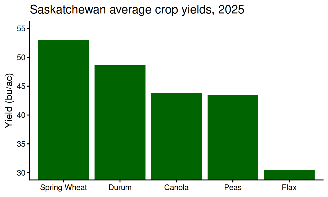
The chart below shows the 2025 average yields across Saskatchewan RMs of five crops, in bushels per acre. The underlying values are spring wheat 53.0, durum 48.6, canola 43.9, peas 43.5 and flax 30.5. Copy those values into a blank sheet.
(a) Read the value axis. Where does it start, and how does that affect the comparison across crops?
(b) In a sentence: what would a reader who only glances at this chart conclude about canola relative to spring wheat?
(c) Where should the vertical axis of a bar chart should start?
Answer
(a) The axis starts at 30. Every bar loses its bottom 30 bu/ac, so the drawn lengths no longer stand in the same ratio as the yields: canola is drawn at (43.9 − 30) / (53.0 − 30) = 0.60 of spring wheat where the true ratio is 43.9 / 53.0 = 0.83. Flax, at 30.5, is almost nothing at all.
(b) That canola yields are around 60% of spring wheat yields, when the true figure is 83% – the truncated chart roughly doubles the apparent gap.
(c) At zero. A bar carries its value as length, so cutting the base off every bar changes the lengths without changing the labels, and the visual comparison no longer matches the numbers.
Question 2
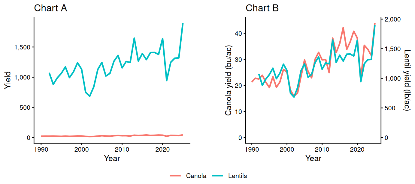
Both charts below plot the average canola yield across RMs (bu/ac) and lentil yield (lb/ac, recorded from 1992) over 1990-2025. Chart A puts both series on one value axis. Chart B adds a second value axis on the right for lentils.
(a) Describe the problem with Chart A.
(b) Describe the problem with Chart B
(c) Suggest one alternative to the dual axis that avoids the problem.
Answer
(a) The canola series is squashed into a nearly flat line along the bottom. Lentils run to about 1,900 lb/ac while canola runs to about 44 bu/ac, so the lentil series sets the axis and the canola variation – which is real and large in proportional terms – becomes invisible.
(b) It invites the reader to see a relationship that the chart-maker chose. The two lines appear to track each other closely, but the right-hand scale is a free choice: run it to 4,000 lb/ac instead of 2,000 and the lentil line is drawn at half its current height, below canola for the whole period, so the same data would show canola consistently out-yielding lentils.
(c) Two panels stacked with a shared year axis, or index both series to a common starting year (1990 = 100) so one axis serves both.
Question 3
Both charts below show the seeded acres of the three largest Manitoba wheat varieties in 2023, 2024 and 2025. They hold the same numbers in two layouts.
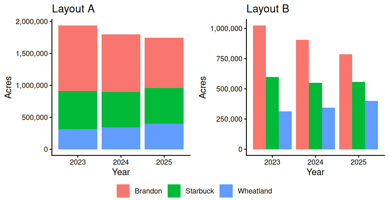
(a) Which layout better demonstrates how the total acreage of the three varieties changed from year to year, and what on the chart carries that total?
(b) Which layout better demonstrates how each individual variety changed from year to year, and why is the other one worse at it?
(c) In Layout A the top of the Starbuck segment is higher in 2025 than in 2024. Does this mean Starbuck’s acres go up?
(d) Explain another way that you could graph this data, that might be an improvement if you were interested in comparing how each varieties acreage changed over time.
Answer
(a) Layout A, the stacked bars. The height of each year’s stack is the total, so the totals can be compared directly.
(b) Layout B, the grouped bars. Every variety’s bars sit on the axis baseline, so each variety can be tracked across years. In the stacked chart only the bottom segment has a common baseline; the upper segments start wherever the segment below them ends, so their lengths are hard to compare.
(c) No. Starbuck went from about 551,000 acres to 557,000, which Layout B shows as two bars of the same height. The segment moved because Wheatland, stacked beneath it, grew by about 57,000 acres and pushed everything above it up.
(d) Faceting gives each variety its own panel with a shared scale, so overlapping or crowded series can be read separately while remaining comparable.
Question 4
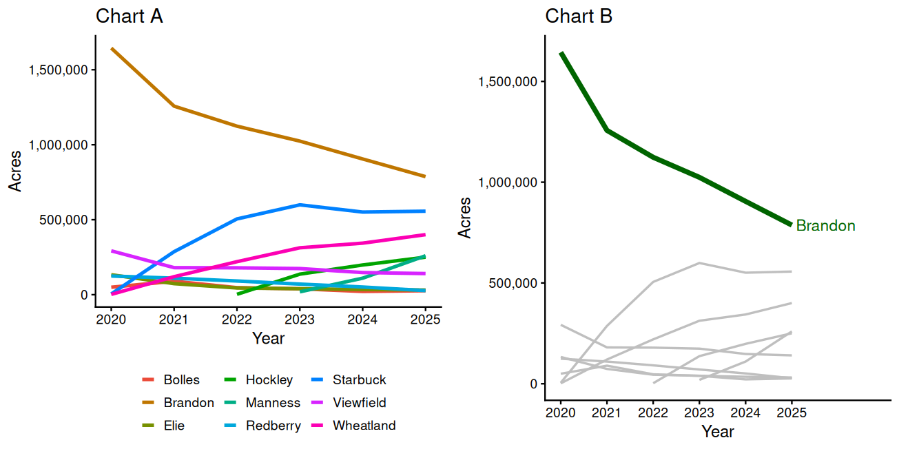
Both charts below show the seeded acres of the nine largest Manitoba wheat varieties over 2020-2025. You want the reader to focus on AAC Brandon.
(a) When do you think you would prefer Chart B to Chart A?
(b) If your audience was interested in understanding the largest wheat varieties in Manitoba, how could you improve Chart A?
Answer
(a) Whenever Brandon is the point of the chart. In Chart A nine saturated colours compete equally, so nothing stands out, and finding Brandon means matching its colour in the legend and carrying that to the plot – several of the nine hues are close enough that the match is uncertain, harder still for colour-blind readers. Chart B answers the question at a glance. The cost is that the other eight varieties lose their identity, which matters if the reader needs to name the rival that is rising.
(b) Drop to the few varieties the reader actually needs and label the lines directly at their right-hand ends instead of using a legend, so no colour matching is required. If all nine must stay, give each a distinguishable colour or facet them into small panels with a shared scale.
Question 5
The chart below shows the seeded acres of the six most-planted Manitoba wheat varieties from 2020 to 2025.
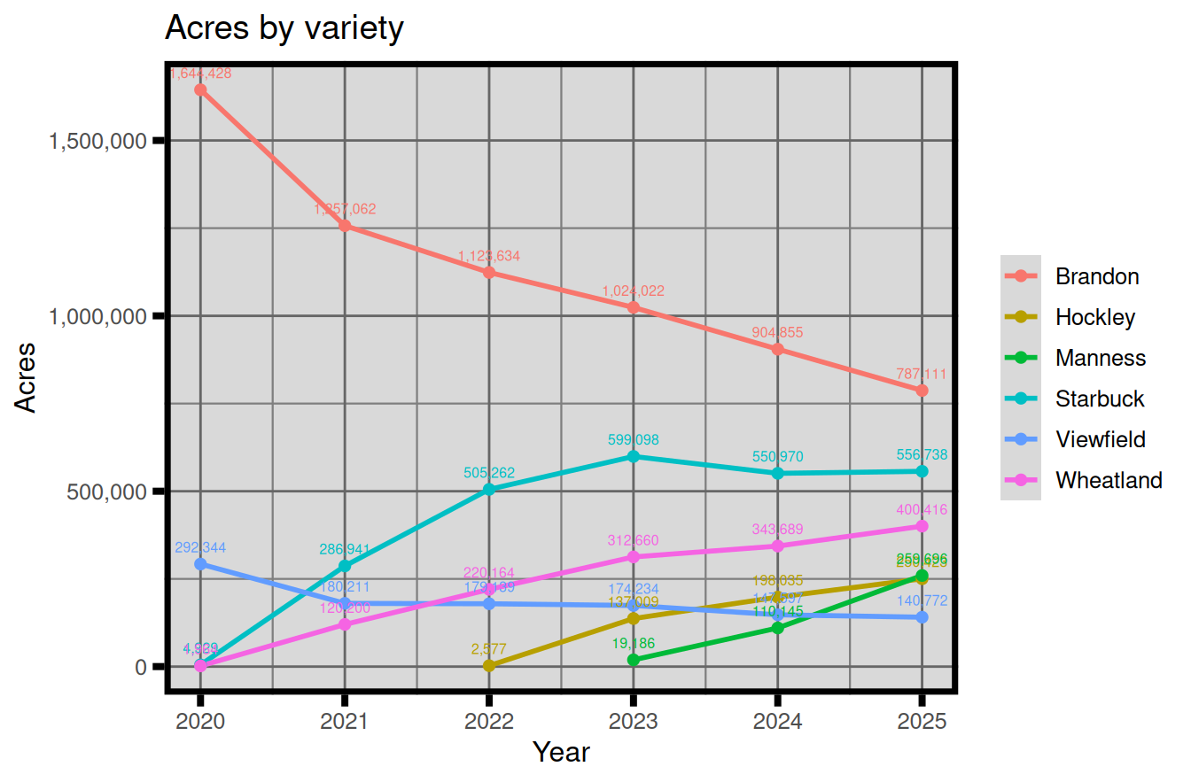
(a) List the elements you would remove from this chart, and explain why they would help make the graph more legible.
Answer
(a) The grey panel fill, the heavy black border, the vertical gridlines, the minor gridlines and the thick tick marks all go: they draw ink without carrying any of the data, and the border and fill in particular lower the contrast between the lines and the background.
The value labels on every point go too, and they are the worst offender. Thirty-odd numbers printed this close together overlap each other and the lines, so most cannot be read anyway, and they hide the shapes the reader came for. Exact values belong in a table, or on the handful of points that carry the story.
Light horizontal gridlines can stay – with six lines they help the reader read a value off the axis. The principle behind all of it: every element should help the reader see the data, and anything that decorates without informing comes off.
Question 6
The chart below shows the 2025 average yields across Saskatchewan RMs of seven crops, in bu/ac. Lentils are left out because they are recorded in lb/ac. One reader needs the exact values to put in a report; another wants to see at a glance which crops yield most.
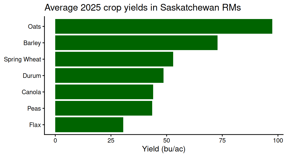
(a) Which of the two readers does this chart serve, and what would you give the other one instead?
(b) How can you change the chart to better serve both audiences?
Answer
(a) It serves the reader who wants the ranking: the sort order and the bar lengths give it immediately. The report writer is left reading values off an axis, and will get 53 rather than 53.0; a table serves them better – exact values, easy to copy, no reading off a scale.
(b) Write the value as a data label at the end of each bar. The bars carry the comparison and the labels carry the numbers, so both readers are served by one chart. This works here because there are seven labels, one per bar, each sitting in clear space at the end of its own bar – on a crowded line chart the same labels would overlap and help nobody.
Question 7
For each display below, name the chart type you would choose and justify it in one sentence.
(a) How the average canola yield across RMs changed from 1990 to 2025.
(b) The 2025 average yields of six crops.
(c) How Manitoba’s 2025 spring wheat acres split across the four largest varieties and everything else.
Answer
(a) A line chart – yield against a continuous time axis shows the trend and the year-to-year swings.
(b) A bar chart – six categories compared by length, sorted so the ranking is visible.
(c) A pie chart (or a bar chart of shares) – the five values are shares of one whole, and five slices is few enough to read.
Question 8
The chart below will stand on its own, shows the average durum yield across Saskatchewan RMs for every year from 1990 to 2025, in bushels per acre.
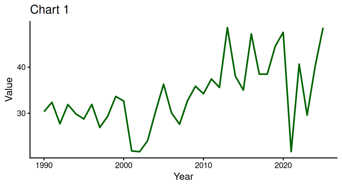
(a) How would you change this chart?
Answer
(a) The title and the vertical axis label both have to be replaced, because neither says anything. “Chart 1” names no crop, no place and no period; “Value” does not say what is measured or in what units, so a reader cannot tell whether the axis holds yields, acres or dollars.
A title that names the what, where and when: “Average durum yield in Saskatchewan RMs, 1990-2025”. Better still, one that carries the finding, since the chart stands on its own: “Saskatchewan durum yields have risen since 1990, with drought losses in 2001-02 and 2021”. The vertical axis becomes “Yield (bu/ac)”.
The horizontal axis label “Year” can stay – it is accurate and the units are obvious.
Question 9
The chart below shows the average barley yield across Saskatchewan RMs in each year from 1990 to 2025. It was pasted into a report with no caption and no surrounding text.
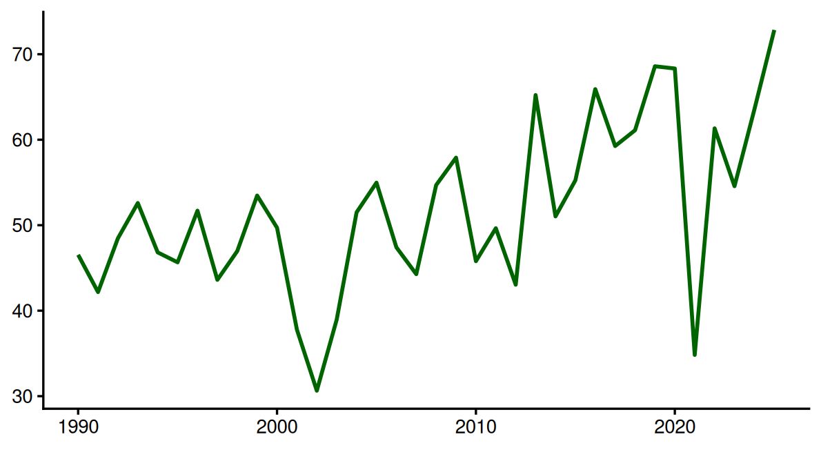
(a) How would you improve this chart?
Answer
(a) Everything a reader needs to interpret it is missing. There is no title, so nothing says what crop this is, where it was grown, or that each point is an average across RMs rather than one place: “Average barley yield across Saskatchewan RMs, 1990-2025”. The vertical axis has no name and no units, so the numbers could as easily be seeded acres in thousands or rainfall in millimetres as yields – it should read “Yield (bu/ac)”. The horizontal axis does not say its numbers are years.
Beyond the labels, the vertical axis does not start at zero. On a line chart that is defensible, but it should be a decision rather than a default, and it exaggerates how far the 2002 drought fell. A note on where the data came from would let a reader check it.
Question 10
The chart below shows the 2025 pea yield in each Saskatchewan RM that reported one, in bu/ac. The RM yields run from 6.8 to 73.5, and the average across RMs is 43.5.
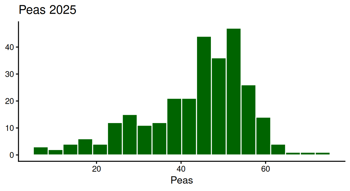
(a) How would you improve this chart?
Answer
(a) All three labels need work. “Peas 2025” gives the crop and the year but not the place, and not that each observation is an RM: “2025 pea yields across Saskatchewan RMs”. The horizontal axis repeats the crop name where the units belong, so a reader cannot tell whether it holds yields, acres or dollars – it should read “Yield (bu/ac)”. The vertical axis has no label at all, and a reader cannot tell whether the bars count RMs, farms or fields: “Number of RMs”.
A reference line at the average of 43.5 bu/ac would let a reader place any single RM against the rest, which is what a distribution is for – it is the difference between knowing an RM grew 30 bu/ac and knowing that 30 was a poor result.
Section 2 — Graphing in Excel
Build each chart on the worksheet for that question. Titles and axis labels are part of the marks in this section. The PivotTable steps are the ones from Module 1.
Question 11
The file rm_yields_1990_2025.csv holds the average yield of each crop in every RM and year, one row per RM-year-crop.
(a) Use a PivotTable to calculate the average canola yield across RMs in each year from 1990 to 2025.
(b) Make a line chart of the series with a title and labelled axes, and set the vertical axis to start at zero.
(c) Add a data label marking the year with the highest average yield (clicking a point twice selects just that point).
Answer
A PivotTable with Year in Rows, Yield in Values (changed from Sum to Average), and Crop filtered to Canola. The series runs from about 21 bu/ac in 1990 to about 44 in 2025. The data label goes on the maximum point (select the point twice, then Add Data Label).
Question 12
The Manitoba wheat file again: variety, municipality, year, farms, acres, yield.
(a) Insert a PivotChart showing the total acres of each variety in each year, 2020 to 2025, drawn as one line per variety.
(b) The chart has too many lines to read. Filter it to the major varieties – I kept the eight whose acres summed over 2020–2025 exceed 300,000 (ticking just those in the PivotChart’s field list is fine).
(c) In a cell, explain what the filtered chart gains and what information it no longer shows.
Answer
The PivotChart has Year in the axis area, Variety in the legend area and Acres in Values. Eight varieties have more than 300,000 acres summed over the six years; keep them by unticking the others in the field list (a value filter on the variety field does the same thing faster). The filtered chart makes the major varieties readable; it no longer shows the small varieties at all, or the total acreage across every variety.
Question 13
The file rm_yields_1990_2025.csv: one row per RM-year-crop, with lentils in lb/ac and everything else in bu/ac.
(a) Use a PivotTable to calculate the 2025 average yield of each crop across RMs, leaving lentils out (its units don’t belong on this axis).
(b) Make a bar chart of the averages, change it to horizontal bars, and sort so the highest-yielding crop is at the top (watch which sort order puts the largest bar on top).
(c) Add a title and a labelled axis.
Answer
Crop in Rows (filtered to exclude Lentils), average Yield in Values, Year filtered to 2025. The 2025 averages: Oats 97.5, Barley 72.8, Spring Wheat 53.0, Durum 48.6, Canola 43.9, Peas 43.5, Flax 30.5. Horizontal bars put the first row at the bottom, so the table is sorted ascending to get the largest bar on top.
Question 14
The same file. In 2025 there is one canola yield for each of about 290 RMs.
(a) Get the 2025 canola yields into a column (a filter on the long table, or a PivotTable with RM in Rows whose values you copy out as plain values – Excel’s statistic charts will not draw directly from a PivotTable).
(b) Make a histogram of the yields.
(c) In a cell, describe the shape of the distribution in one sentence: where the yields centre and how spread out they are.
Answer
An Insert > Histogram chart on the yield column. The distribution centres around 44 bu/ac; most RMs fall roughly between 34 and 52, with a tail of lower-yielding RMs. Any sentence naming the centre and the spread earns the marks.
Question 15
The Manitoba wheat file.
(a) Use a PivotTable to total the 2025 acres of the four largest varieties, and make a bar chart of them.
(b) Add data labels showing the acres at the end of each bar, formatted with a thousands separator (in the Format Data Labels pane, under Number).
(c) In a cell, explain what the data labels let you remove from the chart.
Answer
Data labels are added through Add Chart Element > Data Labels and formatted (Number, with a 1000 separator) in the Format Data Labels pane. With exact values printed on the bars, the gridlines and even the value axis can go – the labels carry the numbers, the bars carry the comparison.
Question 16
The file rm_yields_1990_2025.csv again. The Unit column shows lentils in lb/ac.
(a) Insert a PivotChart of the average yield across RMs of every crop by year, one line per crop.
(b) One line makes the rest unreadable. Identify it, explain why (look at the Unit column), filter it out, and retitle the chart to say what it now shows.
Answer
The lentils line sits in the thousands (lb/ac) and flattens the bu/ac crops against the axis – a units problem, not a yields problem. After removing lentils, any descriptive title for the remaining bu/ac crops earns the marks.
Question 17
The file rm_yields_1990plus.csv: one row per RM-year, one column per crop.
(a) Filter the table to RM 1.
(b) Make a line chart of RM 1’s canola yield from 1990 to 2025, with a title and labelled axes.
(c) In a cell: this chart shows one RM; the RM-average line in the textbook is much smoother. Why?
Answer
Select the Year and Canola columns with the filter applied and insert a line chart. A single RM keeps all its local weather luck, so the line swings hard year to year; averaging across ~300 RMs cancels much of that noise, which is why the RM-average series is smoother.
Question 18
The Manitoba wheat file.
(a) Use a PivotTable to total the acres of AAC Brandon and AAC Starbuck in each year, and make a clustered (grouped) column chart from it.
(b) Copy the chart, and change the copy to stacked columns, so both versions sit on the sheet.
(c) In a cell: which question does each version answer better – “how did the combined acreage of the two varieties change?” and “how did each variety change?”
Answer
Stacked columns answer the combined-acreage question: the stack height is the total. Grouped columns answer the per-variety question: every bar starts at zero, so each variety can be tracked across years.
Question 19
The file rm_yields_1990plus.csv. RM 1 grew durum in some years but not others, so its Durum column has blank cells.
(a) Filter to RM 1 and make a line chart of the durum yield over 1990–2025.
(b) Use Select Data > Hidden and Empty Cells to control how the blanks are drawn, and choose the setting you would publish.
(c) In a cell: why would filling the blank years with zero be worse than leaving gaps?
Answer
Showing empty cells as Gaps is the honest setting: the line breaks where there is no data. A zero draws the line down to the floor and claims a yield of 0 bu/ac in years when durum simply wasn’t grown or reported – a missing value is not a zero.
Question 20
The Manitoba wheat file.
(a) Make a bar chart of the 2025 acres of the six most-planted varieties (a PivotTable to total the acres, then sort).
(b) Format it so AAC Starbuck stands out: all bars in one muted colour, Starbuck in a strong one (clicking a bar twice selects just that bar). Narrow the gap between the bars.
(c) In a cell: when is highlighting one bar the right choice, and when is it misleading?
Answer
Single-bar fill and gap width both live in the Format Data Series pane. Highlighting is right when the chart’s story is about that category (“here is where Starbuck sits among the leaders”); it misleads when the highlight implies importance the data doesn’t support, or hides that another bar is larger.
Section 3 — Graphing in R
Answer these in your R script. Load tidyverse and janitor once at the top, read each file with read_csv() and clean the column names with clean_names(). Written answers go in comments. The file paths below assume the data sits in your project’s data/ folder.
Question 21
The same file: one row per RM-year-crop.
(a) Filter to spring wheat and canola (%in%) and calculate each crop’s average yield across RMs in each year.
(b) Plot both series on one chart with one line per crop.
(c) In a comment: what does mapping colour = crop inside aes() do that setting a colour inside geom_line() does not?
Answer
# Read the long yields file and clean the names
rm_yields <- read_csv("data/rm_yields_1990_2025.csv",
                      show_col_types = FALSE) |>
  clean_names()

# (a) Average yield by crop and year for the two crops
two_crops <- rm_yields |>
  filter(crop %in% c("Spring Wheat", "Canola")) |>   # keep either crop
  group_by(crop, year) |>                            # one group per crop-year
  summarise(mean_yield = mean(yield, na.rm = TRUE),
            .groups = "drop")

two_crops

# (b) One line per crop
two_crops |>
  ggplot(aes(x = year, y = mean_yield, colour = crop)) +   # one line per crop
  geom_line(linewidth = 1) +
  scale_y_continuous(limits = c(0, NA)) +
  labs(title = "Average spring wheat and canola yields in Saskatchewan RMs",
       x = "Year", y = "Yield (bu/ac)", colour = NULL) +
  theme_classic(base_size = 13)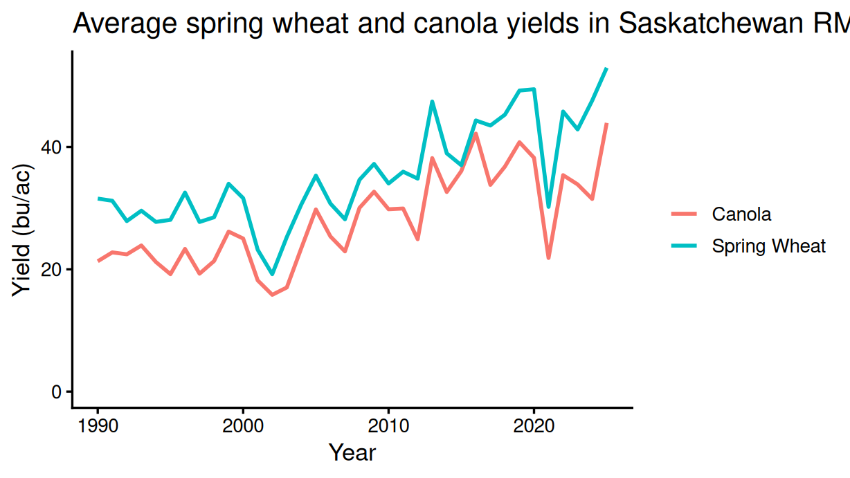
# (c) Mapping colour = crop inside aes() ties colour to the data: each
# value of crop gets its own colour and its own line, and a legend is
# added. A colour set inside geom_line() is a fixed appearance choice
# applied to everything, and draws one line.
# A tibble: 72 × 3
crop year mean_yield
<chr> <dbl> <dbl>
1 Canola 1990 21.3
2 Canola 1991 22.8
3 Canola 1992 22.5
4 Canola 1993 23.9
5 Canola 1994 21.2
6 Canola 1995 19.2
7 Canola 1996 23.3
8 Canola 1997 19.3
9 Canola 1998 21.4
10 Canola 1999 26.2
# ℹ 62 more rowsQuestion 22
The file mb_wheat_reported_2020_2025.csv holds Manitoba red spring wheat records by variety, municipality and year: the number of farms, seeded acres and average yield.
(a) Total the 2025 acres by variety and keep the varieties with more than 100,000 acres.
(b) Make a horizontal bar chart of those totals, ordered so the largest bar is at the top (this is fct_reorder()), with a title, a labelled acres axis and comma-formatted axis labels.
(c) In a comment: what does fct_reorder() change about the variety column, and what order would the bars take without it?
Answer
# Read the Manitoba wheat file and clean the names
mb_wheat <- read_csv("data/mb_wheat_reported_2020_2025.csv",
                     show_col_types = FALSE) |>
  clean_names()

# (a) Total 2025 acres by variety, keeping those over 100,000 acres
top_2025 <- mb_wheat |>
  filter(year == 2025) |>                          # 2025 only
  group_by(variety) |>                             # one group per variety
  summarise(acres = sum(acres, na.rm = TRUE)) |>   # total the acres
  filter(acres > 100000)                           # keep the large varieties

top_2025

# (b) Horizontal bar chart, largest at the top
top_2025 |>
  ggplot(aes(x = acres, y = fct_reorder(variety, acres))) +
  geom_col(fill = "DarkGreen") +
  scale_x_continuous(labels = scales::comma) +     # 400,000 not 4e+05
  labs(title = "Acres of Manitoba wheat varieties, 2025",
       x = "Acres", y = NULL) +
  theme_classic(base_size = 13)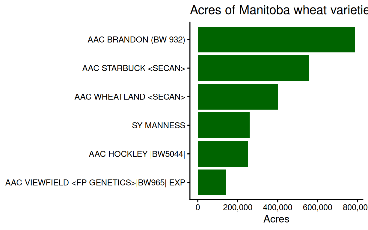
# (c) fct_reorder() converts variety to a factor whose categories are
# ordered by acres, so the bars plot in that order. Without it the
# bars would plot alphabetically.
# A tibble: 6 × 2
variety acres
<chr> <dbl>
1 AAC BRANDON (BW 932) 787111.
2 AAC HOCKLEY |BW5044| 250423.
3 AAC STARBUCK <SECAN> 556738.
4 AAC VIEWFIELD <FP GENETICS>|BW965| EXP 140772.
5 AAC WHEATLAND <SECAN> 400416.
6 SY MANNESS 259696 Question 23
The file rm_yields_1990plus.csv: one row per RM-year, one column per crop. To draw one line per crop in ggplot, the crops need to be in one column.
(a) For canola and barley, calculate the average yield across RMs in each year (this is easiest after pivot_longer() on the two crop columns).
(b) Plot the two series with one line per crop.
(c) In a comment: why did the wide table need reshaping before ggplot could colour by crop?
Answer
# Read the wide yields file and clean the names
rm_wide <- read_csv("data/rm_yields_1990plus.csv",
                    show_col_types = FALSE) |>
  clean_names()

# (a) Two crop columns into one, then average by crop and year
two_long <- rm_wide |>
  pivot_longer(cols = c(canola, barley),      # the two crops
               names_to = "crop",
               values_to = "yield") |>
  group_by(crop, year) |>
  summarise(mean_yield = mean(yield, na.rm = TRUE),
            .groups = "drop")

two_long

# (b) One line per crop
two_long |>
  ggplot(aes(x = year, y = mean_yield, colour = crop)) +
  geom_line(linewidth = 1) +
  scale_y_continuous(limits = c(0, NA)) +
  labs(title = "Average canola and barley yields in Saskatchewan RMs",
       x = "Year", y = "Yield (bu/ac)", colour = NULL) +
  theme_classic(base_size = 13)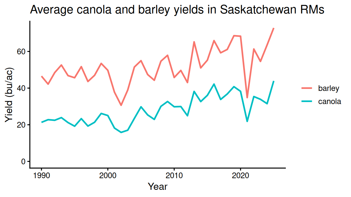
# (c) colour = crop needs a crop column to map from. In the wide
# table the crop lives in the column names, not in a column, so
# there is nothing for aes() to point at until the table is long.
# A tibble: 72 × 3
crop year mean_yield
<chr> <dbl> <dbl>
1 barley 1990 46.5
2 barley 1991 42.2
3 barley 1992 48.5
4 barley 1993 52.6
5 barley 1994 46.8
6 barley 1995 45.7
7 barley 1996 51.7
8 barley 1997 43.6
9 barley 1998 47.0
10 barley 1999 53.5
# ℹ 62 more rowsQuestion 24
The Manitoba wheat file.
(a) Total AAC Brandon’s acres in each year (the variety is recorded as AAC BRANDON (BW 932)).
(b) Make a line chart of the series with a title, labelled axes, comma-formatted axis labels and a y-axis starting at zero.
(c) In a comment: with the zero baseline, roughly what fraction of its 2020 acreage does Brandon keep by 2025? Would a truncated axis make the decline look smaller or larger?
Answer
# Read the Manitoba wheat file and clean the names
mb_wheat <- read_csv("data/mb_wheat_reported_2020_2025.csv",
                     show_col_types = FALSE) |>
  clean_names()

# (a) Brandon's total acres by year
brandon <- mb_wheat |>
  filter(variety == "AAC BRANDON (BW 932)") |>
  group_by(year) |>
  summarise(acres = sum(acres, na.rm = TRUE))

brandon

# (b) Line chart with a zero baseline
brandon |>
  ggplot(aes(x = year, y = acres)) +
  geom_line(colour = "DarkGreen", linewidth = 1) +
  scale_y_continuous(labels = scales::comma, limits = c(0, NA)) +
  labs(title = "Acres of AAC Brandon wheat in Manitoba",
       x = "Year", y = "Acres") +
  theme_classic(base_size = 13)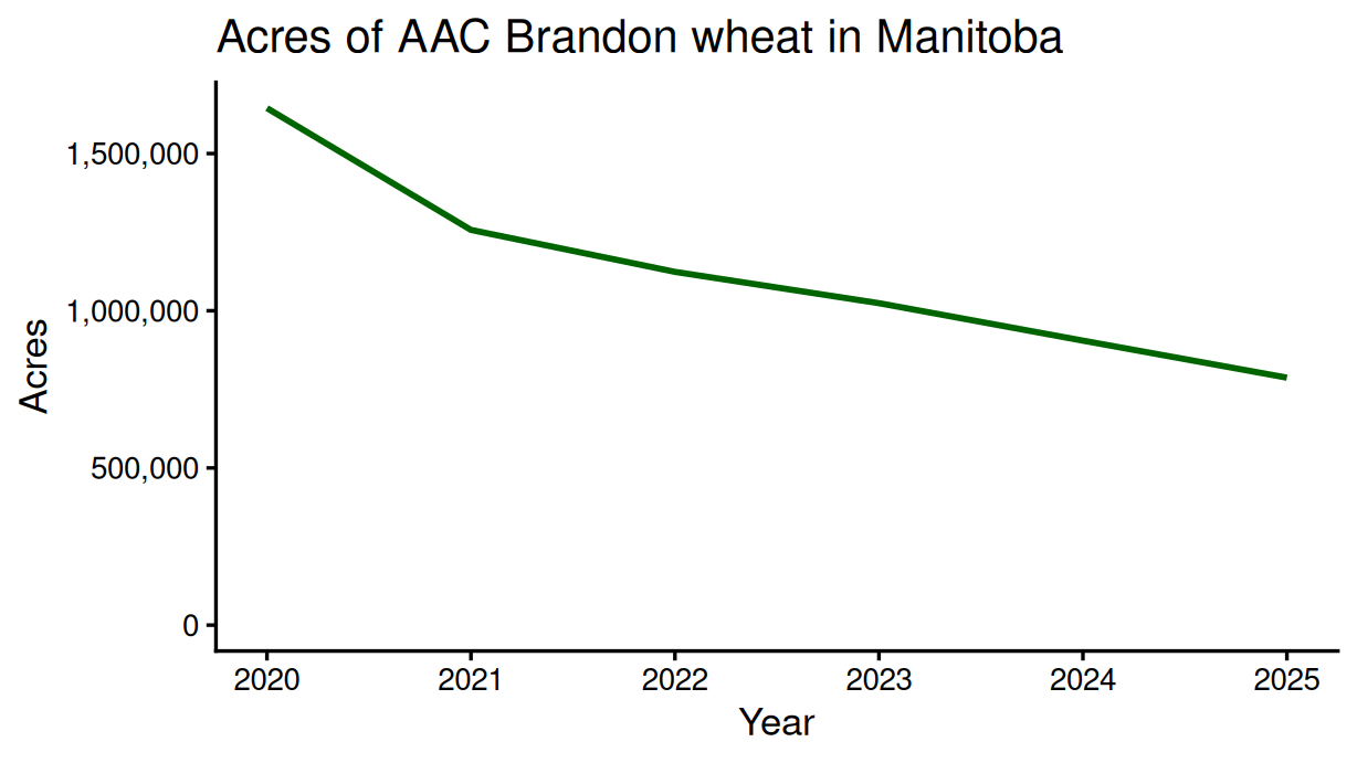
# (c) About half: 787,111 of 1,644,428 acres, or 48%. A truncated
# axis would make the decline look larger -- the line would fall
# almost the full height of the chart.
# A tibble: 6 × 2
year acres
<dbl> <dbl>
1 2020 1644428.
2 2021 1257062.
3 2022 1123634.
4 2023 1024022.
5 2024 904855.
6 2025 787111.Question 25
The Manitoba wheat file.
(a) Total the 2025 acres by variety, keeping the four largest varieties and grouping the rest into "Other" (if_else() with a threshold of 255,000 acres, which sits between the 4th- and 5th-largest).
(b) Make a pie chart of the five values (geom_col() plus coord_polar()), with a title.
(c) In a comment: what makes acres suitable for a pie chart when yields are not?
Answer
# Read the Manitoba wheat file and clean the names
mb_wheat <- read_csv("data/mb_wheat_reported_2020_2025.csv",
                     show_col_types = FALSE) |>
  clean_names()

# (a) 2025 totals, then keep the four largest varieties and group the
# rest as Other; the threshold sits between the 4th- and 5th-largest
pie_data <- mb_wheat |>
  filter(year == 2025) |>
  group_by(variety) |>
  summarise(acres = sum(acres, na.rm = TRUE)) |>
  mutate(variety = if_else(acres > 255000, variety, "Other")) |>
  group_by(variety) |>
  summarise(acres = sum(acres))

pie_data

# (b) Pie chart
pie_data |>
  ggplot(aes(x = "", y = acres, fill = variety)) +
  geom_col(width = 1) +
  coord_polar(theta = "y") +
  labs(title = "2025 Manitoba wheat acres by variety",
       x = NULL, y = NULL, fill = NULL) +
  theme_void(base_size = 13)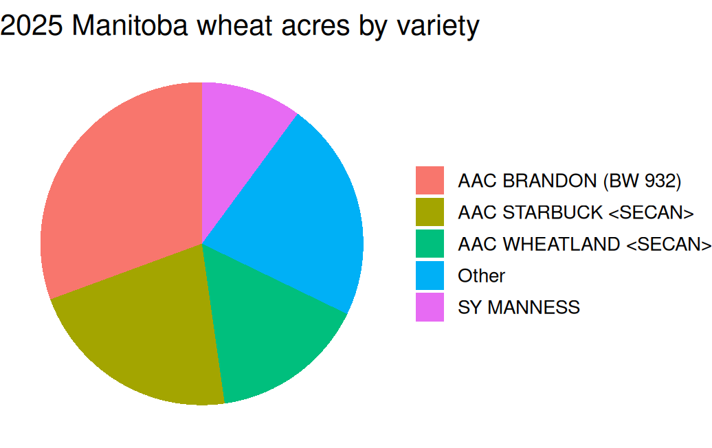
# (c) The acres sum to the province's total seeded acres, so each
# slice is a genuine share of a whole. Yields do not sum to anything
# meaningful, so slices of yield have no interpretation.
# A tibble: 5 × 2
variety acres
<chr> <dbl>
1 AAC BRANDON (BW 932) 787111.
2 AAC STARBUCK <SECAN> 556738.
3 AAC WHEATLAND <SECAN> 400416.
4 Other 567717.
5 SY MANNESS 259696 Question 26
The Manitoba wheat file. The code below draws a chart of the total reported acres by year, but it is unfinished.
mb_wheat |>
  group_by(year) |>
  summarise(acres = sum(acres, na.rm = TRUE)) |>
  ggplot(aes(x = year, y = acres)) +
  geom_line()
(a) Finish the chart: a title, labelled axes, comma-formatted axis labels, a y-axis starting at zero, and a cleaner theme with a readable font size.
(b) In a comment: which of your additions changes what the reader concludes from the chart (rather than just how it looks)?
Answer
# Read the Manitoba wheat file and clean the names
mb_wheat <- read_csv("data/mb_wheat_reported_2020_2025.csv",
                     show_col_types = FALSE) |>
  clean_names()

# (a) The finished chart
mb_wheat |>
  group_by(year) |>
  summarise(acres = sum(acres, na.rm = TRUE)) |>
  ggplot(aes(x = year, y = acres)) +
  geom_line(colour = "DarkGreen", linewidth = 1) +
  scale_y_continuous(labels = scales::comma, limits = c(0, NA)) +
  labs(title = "Total reported wheat acres in Manitoba",
       x = "Year", y = "Acres") +
  theme_classic(base_size = 13)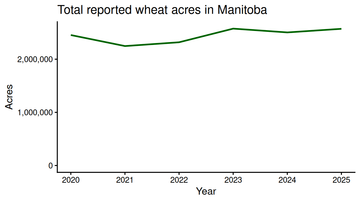
# (b) The zero baseline is the one that changes the conclusion: with
# ggplot's default limits the small year-to-year movements fill the
# whole panel and look dramatic; from zero they are visibly modest.
# The title, labels, commas and theme change readability, not meaning.
Question 27
The file rm_yields_1990_2025.csv. Lentils are recorded in lb/ac; the other crops in bu/ac.
(a) Calculate the 2025 average yield across RMs of each crop except lentils (filter it out, and say why in a comment).
(b) Make a bar chart of the averages, ordered from highest to lowest.
(c) In a comment: what would the chart look like if lentils stayed in?
Answer
# Read the long yields file and clean the names
rm_yields <- read_csv("data/rm_yields_1990_2025.csv",
                      show_col_types = FALSE) |>
  clean_names()

# (a) 2025 averages, without lentils -- its lb/ac values would sit on
# a bu/ac axis as if they were comparable
avg_2025 <- rm_yields |>
  filter(year == 2025,
         crop != "Lentils") |>
  group_by(crop) |>
  summarise(mean_yield = mean(yield, na.rm = TRUE))

avg_2025

# (b) Ordered bars
avg_2025 |>
  ggplot(aes(x = mean_yield, y = fct_reorder(crop, mean_yield))) +
  geom_col(fill = "DarkGreen") +
  labs(title = "Average 2025 crop yields in Saskatchewan RMs",
       x = "Yield (bu/ac)", y = NULL) +
  theme_classic(base_size = 13)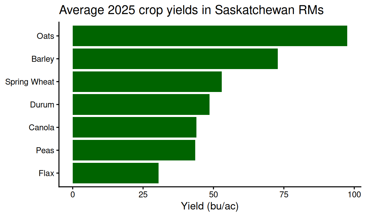
# (c) The lentils bar, near 1,900, would stretch the axis twenty-fold
# and squash the bu/ac crops into unreadable slivers -- a units
# problem drawn as if it were a yields story.
# A tibble: 7 × 2
crop mean_yield
<chr> <dbl>
1 Barley 72.8
2 Canola 43.9
3 Durum 48.6
4 Flax 30.5
5 Oats 97.5
6 Peas 43.5
7 Spring Wheat 53.0Question 28
The file rm_yields_1990plus.csv has one row per RM-year and one column per crop, with yields in bu/ac.
(a) For 2025, make a scatter plot of spring wheat yield against barley yield across RMs, with a title and labelled axes.
(b) In a comment: describe the pattern in one sentence.
(c) Save the chart to output/ as a PNG with ggsave().
Answer
# Read the wide yields file and clean the names
rm_wide <- read_csv("data/rm_yields_1990plus.csv",
                    show_col_types = FALSE) |>
  clean_names()

# (a) Scatter of the two 2025 yields, one point per RM
wheat_barley_scatter <- rm_wide |>
  filter(year == 2025) |>                       # 2025 only
  ggplot(aes(x = spring_wheat, y = barley)) +
  geom_point(colour = "DarkGreen") +
  labs(title = "Spring wheat and barley yields in Saskatchewan RMs, 2025",
       x = "Spring wheat yield (bu/ac)", y = "Barley yield (bu/ac)") +
  theme_classic(base_size = 13)

wheat_barley_scatter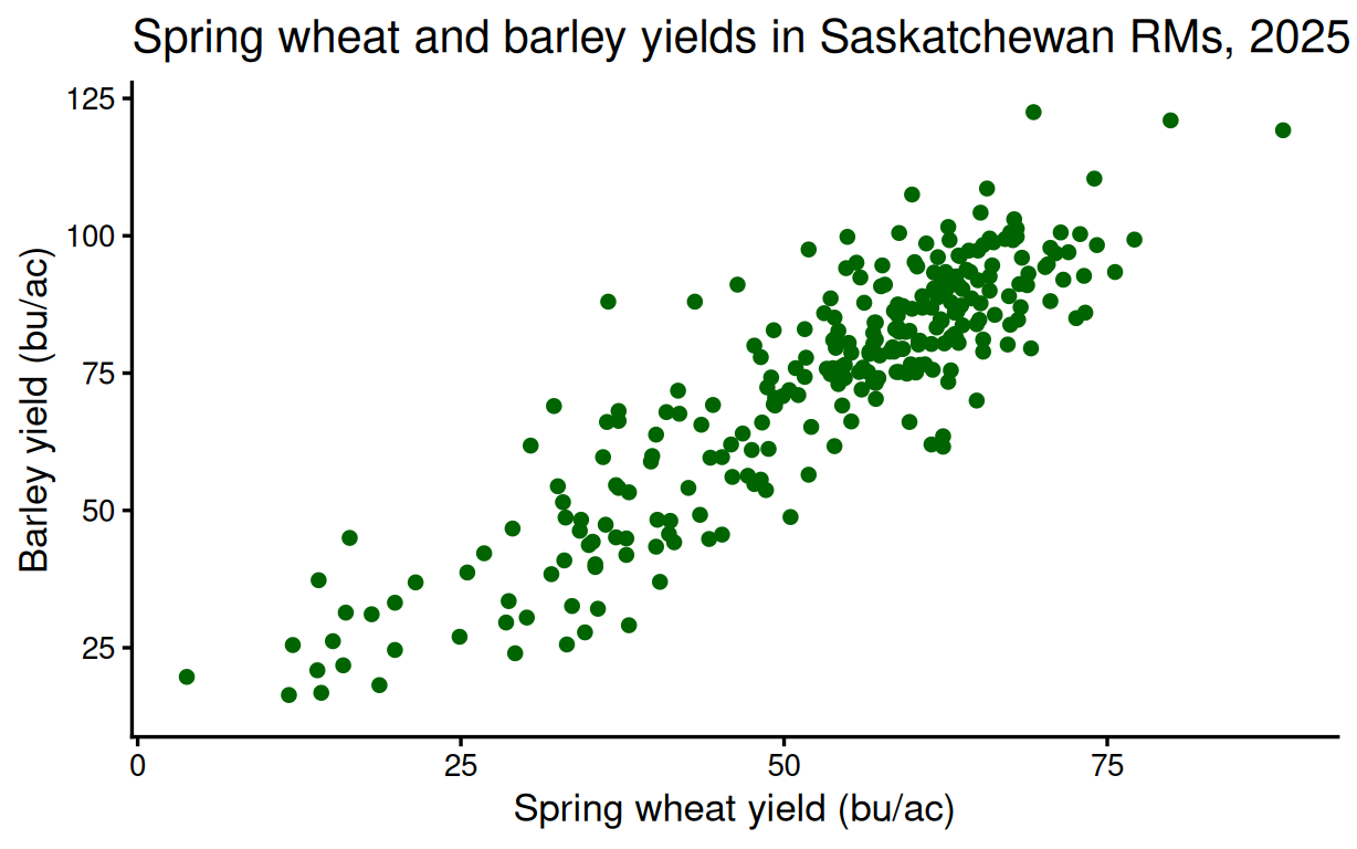
# (b) The points rise together: RMs with higher spring wheat yields
# generally also had higher barley yields in 2025. (16 RMs are missing
# one of the two yields; R drops them with a warning.)

# (c) Save the chart as a PNG
ggsave(
  "output/mod04_q42_scatter.png",
  plot = wheat_barley_scatter,
  width = 6.4,
  height = 4.0,
  dpi = 300
)
Question 29
The file rm_yields_1990_2025.csv.
(a) Make a bar chart of the 2025 average yield across RMs of each crop except lentils, ordered from highest to lowest, and assign the chart to an object.
(b) Save it twice with ggsave(): once as a PNG and once as a PDF, both 6.4 inches wide and 4 inches tall.
(c) In a comment: when is the PDF the better file to hand over?
Answer
# Read the long yields file and clean the names
rm_yields <- read_csv("data/rm_yields_1990_2025.csv",
                      show_col_types = FALSE) |>
  clean_names()

# (a) The chart as an object
yield_bar <- rm_yields |>
  filter(year == 2025,
         crop != "Lentils") |>
  group_by(crop) |>
  summarise(mean_yield = mean(yield, na.rm = TRUE)) |>
  ggplot(aes(x = mean_yield, y = fct_reorder(crop, mean_yield))) +
  geom_col(fill = "DarkGreen") +
  labs(title = "Average 2025 crop yields in Saskatchewan RMs",
       x = "Yield (bu/ac)", y = NULL) +
  theme_classic(base_size = 13)

yield_bar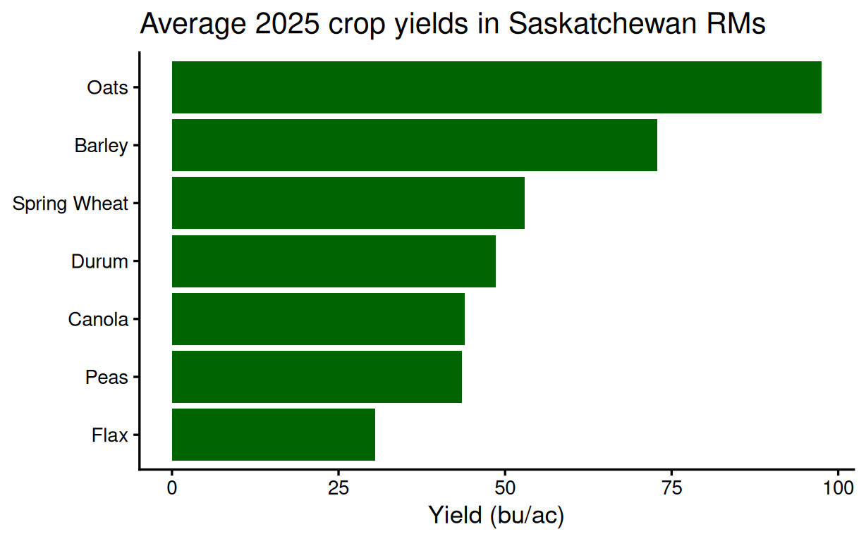
# (b) Save as PNG and as PDF
ggsave("output/mod04_q43_yields.png", plot = yield_bar,
       width = 6.4, height = 4.0, dpi = 300)
ggsave("output/mod04_q43_yields.pdf", plot = yield_bar,
       width = 6.4, height = 4.0)

# (c) The PDF keeps lines and text as vectors, so it stays sharp at
# any size -- the right choice for print and publication. The PNG is
# for slides and web pages.
Question 30
The Manitoba wheat file.
(a) Make a vertical bar chart of the 2025 acres of the varieties with more than 100,000 acres – the six largest (variety on the x-axis).
(b) Make the same chart with horizontal bars (swap the axes in aes()), ordered by acres.
(c) In a comment: which version is easier to read here, and what feature of this data decides it?
Answer
# Read the Manitoba wheat file and clean the names
mb_wheat <- read_csv("data/mb_wheat_reported_2020_2025.csv",
                     show_col_types = FALSE) |>
  clean_names()

# The six largest 2025 varieties
top_six <- mb_wheat |>
  filter(year == 2025) |>
  group_by(variety) |>
  summarise(acres = sum(acres, na.rm = TRUE)) |>
  filter(acres > 100000)        # keeps the six largest

# (a) Vertical bars: the variety names collide on the x-axis
top_six |>
  ggplot(aes(x = variety, y = acres)) +
  geom_col(fill = "DarkGreen") +
  scale_y_continuous(labels = scales::comma) +
  labs(title = "Acres of Manitoba wheat varieties, 2025",
       x = NULL, y = "Acres") +
  theme_classic(base_size = 13)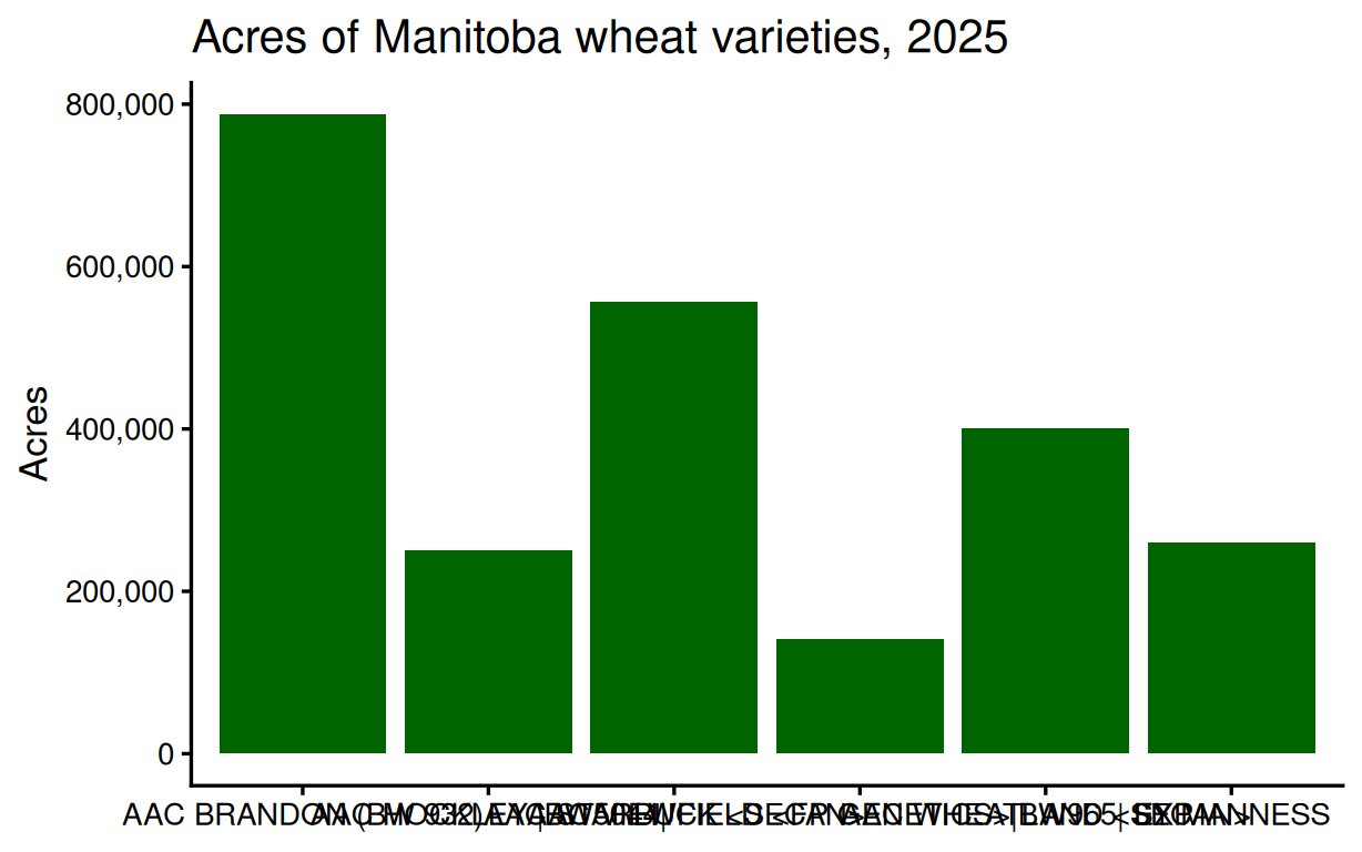
# (b) Horizontal bars, ordered
top_six |>
  ggplot(aes(x = acres, y = fct_reorder(variety, acres))) +
  geom_col(fill = "DarkGreen") +
  scale_x_continuous(labels = scales::comma) +
  labs(title = "Acres of Manitoba wheat varieties, 2025",
       x = "Acres", y = NULL) +
  theme_classic(base_size = 13)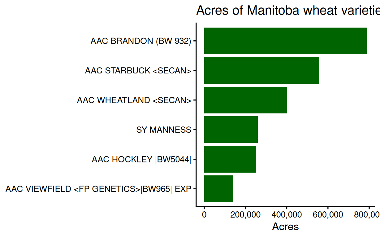
# (c) Horizontal. The variety names are long, so on the x-axis they
# overlap or need rotating; on the y-axis they read naturally.