Let’s now start working with spatial data in R. We will use the sf package to work with vector data and the terra package to work with raster data. Except for the geometry, we can use much the same functions as we have learned up to this point (e.g., filter(), select(), mutate(), summarise(), group_by(), left_join()).
The four files we will work with in this chapter are:
A slice of the 2023 Annual Crop Inventory around the RM of Blaine Lake, north-west of Saskatoon: aci_slice_2023.tif.
Crop class names: aci_crop_classes.csv, which says what each code in the crop inventory means and the colour Agriculture Canada uses for it.
20.1 Vector data
When reading and manipulating vector data, we will use the sf package. As usual, this can be installed by running install.packages("sf") in the console, and then can be loaded into every session with library(sf). The sf package works with the tidyverse functions we have learned, so it works well with the functions we have learned in this course.
NoteVideo walkthrough of this section
20.1.1 Reading vector data
Let’s start by just reading in the RM boundaries file. We do this by loading the sf package and using the st_read() function instead of read_csv(). The result is an sf object, which is a data frame with a geometry column.
# Load the packages for vector spatial data and for tidying nameslibrary(sf)library(janitor)# Read the RM boundaries, putting the column names in lower case.# quiet = TRUE stops st_read printing the full path it read from.# The RM number arrives as text, so make it a number here -- we need it# numeric later to join the yields onto it.rms <-st_read("data/sask_rms.geojson", quiet =TRUE) |>clean_names() |>mutate(rmno =as.numeric(rmno))# Print the first rows: a data frame with a geometry columnhead(rms, 3)
> # Load the packages for vector spatial data and for tidying names
> library(sf)
> library(janitor)
>
> # Read the RM boundaries, putting the column names in lower case.
> # quiet = TRUE stops st_read printing the full path it read from.
> # The RM number arrives as text, so make it a number here -- we need it
> # numeric later to join the yields onto it.
> rms <- st_read("data/sask_rms.geojson", quiet = TRUE) |>
+   clean_names() |>
+   mutate(rmno = as.numeric(rmno))
>
> # Print the first rows: a data frame with a geometry column
> head(rms, 3)
Simple feature collection with 3 features and 2 fields
Geometry type: MULTIPOLYGON
Dimension:     XY
Bounding box:  xmin: -108.5354 ymin: 49.26171 xmax: -107.2174 ymax: 51.61981
Geodetic CRS:  WGS 84
  rmno                 rmnm                       geometry
1  288      PLEASANT VALLEY MULTIPOLYGON (((-108.5354 5...
2  167 SASKATCHEWAN LANDING MULTIPOLYGON (((-107.8702 5...
3   46       GLEN MCPHERSON MULTIPOLYGON (((-107.6208 4...
Look at the first three rows of the data in the console output. As in Table 19.1 we have three columns: the RM number, the RM name and the geometry.
20.1.2 Mapping vector data
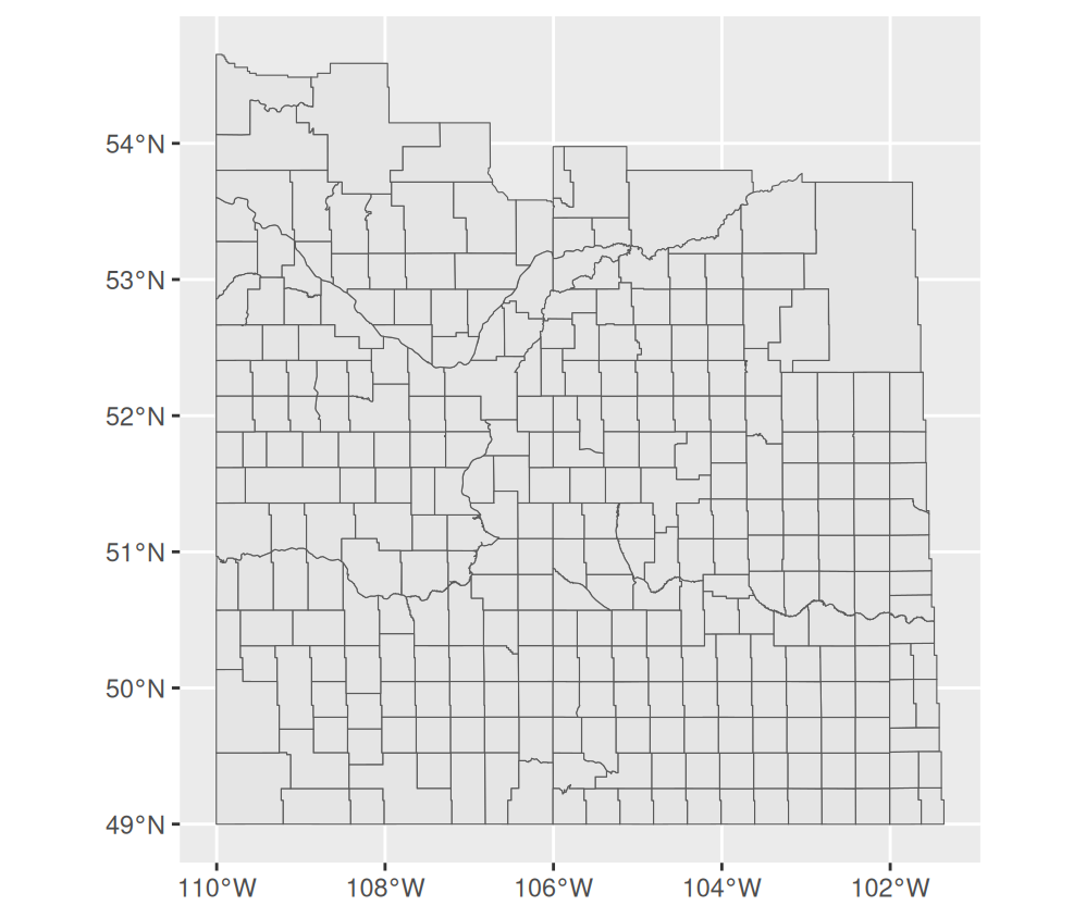
Creating a map is dead simple. We just use ggplot() and give it the name of the data. Then we add a geom_sf() layer, which draws the geometry column. This will plot all the boundaries.
ggplot(rms) +geom_sf()
Figure 20.1: All 296 rural municipalities, drawn from the whole file.
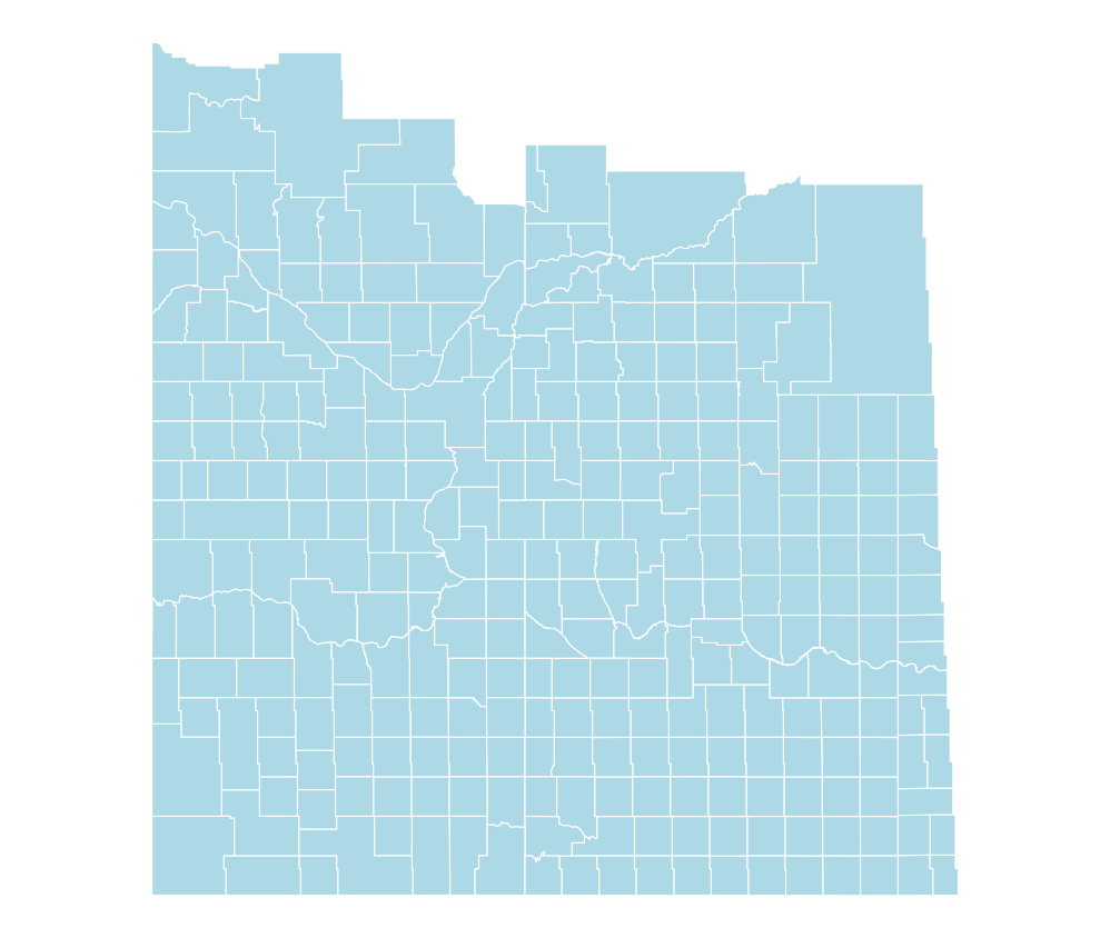
We can make the map look a bit cleaner by adding theme_void() to remove the axes and background. We can also change the fill colour of the polygons and the colour of the borders, by using the fill and colour arguments in geom_sf().
Figure 20.2: The same map with the axes and background removed, and the fill and border colours set.
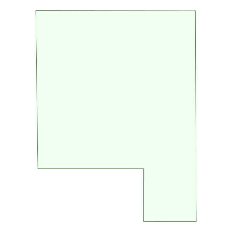
We can also plot a single RM (or a set of RMs) by filtering the data to just that row. For example, let’s plot RM 283, Rosedale.
# One row of the file, and its geometryrosedale <-filter(rms, rmno ==283)ggplot(rosedale) +geom_sf(fill ="honeydew", colour ="darkgreen") +theme_void()
Figure 20.3: RM 283, Rosedale, drawn from its own row of the boundary file.
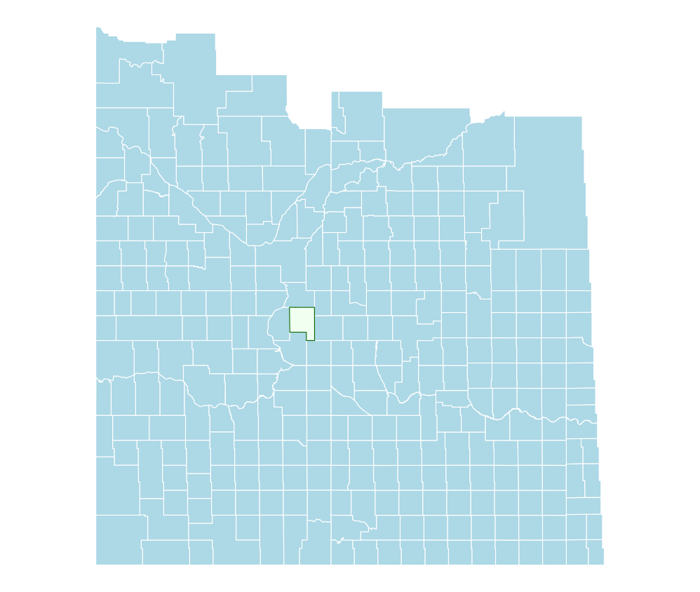
Finally, we can layer maps on top of each other. For example, if we want to highlight the RM of Rosedale on the map we can draw the map of the whole province first and then add the map of Rosedale on top of it (note that we now need to specify the data for the Rosedale layer, since we don’t want to use the whole province for that layer).
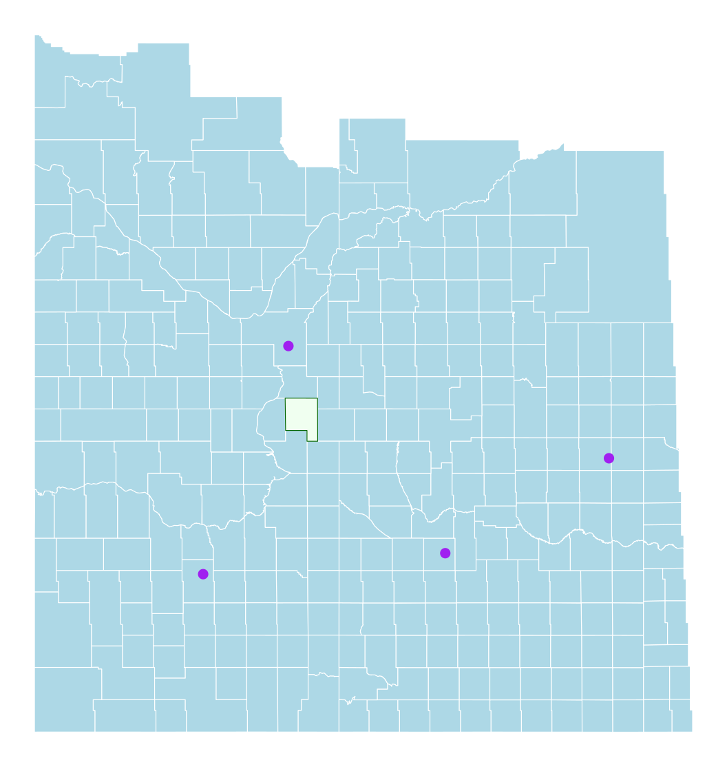
ggplot(rms) +geom_sf(fill="lightblue", colour="white") +geom_sf(data=rosedale, fill ="honeydew", colour ="darkgreen") +theme_void()
Figure 20.4: All 296 rural municipalities, with Rosedale filled in.
20.1.3 Creating vector data from scratch and adding it to a map
We can convert any table that has longitude and latitude columns into a spatial object using the st_as_sf() function. We may want to do that if, for example, we want to add points to a map or create a new spatial dataset from tabular data.
Consider for example, the four largest cities in Saskatchewan, with their longitude and latitude:
City
Longitude
Latitude
Saskatoon
-106.67
52.13
Regina
-104.61
50.45
Swift Current
-107.79
50.28
Yorkton
-102.46
51.22
We can create this as spatial data by first creating a data frame and then using st_as_sf() to convert it to a spatial object. We need to specify which columns hold the coordinates and what coordinate reference system (CRS) they are in. In this case, the coordinates are in degrees, so we use the EPSG code 4326.
# Four cities as a plain tablecities <-data.frame(city =c("Saskatoon", "Regina", "Swift Current", "Yorkton"),lon =c(-106.67, -104.61, -107.79, -102.46),lat =c(52.13, 50.45, 50.28, 51.22))# Turn the coordinate columns into point geometrycities_sf <-st_as_sf(cities, coords =c("lon", "lat"), crs =4326)# Print the spatial versioncities_sf
> # Four cities as a plain table
> cities <- data.frame(
+   city = c("Saskatoon", "Regina", "Swift Current", "Yorkton"),
+   lon = c(-106.67, -104.61, -107.79, -102.46),
+   lat = c(52.13, 50.45, 50.28, 51.22)
+ )
>
> # Turn the coordinate columns into point geometry
> cities_sf <- st_as_sf(cities, coords = c("lon", "lat"), crs = 4326)
>
> # Print the spatial version
> cities_sf
Simple feature collection with 4 features and 1 field
Geometry type: POINT
Dimension:     XY
Bounding box:  xmin: -107.79 ymin: 50.28 xmax: -102.46 ymax: 52.13
Geodetic CRS:  WGS 84
           city              geometry
1     Saskatoon POINT (-106.67 52.13)
2        Regina POINT (-104.61 50.45)
3 Swift Current POINT (-107.79 50.28)
4       Yorkton POINT (-102.46 51.22)
Both objects are now layers that can share a map:
# The polygons, then the points on topggplot(rms) +geom_sf(fill="lightblue", colour="white") +geom_sf(data=rosedale, fill ="honeydew", colour ="darkgreen") +geom_sf(data = cities_sf, colour ="purple", size =2) +theme_void()
Figure 20.5: Two vector layers on one map: the RM polygons and four cities as points.
20.1.4 Mapping values
The maps we have drawn so far are just the shapes of the RMs. We can also map information about the RMs, such as their yields.
To do this, we can attach RM yields to the RM boundaries by joining the two datasets. I am going to use the RM yields dataset that we have been using in this course, to get canola yields in 2023. Then I will map these yields across the whole province.
First I join the data as we learned to do in Section 9.2. Note that the RM number is rmno in the sask_rms.geojson and rm in the rm_yields_1990_2025.csv (noting we changed column names to lower case). Also note that the RM number arrives as text in sask_rms.geojson, which is why we converted it to a number when we read the file – a join needs both keys to be the same type.
# Read the RM yield file: one row per RM, year and croprm_yields <-read_csv("data/rm_yields_1990_2025.csv", show_col_types =FALSE) |>clean_names()# One row per RM: 2023 canolacanola_2023 <- rm_yields |>filter(year ==2023, crop =="Canola") |>select(rm, yield)# Join the yields onto the boundariesrm_canola <-left_join(rms, canola_2023, by =c("rmno"="rm"))##Print the first three rows of the merged object to show the geometry and yield columnshead(rm_canola, 3)
> # Read the RM yield file: one row per RM, year and crop
> rm_yields <- read_csv("data/rm_yields_1990_2025.csv", show_col_types = FALSE) |>
+   clean_names()
>
> # One row per RM: 2023 canola
> canola_2023 <- rm_yields |>
+   filter(year == 2023, crop == "Canola") |>
+   select(rm, yield)
>
> # Join the yields onto the boundaries
> rm_canola <- left_join(rms, canola_2023, by = c("rmno" = "rm"))
>
> ##Print the first three rows of the merged object to show the geometry and yield columns
> head(rm_canola, 3)
Simple feature collection with 3 features and 3 fields
Geometry type: MULTIPOLYGON
Dimension:     XY
Bounding box:  xmin: -108.5354 ymin: 49.26171 xmax: -107.2174 ymax: 51.61981
Geodetic CRS:  WGS 84
  rmno                 rmnm yield                       geometry
1  288      PLEASANT VALLEY  18.5 MULTIPOLYGON (((-108.5354 5...
2  167 SASKATCHEWAN LANDING  18.6 MULTIPOLYGON (((-107.8702 5...
3   46       GLEN MCPHERSON    NA MULTIPOLYGON (((-107.6208 4...
The joined object still has a geometry column, but now it also has a yield column.
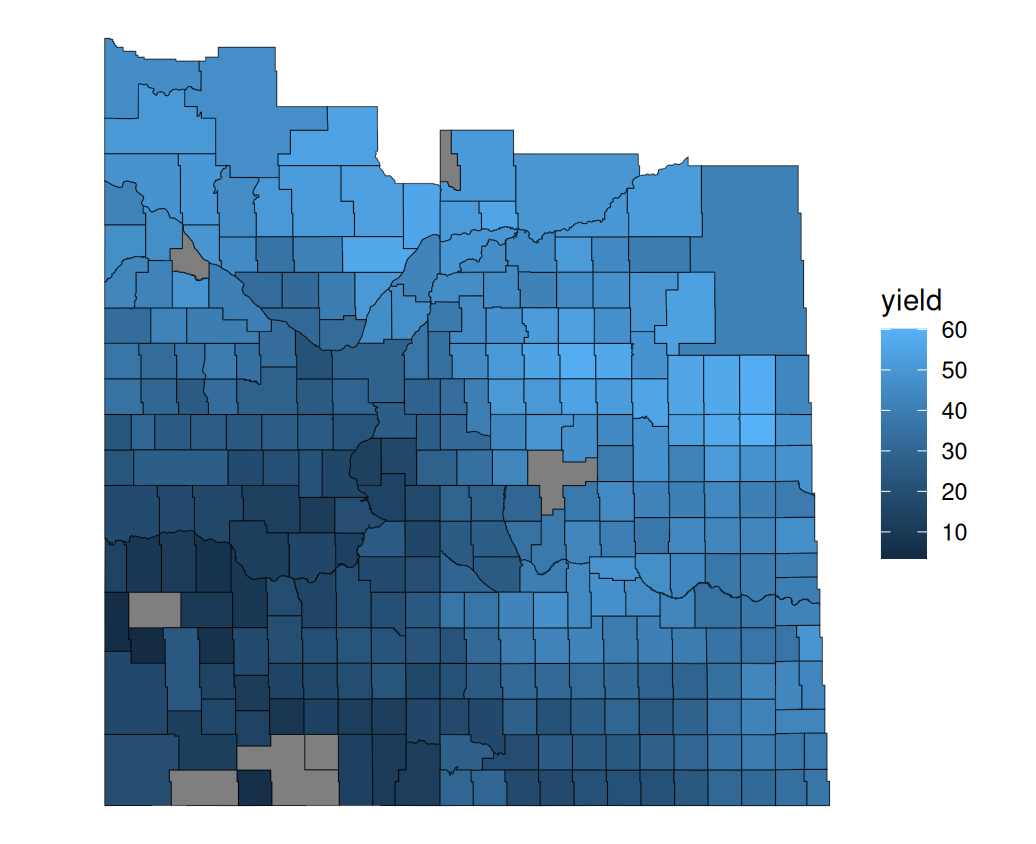
We can now map the yields in each RM, using colour to represent lower and higher yielding RMs. To do so we simply add aes() inside of geom_sf, with the fill argument equal to the column that we want mapped – in this case yield.
ggplot(rm_canola) +# fill each RM by its yield; NA keeps the default greygeom_sf(aes(fill = yield)) +theme_void()## The commented out options below make the graph look nicer, but are optional.## To use them, delete the # and add a + to the end of the line above.# scale_fill_gradient(low = "lightyellow", high = "darkgreen", name = "Yield (bu/ac)") +# labs(title = "Canola yield by RM, 2023")
Figure 20.6: Canola yield by RM, 2023. The seven grey RMs have no reported canola yield for 2023.
For those familiar with the pattern of canola yields, the map looks right – yields are highest in the black and grey soil zones in the north and east of the province and lowest in the brown soil zone in the southwest. The map tells a nice story that a simple table could not.
20.2 Raster data
NoteVideo walkthrough of this section
20.2.1 Reading raster data
Raster data is handled by the terra package rather than sf, and read with rast() rather than st_read(). Printing the object tells you what you have: how many cells, how big each one is, how much ground they cover, and in what CRS.
# Load the package for raster datalibrary(terra)# Read the crop inventory sliceaci <-rast("data/aci_slice_2023.tif")# Size, resolution, extent and CRS in one printoutaci
> # Load the package for raster data
> library(terra)
>
> # Read the crop inventory slice
> aci <- rast("data/aci_slice_2023.tif")
>
> # Size, resolution, extent and CRS in one printout
> aci
class       : SpatRaster
size        : 2997, 2745, 1  (nrow, ncol, nlyr)
resolution  : 30.02163, 30.02163  (x, y)
extent      : 333164.2, 415573.5, 5806675, 5896650  (xmin, xmax, ymin, ymax)
coord. ref. : WGS 84 / UTM zone 13N (EPSG:32613)
source      : aci_slice_2023.tif
name        : aci_2023_sk_v4
min value   :             20
max value   :            230
This data has 2,997 rows and 2,745 columns, so a little over eight million cells, each one 30 metres on a side. Each cell holds a single number.
Those pieces can also be pulled out on their own, which is handy when you want one of them rather than the whole printout. dim() gives the number of rows, columns and layers, res() gives the cell size, and ext() gives the extent.
##Rows, columns and layersdim(aci)##The size of a cell, in the units of the CRS -- here, metresres(aci)##The ground the raster coversext(aci)
> ##Rows, columns and layers
> dim(aci)
[1] 2997 2745    1
>
> ##The size of a cell, in the units of the CRS -- here, metres
> res(aci)
[1] 30.02163 30.02163
>
> ##The ground the raster covers
> ext(aci)
SpatExtent : 333164.15726322721, 415573.54427041067, 5806674.9567502793, 5896649.7956794333 (xmin, xmax, ymin, ymax)
res() returns two numbers because cells need not be square. Here both come back as 30.02 rather than a round 30: the cells were 30 metres in the system the data was first built in, and reprojecting it to this one leaves them a fraction off.
To see those numbers arranged the way they sit on the ground, convert the raster to a matrix and look at a small slice of it. Here are twelve rows and ten columns from where two fields meet:
# The whole raster as a matrix of valuesaci_matrix <-as.matrix(aci, wide =TRUE)# Twelve rows and ten columns, where two fields meetaci_matrix[1380:1391, 2106:2115]
That is the raster. Every number is one 30-metre cell, and its position in the matrix is its position on the ground. Two fields meet in this slice: 146 is spring wheat on the left, 153 is canola on the right, and the line of 34s between them is a road.
20.2.2 Mapping raster data
To map it we need the tidyterra package, which adds geom_spatraster() to ggplot. It works the same way as geom_sf() – give it the data and it draws what it finds.
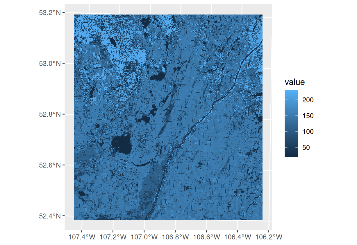
The numbers are class codes, though, not quantities. Canola is not worth more than spring wheat because 153 is a bigger number than 146, so R has to be told the values are categories rather than a scale. If we map the raster as it arrives, it is drawn with a colour gradient running from the lowest code to the highest:
Figure 20.7: The crop inventory mapped before R is told the values are categories. The legend is a numeric ramp, and crops with codes near each other get near-identical shades.
The fields are there, but the legend is a scale from 20 to 230 and two unrelated crops with neighbouring codes come out the same shade.
What we want instead is a crop name attached to each code. The file aci_crop_classes.csv holds those names, along with the colour Agriculture Canada uses for each class on its own maps.
##The code, the name and the official colour for each classclasses <-read_csv("data/aci_crop_classes.csv")head(classes)
> ##The code, the name and the official colour for each class
> classes <- read_csv("data/aci_crop_classes.csv")
Rows: 75 Columns: 3
── Column specification ────────────────────────────────────────────────────────
Delimiter: ","
chr (2): crop, colour
dbl (1): value

ℹ Use `spec()` to retrieve the full column specification for this data.
ℹ Specify the column types or set `show_col_types = FALSE` to quiet this message.
>
> head(classes)
# A tibble: 6 × 3
  value crop                    colour
  <dbl> <chr>                   <chr>
1    10 Cloud                   #000000
2    20 Water                   #3333ff
3    30 Exposed land and barren #996666
4    34 Urban and developed     #cc6699
5    35 Greenhouses             #e1e1e1
6    50 Shrubland               #ffff00
We attach this table to the raster with levels(). This is written the other way round from most functions – the function goes on the left of the arrow and the table on the right:
##Attach the class table to the rasterlevels(aci) <- classes##The raster is now categorical: it knows the names, not just the codesaci
> ##Attach the class table to the raster
> levels(aci) <- classes
>
> ##The raster is now categorical: it knows the names, not just the codes
> aci
class       : SpatRaster
size        : 2997, 2745, 1  (nrow, ncol, nlyr)
resolution  : 30.02163, 30.02163  (x, y)
extent      : 333164.2, 415573.5, 5806675, 5896650  (xmin, xmax, ymin, ymax)
coord. ref. : WGS 84 / UTM zone 13N (EPSG:32613)
source      : aci_slice_2023.tif
categories  : crop, colour
name        :      crop
min value   :     Water
max value   : Mixedwood
The table has to be laid out the way levels() expects: the first column holds the codes that appear in the raster, and the columns after it hold what each code means. Printing the raster again shows the difference – it now reports itself as categorical and lists the class names rather than a range of numbers.
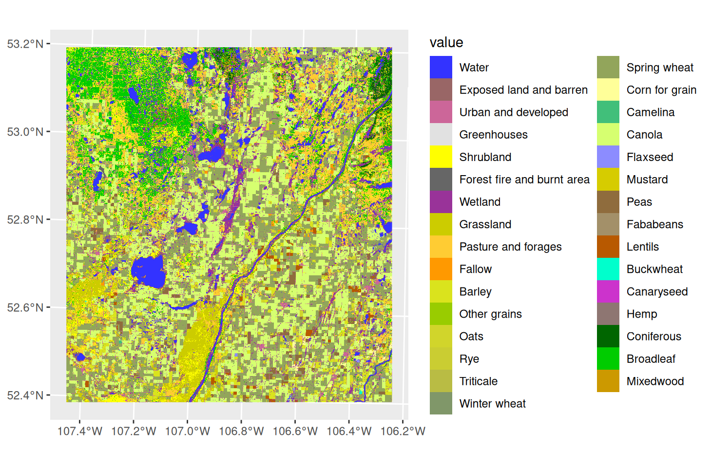
Doing this achieves two things at once. The cells now carry a crop name, so the legend reads as a list of crops, and the raster is categorical, so R stops treating the codes as a scale. We can then set the colours ourselves with scale_fill_manual(), pairing each crop name with its official colour.
Figure 20.8: The 2023 Annual Crop Inventory slice, with each class in its official colour.
Canola and spring wheat take up well over half the area between them, and the river and the roads show up as their own classes.
20.3 Mapping aesthetics
To this point, we’ve been worried mostly about just getting our data into a map. But just like with our graphs, it is important to make our maps interpretable to our audience.
Most importantly, we should title the map and label the legend. If the reader needs any more detail, we can also add a caption. All of these are done with labs(). In the code below we use three arguments:
title – the main title of the map, which should be short and descriptive.
fill – the label for the legend, which should include the units of measurement
caption – a short note about the source of the data, and any other information the reader might need to interpret the map.
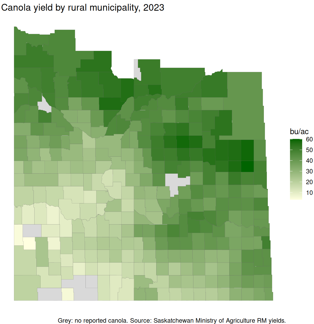
ggplot(rm_canola) +geom_sf(aes(fill = yield), colour ="grey40", linewidth =0.05) +scale_fill_gradient(low ="lightyellow", high ="darkgreen",na.value ="grey85") +theme_void() +labs(title ="Canola yield by rural municipality, 2023",fill ="bu/ac",caption ="Grey: no reported canola. Source: Saskatchewan Ministry of Agriculture RM yields." )
Figure 20.9: The first map, finished: title, units, missing data named, and the source stated.
20.4 Comparing maps
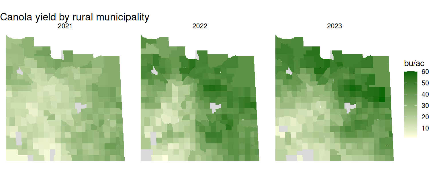
Often we want to compare the same measure across years, or across crops. We could draw a separate map for each and put them beside each other, but ggplot() will do it for us with facet_wrap(), which splits one map into a panel per group. The column we are splitting on goes after a ~.
One thing to be careful of here. We want each year joined on separately rather than all three at once. If we filter the yields to three years and join that to the boundaries, an RM with no canola in 2022 simply has no row for 2022, and it vanishes from that panel instead of being drawn as missing. Joining year by year keeps all 296 RMs in every panel.
# One join per year, so every RM appears on every panelcanola_3 <-bind_rows(left_join(rms, filter(rm_yields, crop =="Canola", year ==2021),by =c("rmno"="rm")) |>mutate(year =2021),left_join(rms, filter(rm_yields, crop =="Canola", year ==2022),by =c("rmno"="rm")) |>mutate(year =2022),left_join(rms, filter(rm_yields, crop =="Canola", year ==2023),by =c("rmno"="rm")) |>mutate(year =2023))ggplot(canola_3) +geom_sf(aes(fill = yield), colour =NA) +facet_wrap(~ year) +scale_fill_gradient(low ="lightyellow", high ="darkgreen",na.value ="grey85") +theme_void() +labs(title ="Canola yield by rural municipality",fill ="bu/ac")
Figure 20.10: Canola yield by RM for three years, on one shared scale.
The three panels share one fill scale, which is what makes them comparable: a colour means the same number of bushels in every panel, so 2021 reads as the poor year it was. Had each panel been scaled to its own range, the darkest green in 2021 would mean something different from the darkest green in 2023, and all three years would look much the same.