| RMNO | RMNM | geometry |
|---|---|---|
| 288 | PLEASANT VALLEY | MULTIPOLYGON (((-108.5354 51.61965, -108.1134 … |
| 167 | SASKATCHEWAN LANDING | MULTIPOLYGON (((-107.8702 50.6925, -107.8383 5… |
| 046 | GLEN MCPHERSON | MULTIPOLYGON (((-107.6208 49.52375, -107.2175 … |
| 075 | PINTO CREEK | MULTIPOLYGON (((-106.8173 49.78532, -106.8174 … |
| 104 | GRAVELBOURG | MULTIPOLYGON (((-106.8241 50.04768, -106.4145 … |
| 283 | ROSEDALE | MULTIPOLYGON (((-106.7129 51.70728, -106.2877 … |
19 Spatial Data
Almost everything in agriculture happens somewhere that we can point to on a map: a yield belongs to a field, a rainfall reading to a gauge, and an insurance contract is offered to farmers in a particular risk zone. Spatial data is data that keeps the where attached to the numbers, so that location itself can be part of the analysis.
Most spatial data comes in one of two shapes: vector data and raster data.
19.1 Vector data
Vector data describes things with boundaries or positions: points (a weather station, an elevator), lines (a road, a river), and polygons (a field, a rural municipality, a risk zone). A vector dataset is a table like any other, except that each row carries a geometry column describing its shape.
In this class, we will use geojson files for vector data. They are essentially the same as a CSV file, with an extra column that holds the geometry. Consider for example, sask_rms.geojson, which holds the boundaries of all 296 Saskatchewan rural municipalities. The first few rows of the file are shown in Table 19.1.
There are three columns:
RMNOis the RM numberRMNMis the RM namegeometryis the geometry column that holds the shape of each RM.
Geometry looks intimidating. But it is just a list of points (usually longitude and latitude). If you connect these points you get a shape on a map.
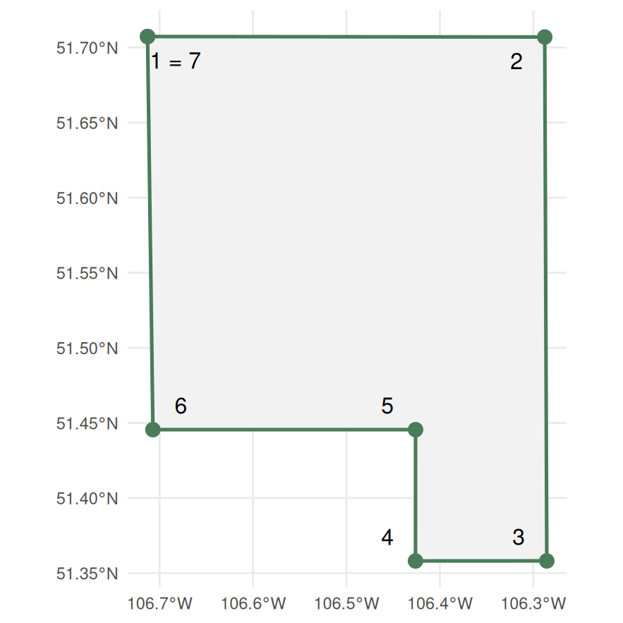
Consider the Rosedale RM, the last row of the table. Its geometry is a polygon with seven points, which are shown in Table 19.2. Note that the last point repeats the first to create a closed shape or polygon.
The order the points are stored in matters, because the boundary is drawn by joining them in that order. The same points listed in a different order trace a different shape, and if the lines end up crossing each other the polygon is not valid – a shape whose boundary crosses itself has no single inside, so there is no area to measure.
| Point | X | Y |
|---|---|---|
| 1 | -106.7129 | 51.7073 |
| 2 | -106.2877 | 51.7070 |
| 3 | -106.2855 | 51.3581 |
| 4 | -106.4261 | 51.3581 |
| 5 | -106.4260 | 51.4455 |
| 6 | -106.7072 | 51.4455 |
| 7 | -106.7129 | 51.7073 |
Figure 19.1 shows these seven points when they are connected on a map. The shape is a rectangle with a square cut out of the bottom left corner.
Many RMs in the province are simple rectangles, but others are more complex. For example, the RM of Prince Albert has 112 points because its boundary follows a river.
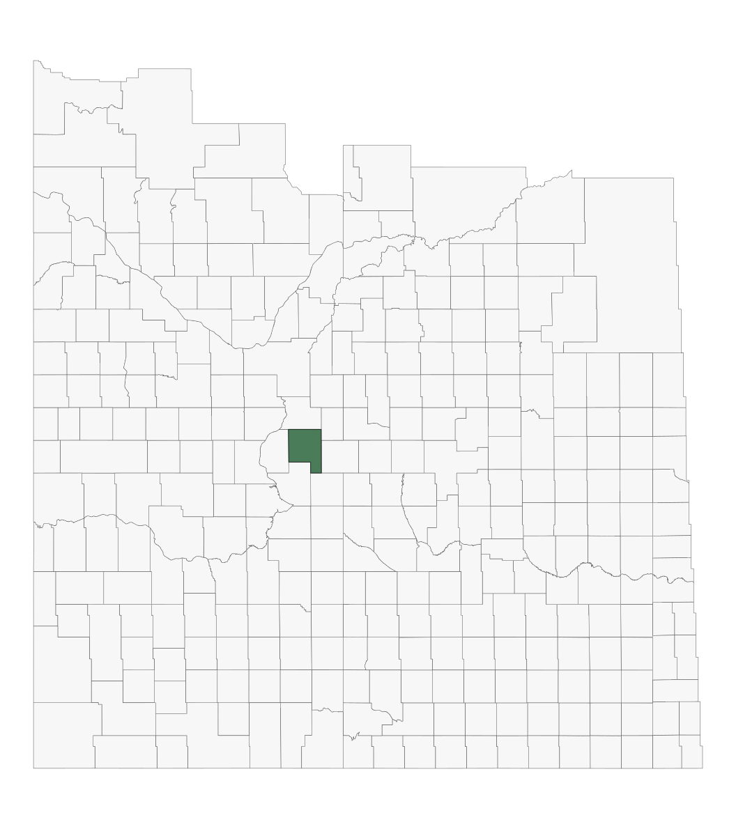
We can plot all the RMs in the province by putting on a map all the boundary points in the geometries of all RMs. Figure 19.2 shows the result, with Rosedale highlighted in green.
19.2 Raster data
Raster data divides the land into a grid of equal cells and stores one value per cell. Satellite imagery is typically raster data. For example, the Annual Crop Inventory dataset divides all agricultural land in Canada into 30-metre cells, and each cell holds a single value that represents the crop that was grown in that cell (or, at least, Agriculture Canada’s prediction of what was grown in that cell.)
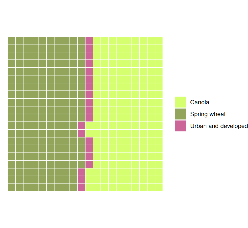
Before any of it is drawn, a raster is just a grid of numbers. Table 19.3 is a 20-by-20 window of the 2023 Annual Crop Inventory, covering 600 metres of ground in each direction. Every number is one 30-metre cell, and the number says what was growing there: 153 is canola, 146 is spring wheat, and 34 is urban and developed land, which here is a road.
| 146 | 146 | 146 | 146 | 146 | 146 | 146 | 146 | 146 | 146 | 34 | 153 | 153 | 153 | 153 | 153 | 153 | 153 | 153 | 153 | |
| 146 | 146 | 146 | 146 | 146 | 146 | 146 | 146 | 146 | 146 | 34 | 153 | 153 | 153 | 153 | 153 | 153 | 153 | 153 | 153 | |
| 146 | 146 | 146 | 146 | 146 | 146 | 146 | 146 | 146 | 146 | 34 | 153 | 153 | 153 | 153 | 153 | 153 | 153 | 153 | 153 | |
| 146 | 146 | 146 | 146 | 146 | 146 | 146 | 146 | 146 | 146 | 34 | 153 | 153 | 153 | 153 | 153 | 153 | 153 | 153 | 153 | |
| 146 | 146 | 146 | 146 | 146 | 146 | 146 | 146 | 146 | 146 | 34 | 153 | 153 | 153 | 153 | 153 | 153 | 153 | 153 | 153 | |
| 146 | 146 | 146 | 146 | 146 | 146 | 146 | 146 | 146 | 146 | 34 | 153 | 153 | 153 | 153 | 153 | 153 | 153 | 153 | 153 | |
| 146 | 146 | 146 | 146 | 146 | 146 | 146 | 146 | 146 | 146 | 34 | 153 | 153 | 153 | 153 | 153 | 153 | 153 | 153 | 153 | |
| 146 | 146 | 146 | 146 | 146 | 146 | 146 | 146 | 146 | 146 | 34 | 153 | 153 | 153 | 153 | 153 | 153 | 153 | 153 | 153 | |
| 146 | 146 | 146 | 146 | 146 | 146 | 146 | 146 | 146 | 146 | 34 | 153 | 153 | 153 | 153 | 153 | 153 | 153 | 153 | 153 | |
| 146 | 146 | 146 | 146 | 146 | 146 | 146 | 146 | 146 | 146 | 34 | 153 | 153 | 153 | 153 | 153 | 153 | 153 | 153 | 153 | |
| 146 | 146 | 146 | 146 | 146 | 146 | 146 | 146 | 146 | 146 | 34 | 153 | 153 | 153 | 153 | 153 | 153 | 153 | 153 | 153 | |
| 146 | 146 | 146 | 146 | 146 | 146 | 146 | 146 | 146 | 34 | 153 | 153 | 153 | 153 | 153 | 153 | 153 | 153 | 153 | 153 | |
| 146 | 146 | 146 | 146 | 146 | 146 | 146 | 146 | 146 | 34 | 153 | 153 | 153 | 153 | 153 | 153 | 153 | 153 | 153 | 153 | |
| 146 | 146 | 146 | 146 | 146 | 146 | 146 | 146 | 146 | 146 | 34 | 153 | 153 | 153 | 153 | 153 | 153 | 153 | 153 | 153 | |
| 146 | 146 | 146 | 146 | 146 | 146 | 146 | 146 | 146 | 146 | 34 | 153 | 153 | 153 | 153 | 153 | 153 | 153 | 153 | 153 | |
| 146 | 146 | 146 | 146 | 146 | 146 | 146 | 146 | 146 | 146 | 34 | 153 | 153 | 153 | 153 | 153 | 153 | 153 | 153 | 153 | |
| 146 | 146 | 146 | 146 | 146 | 146 | 146 | 146 | 146 | 146 | 34 | 153 | 153 | 153 | 153 | 153 | 153 | 153 | 153 | 153 | |
| 146 | 146 | 146 | 146 | 146 | 146 | 146 | 146 | 146 | 34 | 153 | 153 | 153 | 153 | 153 | 153 | 153 | 153 | 153 | 153 | |
| 146 | 146 | 146 | 146 | 146 | 146 | 146 | 146 | 146 | 34 | 153 | 153 | 153 | 153 | 153 | 153 | 153 | 153 | 153 | 153 | |
| 146 | 146 | 146 | 146 | 146 | 146 | 146 | 146 | 146 | 34 | 153 | 153 | 153 | 153 | 153 | 153 | 153 | 153 | 153 | 153 |
The road is visible in the numbers: a line of 34s running down the middle of the window, jogging a column to the left part way down. On either side of it, one field of spring wheat and one of canola. Nothing has been drawn yet and the shapes are already there.
Give every number a colour and the picture appears. Figure 19.3 draws the same 400 cells.
Note that the numbers in raster data can be either continuous or categorical. Continuous data has a natural numbering with some unit or scale – for example, yields might be in bu/acre or rainfall in mm. Categorical data has no natural numbering, and the numbers are just codes for classes – for example, the Annual Crop Inventory uses 153 to mean canola, 146 to mean spring wheat, and so on. The numbers themselves have no meaning; they are just a way to store the class.
This has implications for how we will plot the data. Continuous data can be drawn with a colour gradient – darker colours typically representing higher values, while categorical data should be plotted with colours that allow you to clearly distinguish one class from another – the numbers that are closer together are not necessarily any more similar than numbers that are far apart.
19.3 Coordinates and reference systems
A location is usually written as a longitude and a latitude. But beware that the order of these two can vary: maps, GPS units and Google write latitude first, while R and most spatial file formats want longitude first, because longitude is the x coordinate and latitude is the y.
Getting the order wrong is one of the most common mistakes in spatial work. A field near Saskatoon sits at longitude -106.55 and latitude 52.19. Enter those two numbers the other way round and you get:
| Entry order | Longitude | Latitude | What it means |
|---|---|---|---|
| Longitude first | -106.55 | 52.19 | the field, near Saskatoon |
| Latitude first | 52.19 | -106.55 | nowhere – latitude only runs from -90 to 90 |
Anywhere in Saskatchewan the swap gives an impossible latitude, because our longitudes are all beyond -90. That is a useful accident: the error announces itself. Closer to the equator a swap can land you somewhere real and wrong, which is much harder to notice.
One issue in mapping is that maps are flat but Earth is curved. Representing Earth’s curved surface on a flat map requires a map projection. Every projection introduces some distortion of shapes, areas, distances, or directions.
A coordinate reference system (CRS) tells us what a dataset’s coordinates mean and how they relate to locations on Earth. Two main kinds you’ll encounter are:
- A geographic CRS that describes positions using latitude and longitude in degrees. A common example is WGS 84 (EPSG:4326).
- A projected CRS that uses a map projection to describe positions on a flat surface, usually in metres or feet. One example used in Saskatchewan is NAD83(CSRS) / UTM Zone 13N.
The same place can have different coordinates in different CRSs—just as the same distance can be expressed in metres or feet.
For our purposes, the important thing is to ensure that if we are using multiple maps, that they share the same CRS. If not, we need to convert them to a common CRS before we can combine them.
19.4 Resolution, scale and extent
Resolution is the size of the smallest thing the data can tell apart. For a raster it is the cell: the Annual Crop Inventory’s cells are 30 metres, so a quarter section is about 27 cells across, and anything smaller than a cell – a slough’s edge, a yard site – is rounded into whichever class dominates the cell. Vector data has a resolution too, in how finely its boundaries are drawn; the RM file this chapter uses has been simplified to within a few hundred metres, which is fine for a provincial map, but too coarse for measuring a boundary line. Data also has a resolution in time: a yield monitor logs a point every second, the crop inventory gives one value per year.
Extent is how much ground the data covers: it could be a single field for a machinery file, a province, or the entire globe.