16 Graphing with AI
Graphing is a good place to begin using AI assistance. ggplot2 is a great package, but details such as annotations, direct labels and axis breaks require arguments that are easy to forget and somewhat difficult to implement – for example, getting text in just the right place can take trial and error.
It is also fairly easy to verify the work an AI assistant does on a chart. If you make the raw chart yourself and then ask only for changes to how it looks, you can see whether each change happened without reading the code. That only holds for cosmetic changes: if you ask it to alter what is being plotted – the filtering, the grouping, the scales – you need to check the code as well.
In this chapter I walk through creating two different graphs using the Google Antigravity extension. The chapter is mostly structured around the following video:
The prompts I used in the video, and the code and graphs they produced, are below, though you will need to watch the video to make sense of them.
16.1 Creating a barley variety acreage graph
In Chapter 12 we made this chart of barley variety acres.
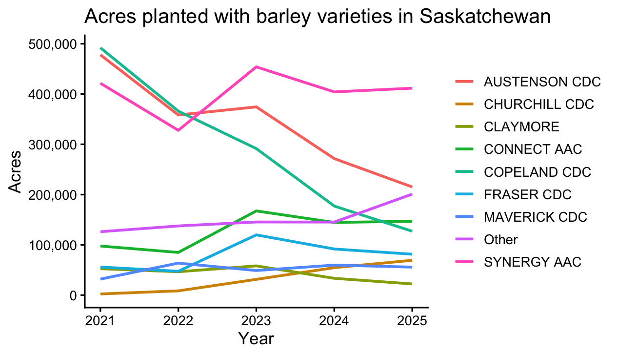
It was fine, but a few things could be better. In the prompts below I rebuilt it and improved on it. After each prompt, a new graph was created and I then asked for further improvements. The video has the details.
Read data/sask_variety_yields.csv. Summarize its structure – the columns, what one row represents, the years covered, and anything I should know about missing values – and add that summary to the Datasets section of README.md.
Write R code to create a graph that plots the acreage of the top 8 Barley varieties by acreage (this would involve filtering the crop to be Barley). Group all other varieties into an other category that will also be plotted. PLot the total acreage of these varieties in a line chart running from 2020 to 2025.
REduce this to the top 6 varieites. Make 2020 the first year. Directly label the lines in the graph as opposed to using a legend.
Make 2021 the first year. Put the vertical axes in thousands of acres, ensure it is not in sceintific notation. Use classic style for the graph with very feint horizontal gridlines on each 100,000
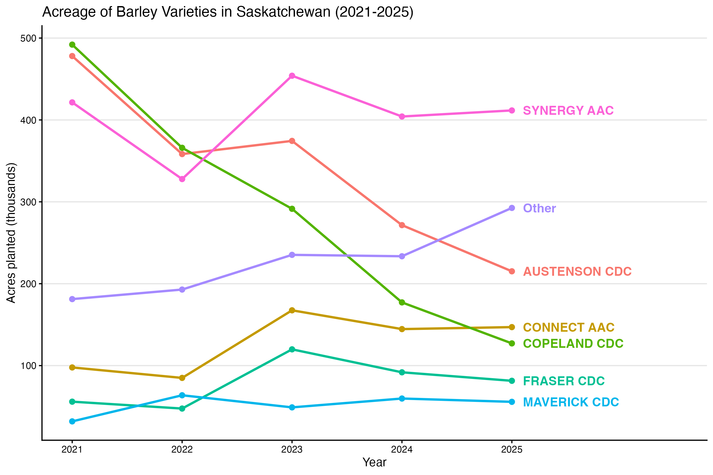
For the vertical axies rename to Acres planted (thousands). And retitle the graph as Acreage of Barley Varieties in Saskatchewan (2021-2025).
The final output is below.
16.2 Building a graph from scratch
In the previous example, I asked an AI agent to create a graph based on data on my computer. In the next example, I asked it to create a graph based on data I had not yet downloaded from Statistics Canada. It downloaded the data, explored it, and created the chart for me.
Here is my prompt:
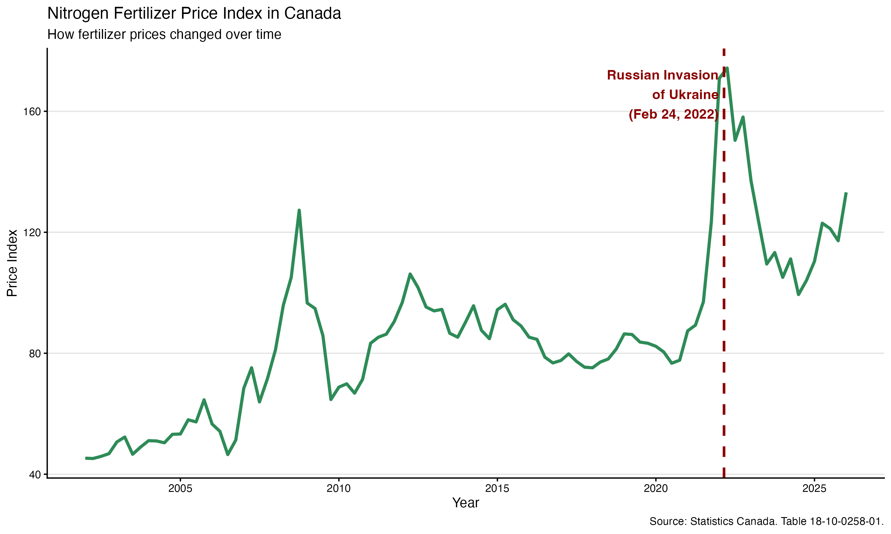
New task. Download the nitrogen fertilizer price index from Statistics Canada (Table 18-10-0258-01) using the cansim package. Analyze the data in R. Create a graph showing how prices have changed over time and annotate the date of the Russian invasion of Ukraine. Write a short report describing the data source, what the data measure, and the main pattern shown in the graph. The audience for the report is just myself, so that I can verify what you have done. But I will later embed the chart in a report. Save everything needed to reproduce the analysis in this project i na new folder called fert_prices.
Here is the chart it produced, the R code, and the final report.
# Load required packages
library(tidyverse)
library(cansim)

# Download Farm input price index data from Statistics Canada
raw_data <- get_cansim("18-10-0258-01")

# Filter for Nitrogen fertilizers in Canada
nitrogen_data <- raw_data %>%
  filter(
    `Price index` == "Nitrogen fertilizers",
    GEO == "Canada"
  ) %>%
  # Keep only necessary columns and drop missing values
  select(Date, GEO, `Price index`, VALUE) %>%
  drop_na(VALUE)

# Define the date of the Russian invasion of Ukraine
invasion_date <- as.Date("2022-02-24")

# Determine a good y-coordinate for the annotation
y_annotation <- max(nitrogen_data$VALUE, na.rm = TRUE) * 0.95

# Create the plot
nitrogen_plot <- ggplot(data = nitrogen_data, aes(x = Date, y = VALUE)) +
  # Add the time series line
  geom_line(color = "#2E8B57", linewidth = 1.2) +
  # Add a vertical dashed line for the invasion date
  geom_vline(xintercept = invasion_date, color = "darkred", linetype = "dashed", linewidth = 1) +
  # Add a text annotation next to the vertical line
  annotate("text", x = invasion_date - 60, y = y_annotation,
           label = "Russian Invasion\nof Ukraine\n(Feb 24, 2022)",
           hjust = 1, color = "darkred", fontface = "bold") +
  # Add titles and labels
  labs(
    title = "Nitrogen Fertilizer Price Index in Canada",
    subtitle = "How fertilizer prices changed over time",
    x = "Year",
    y = "Price Index",
    caption = "Source: Statistics Canada. Table 18-10-0258-01."
  ) +
  # Apply a clean theme
  theme_classic() +
  # Add faint horizontal gridlines for readability
  theme(
    panel.grid.major.y = element_line(color = "grey90", linewidth = 0.5)
  )

# Save the plot
ggsave("fert_prices/nitrogen_price_index.png", plot = nitrogen_plot, width = 10, height = 6)# Nitrogen Fertilizer Price Index Report
## Data Source
The data analyzed in this project comes from Statistics Canada's **Table 18-10-0258-01: Farm Input Price Index**. This specific analysis filters the table to focus on the `"Nitrogen fertilizers"` price index for `"Canada"`.
The data was programmatically retrieved and processed using the R programming language via the `cansim` API package, which ensures the analysis is always based on the latest available data.
## What the Data Measures
The Farm Input Price Index (FIPI) measures the change in prices that Canadian farmers pay for the inputs they use in agricultural production. Rather than tracking absolute dollar prices (e.g., dollars per tonne), the data is presented as an *index* relative to a base period. An increase in the index value indicates that the average price of nitrogen fertilizers across Canada has increased relative to the baseline.
## Main Patterns
As seen in the accompanying graph (`nitrogen_price_index.png`), nitrogen fertilizer prices have experienced significant volatility over the tracked period.
Most notably, there was a steep, dramatic upward spike in the price index beginning in late 2021. This surge was initially driven by rising global natural gas prices and supply chain bottlenecks, and it was further exacerbated by the Russian invasion of Ukraine on February 24, 2022. Following the invasion, prices peaked due to disruptions in the global fertilizer supply chain and geopolitical trade sanctions, before beginning a steady decline through 2023 and 2024 as global markets adjusted.Read that last paragraph again. The agent explains the price spike with natural gas prices, supply chain bottlenecks and trade sanctions – none of which is in the data it was given. It plotted a line and an event marker; everything else is the model supplying a plausible story. The explanations may well be right, but nothing here establishes that, and if you put them in a report they become your claims. The chart also needs two things the agent did not say: the series is quarterly, and it is an index with 2012 = 100, so the values are not dollars.
16.3 More general tips for working with AI
AI output is sensitive to the way you prompt the program. Although AI is becoming better at autonomous work, it still benefits from clear instructions. Here are some tips:
Start with the outcome, not the procedure. Be specific about the deliverables and what it means for the task to be completed.
Ask the agent to verify its own work. Even better, ask the agent to spawn other agents to verify its work. These new agents will not have the context of the working agent, so they are better able to assess the work on its own merits.
Give it the context it needs. Explain what the work is for, what files/data already exist, who the audience is, and any relevant background.
Balance giving constraints with allowing for flexibility. For data analysis, we would definitely want the agent to write R code, as opposed to Python code (assuming we aren’t familiar with the Python language). However, we may not want to specify the exact R functions to use, as the AI may be able to introduce us to new approaches.
Review the agent’s work, not just its final answer. An agent can produce a beautiful graph from the wrong series. Check its source, data selection, code, assumptions, and intermediate decisions. Greater autonomy makes oversight more important, not less.
- ggplot2: Elegant Graphics for Data Analysis, ggplot2-book.org – an explanation of the grammar and its components.
- R Graph Gallery, r-graph-gallery.com – examples organized by the kind of chart being built.
- ggplot2 reference, ggplot2.tidyverse.org/reference – function arguments and current syntax.