> summary(lm(Murder ~ UrbanPop, data = USArrests))

Call:
lm(formula = Murder ~ UrbanPop, data = USArrests)

Residuals:
   Min     1Q Median     3Q    Max
-6.537 -3.736 -0.779  3.332  9.728

Coefficients:
            Estimate Std. Error t value Pr(>|t|)
(Intercept)  6.41594    2.90669   2.207   0.0321 *
UrbanPop     0.02093    0.04333   0.483   0.6312
---
Signif. codes:  0 '***' 0.001 '**' 0.01 '*' 0.05 '.' 0.1 ' ' 1

Residual standard error: 4.39 on 48 degrees of freedom
Multiple R-squared:  0.00484,	Adjusted R-squared:  -0.01589
F-statistic: 0.2335 on 1 and 48 DF,  p-value: 0.6312
Module 7 - Test bank
This bank holds 30 questions, in four sections.
- Section 1 (10 questions) is about what a linear model is, what it assumes, and what a p-value does and does not tell you. No code, and no file needed.
- Section 2 (10 questions) is about reading and interpreting model output. You are given a fitted model and asked what it says, both statistically and in the units of the problem. No code needed – the output is printed with each question. Most use data from outside agriculture, because reading output is the same skill everywhere.
- Section 3 (5 questions) covers correlation and linear models, written and run in R.
- Section 4 (5 questions) covers functional form – logs, quadratics, and choosing between them – written and run in R.
Sections 3 and 4 use these files:
- RM yields and weather. One row per RM per year, 2015 to 2024, with the crop yields and that year’s weather side by side. Most questions use this. It carries a column for each of six crops in bu/ac; the RM’s name, population and nearest Environment Canada weather station, with how far away it is (
station_km); and that station’s weather:precip_may_aug_mm(growing-season rainfall),gdd_base5(growing degree days above 5 °C, the heat a crop needs),odd_above30(degrees above 30 °C summed over the season, the heat that damages it) anddays_above_30. - Canola trial. 120 fields with a nitrogen rate (
fertilizer_kg_ha), growing-season rainfall (rainfall_mm), thevarietygrown and theyield_bu_acreharvested. - Barley trial. 120 fields with the same four columns.
- Saskatchewan wheat fields 2025. 150 fields with
soil_zone(Brown, Dark Brown or Black),variety,acres,yield_bu_ac,protein_pctandseeded_rate_lb_ac.
Your module test will contain one question per section. Sections 1 and 2 are answered in the Canvas text box, in sentences, without AI assistance. Sections 3 and 4 are answered with an R script – you may use AI to help write the code – with a header block, a labelled section for each question, and your sentence answers written as comments. It should run top to bottom in a fresh session.
You are allowed to use AI in sections 3 and 4, and AI has a memory, so the questions on your test will not be the ones below. I will change them slightly – a different crop, a different weather column, a different file – though the concepts will be exactly the same.
For each question, 20% of the mark is for presentation and the other 80% is for the correctness of your script and answers.
Section 1 — Models, assumptions and p-values
These questions are about what a linear model is, what it assumes, and what a p-value does and does not tell you. They are answered in the Canvas text box, in sentences. There is no code in this section, and you do not need any file in front of you.
Question 1
(a) A linear model of canola yield on nitrogen rate is written \(y = \beta_0 + \beta_1 x + \varepsilon\). Say what \(y\), \(\beta_0\), \(\beta_1\) and \(x\) refer to in this example.
(b) The fitted model is \(\widehat{y} = 37.0 + 0.131x\), with yield in bu/ac and nitrogen in kg/ha. State what the slope means in a sentence that includes both units.
(c) A classmate reads the intercept as “a field with no nitrogen yields 37 bu/ac.” The nitrogen rates in the trial run from 70 to 183 kg/ha. Is their reading sound?
Answer
(a) \(y\) is the response, the yield we are trying to explain. \(x\) is the explanatory variable, the nitrogen rate. \(\beta_0\) is the intercept, the value of \(y\) the line gives at \(x = 0\). \(\beta_1\) is the slope, the change in yield that goes with a one-unit change in nitrogen. (\(\varepsilon\) is the error – everything else that moves yield and is not nitrogen.)
(b) One more kg/ha of nitrogen goes with 0.131 bu/ac more yield, on average across these fields.
(c) No. The intercept is where the line crosses \(x = 0\), and no field in the trial had a nitrogen rate anywhere near zero – the lowest was 70 kg/ha. The line has to cross the axis somewhere and 37.0 is where it happens to cross; it is not a measurement of unfertilized yield. Reading it that way is extrapolating well past the data.
Question 2
The assumptions behind reading a linear model as the true relationship.
(a) State the assumptions behind reading a linear model as a true relationship, in one or two sentences each.
Answer
(a) There are four.
Linearity. The true relationship between the two variables is approximately a straight line. A linear model can only capture a linear relationship, so if the real one bends, the line will misdescribe it.
Direction of the relationship. The response variable is the one being explained and the explanatory variable is the one that could move it, not the other way round. It makes sense to put yield on the left and rainfall on the right, because a good yield cannot produce more rain.
Exogeneity. Nothing else that affects the response is related to the explanatory variable. Whatever the model leaves out lands in the error term, and if any of it moves with \(x\) the coefficient carries that along as well – which is omitted variable bias.
Random sampling. The data is a random or representative sample of the population you want to describe. If the effect differs across subgroups and the sample only covers one of them, the estimate does not describe the whole population.
Question 3
A researcher regresses a student’s final grade on whether they attended an extra help session, and finds attendance goes with lower grades.
(a) Which assumption is in trouble here?
(b) Explain why the negative coefficient appears, without claiming the session harms anyone.
(c) What would you need in order to estimate the real effect of the session?
Answer
(a) Exogeneity. Something left out of the model – how the student was already doing – is related to the explanatory variable, so it sits in the error term and moves with attendance.
(b) Students who attend are the ones who are already struggling. The variable marks out a group with lower grades for reasons that have nothing to do with the session, and the model cannot separate “went to the session” from “was struggling to begin with.” The coefficient picks up both.
(c) Something that makes attendance independent of how the student was already doing – assigning the session at random, or some outside reason for attending that is unrelated to their grade. Failing that, measuring the thing you are worried about (prior grades) and holding it constant gets you part of the way.
Question 4
A grain buyer records the last digit of the licence plate on each of 60 trucks that deliver, alongside the moisture reading taken at the scale. The buyer then runs a linear regression with the plate digit as the explanatory variable and the moisture reading as the response. The regression has a slope of -0.053 percentage points of moisture per unit of plate digit, with a p-value of 0.364.
(a) There is no mechanism by which a plate digit could change grain moisture, so the true slope is zero. Why is the fitted slope not zero?
(b) State what the p-value of 0.364 means here.
(c) Would a p-value of 0.364 ever let you conclude the true effect is zero?
Answer
(a) Because the line is fitted to a sample. The 60 moisture readings scatter for reasons that have nothing to do with the plate digit, and the best line through any particular scatter will tilt one way or the other by chance. It would be a surprise if it came out exactly flat.
(b) If the true slope really is zero, then in about 36% of samples like this one we would see a slope at least as far from zero as -0.053, in either direction. Which is to say: this is an entirely ordinary result for data with no relationship in it.
(c) No. A large p-value says the data cannot distinguish the estimate from zero – it is a statement about what this sample can resolve, not a finding that the effect is absent. A small sample of a real effect produces large p-values too. Here we happen to know the effect is absent, but we know that from the absence of any mechanism, not from the p-value.
Question 5
A seed treatment is tested on 90 plots of spring wheat, 45 treated and 45 untreated. The estimated effect is 0.74 bu/ac with a p-value of 0.131. The treatment costs about $6.00/ac and spring wheat is worth about $9.50/bu.
(a) Define what a p-value is.
(b) State what the p-value of 0.131 means here.
(c) The estimated effect is worth about $7.00/ac against a cost of $6.00/ac. Would you recommend the treatment on this evidence?
Answer
(a) The p-value is the probability of seeing a result at least as extreme as the one observed, if the true effect were actually zero.
(b) If the treatment really had no effect, then in about 13% of trials like this one we would see an estimated effect at least as far from zero as 0.74 bu/ac, in either direction. We cannot say with confidence that the effect is non-zero – as we could obtain this estimate by random chance even if the true value were zero. But we also cannot say the effect is zero.
(c) Not on this evidence alone. The point estimate does clear the cost, with about $1/ac to spare. The problem is that the treatment has to deliver 0.632 bu/ac just to break even, and the range of effects this trial is consistent with runs from about -0.21 to 1.68 bu/ac – which includes break-even and a good deal below it. The trial is consistent both with a treatment that pays and one that loses money, and a larger trial is what would settle it.
Question 6
(a) What range of numbers can the correlation take? What do positive and negative values mean?
(b) In a particular year, you find that yield and rainfall across Saskatchewan RMs correlate at 0.00. Does that mean rainfall does not matter to yield?
Answer
(a) The correlation can take any value between -1 and 1, inclusive. A positive correlation indicates that as one variable increases, the other tends to increase as well. A negative correlation indicates that as one variable increases, the other tends to decrease.
(b) No. Rain might help up to a point and hurts after it. Yield rises with rainfall across the dry half of the range and falls across the wet half. In a wet year, it could be the case that these two effects cancel out.
Question 7
(a) Name three explanations for a correlation between two variables other than “the first causes the second.”
(b) Give an example of each of the three explanations in (a).
Answer
(a) Chance; reverse causation, where the second causes the first; and a third variable driving both.
(b) Chance: plate digit and grain moisture in Question 4 – 60 loads produced a slope of -0.053 with nothing behind it. Reverse causation: yield and nitrogen rate across a province, where a grower expecting a good year applies more. A third variable: ice cream sales and drowning deaths, both driven by summer weather.
Question 8
(a) What is \(R^2\)?
(b) A model of yield on nitrogen has an \(R^2\) of 0.34. State what that means for this data.
(c) A model of yield on a fungicide seed treatment produces a model with an \(R^2\) of 0.02. Is this low \(R^2\) a problem?
Answer
(a) The fraction of the variation in the response that the model accounts for.
(b) About 34% of the variation in yield across these fields is accounted for by nitrogen rate. The other 66% is everything else – rainfall, soil, management.
(c) Not necessarily. It depends on what the model is for. Weather and management move yield far more than a seed treatment does, so a small \(R^2\) is exactly what you would expect even if the treatment works and the coefficient is measured well. If you wanted the model to predict yield you would want a high \(R^2\); if you want to know the effect of one input, a low one is not disqualifying.
Question 9
(a) What is an outlier, and why do they matter?
(b) A field yielding 9 bu/ac and a field yielding 340 bu/ac both sit well away from the rest. How would you treat each?
Answer
(a) A point sitting far from the rest of the data. One out at the edge of the x range has leverage: it is a long way from the centre, so tilting the line towards it barely moves the fit anywhere else, and it can swing the slope on its own.
(b) Find out what each one is before deciding. 9 bu/ac is a plausible yield for a field that was hailed out – a real observation, but not one telling you about the relationship you are trying to measure. 340 bu/ac is not a possible yield for any of these crops, so it is likely a data-entry error.
Question 10
(a) Is it possible that the correlation between two variables is positive, but when we regress one value on another the slope is negative? Explain.
(b) Is it valid to have a regression with the number of hours studied as the response variable and grade as the explanatory variable? If you tried to run this regression in R, would you get an error?
Answer
(a) No. The slope is the correlation multiplied by the ratio of the standard deviations of the two variables. The standard deviations are always positive, so the slope has the same sign as the correlation.
(b) No error – R will fit it happily. lm() does not know which variable is a cause and which is an effect; it minimises squared distances and returns a slope either way. Whether the regression is valid is a separate question, and here it is not: the grade cannot change the hours already studied, so the direction is backwards. The slope you get is a real feature of the data, but it describes how hours and grades move together, not an effect of grades on hours. This is the assumption about direction from Question 2, and nothing in the output will flag it.
Section 2 — Reading and interpreting model output
You are given a fitted model and asked what it says. Every question asks for two things: what the output states statistically, and what it means in the units and context of the problem. Several of these models are from outside agriculture, because reading output is the same skill everywhere and the unfamiliar settings stop you from guessing the answer from background knowledge. These are answered in the Canvas text box, in sentences. There is no code in this section, and you do not need any file in front of you – the output is printed with each question. Where a question uses Saskatchewan RM data, it comes from rm_weather.csv.
Question 1
The data USArrests has one row for each of the 50 US states in 1973. Murder is murder arrests per 100,000 residents and UrbanPop is the percentage of the state’s population living in urban areas. A common belief is that cities drive violent crime. To examine this question, the regression below uses the murder rate as the response variable and the urban population as the explanatory variable.
(a) State what the output says about the relationship between urbanisation and the murder rate.
(b) The \(R^2\) is 0.005. Put that in words.
(c) Does this output show that urbanisation has no effect on the murder rate?
Answer
(a) The slope is about 0.02 murders per 100,000 for each additional percentage point of urban population, with a p-value of 0.63. An effect that small with a p-value that large is indistinguishable from no relationship – across these 50 states, how urban a state is tells you essentially nothing about its murder rate.
(b) About half of one percent of the variation in murder rates between states is accounted for by urbanisation. The other 99.5% is everything else.
(c) No, and this is the distinction worth being careful about. The output shows that in this data urbanisation does not predict the murder rate. That is not the same as showing it has no effect. States differ in many ways that are related to both – income, age structure, region, policing – and any of them could be masking a real relationship, or creating one. A null result in observational data is a statement about what this comparison can see.
Question 2
The data is 2,904 RM-years of Saskatchewan canola, from rm_weather.csv. Growing-season rainfall is recorded in millimetres, and a colleague asks whether the model would say something different in centimetres. To examine this question, the two regressions below both use canola yield as the response variable: the first uses rainfall in millimetres as the explanatory variable, the second the same rainfall converted to centimetres.
> canola <- filter(rm_weather, !is.na(canola)) |>
+   mutate(Precip_cm = precip_may_aug_mm / 10)
> summary(lm(canola ~ precip_may_aug_mm, data = canola))

Call:
lm(formula = canola ~ precip_may_aug_mm, data = canola)

Residuals:
    Min      1Q  Median      3Q     Max
-34.698  -5.647   0.680   6.768  27.638

Coefficients:
                   Estimate Std. Error t value Pr(>|t|)
(Intercept)       23.573471   0.501642   46.99   <2e-16 ***
precip_may_aug_mm  0.057027   0.002332   24.45   <2e-16 ***
---
Signif. codes:  0 '***' 0.001 '**' 0.01 '*' 0.05 '.' 0.1 ' ' 1

Residual standard error: 9.562 on 2902 degrees of freedom
Multiple R-squared:  0.1708,	Adjusted R-squared:  0.1705
F-statistic: 597.8 on 1 and 2902 DF,  p-value: < 2.2e-16

> summary(lm(canola ~ Precip_cm, data = canola))

Call:
lm(formula = canola ~ Precip_cm, data = canola)

Residuals:
    Min      1Q  Median      3Q     Max
-34.698  -5.647   0.680   6.768  27.638

Coefficients:
            Estimate Std. Error t value Pr(>|t|)
(Intercept) 23.57347    0.50164   46.99   <2e-16 ***
Precip_cm    0.57027    0.02332   24.45   <2e-16 ***
---
Signif. codes:  0 '***' 0.001 '**' 0.01 '*' 0.05 '.' 0.1 ' ' 1

Residual standard error: 9.562 on 2902 degrees of freedom
Multiple R-squared:  0.1708,	Adjusted R-squared:  0.1705
F-statistic: 597.8 on 1 and 2902 DF,  p-value: < 2.2e-16
(a) Compare the two slopes. Why do they differ by a factor of ten?
(b) Compare the two \(R^2\) values and the two p-values. Why are they identical?
(c) A classmate says the centimetre model is the better one because its slope is larger. Is that correct?
Answer
(a) The slope is a rate: yield change per unit of the explanatory variable. Changing the unit from millimetres to centimetres makes each unit ten times bigger, so the yield change associated with one unit is ten times larger – 0.057 bu/ac per mm becomes 0.570 bu/ac per cm. The relationship is unchanged; only the unit it is quoted in has changed.
(b) Because they describe the same relationship among the same points. \(R^2\) is the fraction of variation accounted for, and the p-value asks whether the slope differs from zero – neither depends on the unit of measurement. Rescaling an explanatory variable rescales the coefficient and its standard error by the same factor, so the ratio between them, and everything computed from it, is untouched.
(c) No, that is not correct. A larger coefficient is not better. The two models are the same model written twice. Judging a variable’s importance by the size of its coefficient is only possible once the units are fixed, which is why the units belong in every sentence that reports a slope.
Question 3
The data women records the average weight of American women in 1975 at each height from 58 to 72 inches, 15 rows in total. height is in inches and weight is in pounds. Taller people are generally heavier, and we might want to know by how much. To examine this question, the regression below uses weight as the response variable and height as the explanatory variable.
> summary(lm(weight ~ height, data = women))

Call:
lm(formula = weight ~ height, data = women)

Residuals:
    Min      1Q  Median      3Q     Max
-1.7333 -1.1333 -0.3833  0.7417  3.1167

Coefficients:
             Estimate Std. Error t value Pr(>|t|)
(Intercept) -87.51667    5.93694  -14.74 1.71e-09 ***
height        3.45000    0.09114   37.85 1.09e-14 ***
---
Signif. codes:  0 '***' 0.001 '**' 0.01 '*' 0.05 '.' 0.1 ' ' 1

Residual standard error: 1.525 on 13 degrees of freedom
Multiple R-squared:  0.991,	Adjusted R-squared:  0.9903
F-statistic:  1433 on 1 and 13 DF,  p-value: 1.091e-14
(a) State what the slope means, in a sentence that includes both units.
(b) The \(R^2\) is 0.991. What does that say, and why is it so much higher than any agricultural model in this section?
(c) The intercept is about -87.5 pounds. Explain how you would interpret this.
Answer
(a) Each additional inch of height is associated with about 3.45 more pounds of weight.
(b) The model accounts for 99.1% of the variation in weight. It is that high because each row is not a person but an average of many women at that height. Averaging removes almost all the individual variation, leaving a nearly perfect relationship. A regression on individual women would have a far lower \(R^2\) for the same underlying relationship. A high \(R^2\) sometimes tells you about how the data was aggregated rather than how strong the relationship is.
(c) The intercept is the weight the line predicts at a height of zero inches, which is meaningless, as the shortest woman in the data is 58 inches. Extending the line 58 inches past the edge of the data produces a negative number. The model is fine within 58 to 72 inches; the intercept is simply not a quantity worth interpreting here.
Question 4
The data is 150 Saskatchewan wheat fields from sask_wheat_2025.csv, 146 of which have a recorded yield. seeded_rate_lb_ac is the seeding rate in pounds per acre, which the grower chooses, and yield_bu_ac is the harvested yield. To examine the relationship between these variables, the regression below uses the yield as the response variable and the seeding rate as the explanatory variable.
> wheat <- read_csv("data/sask_wheat_2025.csv", show_col_types = FALSE)
> summary(lm(yield_bu_ac ~ seeded_rate_lb_ac, data = wheat))

Call:
lm(formula = yield_bu_ac ~ seeded_rate_lb_ac, data = wheat)

Residuals:
     Min       1Q   Median       3Q      Max
-16.1126  -5.0473  -0.3139   5.2161  21.4365

Coefficients:
                  Estimate Std. Error t value Pr(>|t|)
(Intercept)       34.90591    4.74579   7.355 1.33e-11 ***
seeded_rate_lb_ac  0.08982    0.04056   2.214   0.0284 *
---
Signif. codes:  0 '***' 0.001 '**' 0.01 '*' 0.05 '.' 0.1 ' ' 1

Residual standard error: 7.239 on 144 degrees of freedom
  (4 observations deleted due to missingness)
Multiple R-squared:  0.03293,	Adjusted R-squared:  0.02621
F-statistic: 4.903 on 1 and 144 DF,  p-value: 0.02838
(a) Is the slope statistically significant at the 5% level?
(b) Seed costs about $0.17/lb and wheat is worth about $9.50/bu. Is an extra pound of seed worth applying, on these numbers?
(c) The \(R^2\) is 0.033. Reconcile that with your answer to (a).
Answer
(a) Yes, just. The p-value is 0.028, below the 0.05 threshold.
(b) An extra pound of seed buys 0.090 bu/ac, worth about $0.85 at $9.50/bu, against a cost of $0.17. On these numbers it looks strongly worth doing. But the comparison is between fields that happened to be seeded at different rates, not between seeding rates assigned at random, and growers choose higher rates on better land and in better conditions. Some of this slope is the land, not the seed.
(c) They are answering different questions and there is no contradiction. The p-value asks whether the slope can be distinguished from zero; with 146 fields it can, barely. The \(R^2\) asks how much of the variation in yield seeding rate accounts for, and the answer is about 3%. A relationship can be real and still be a minor part of what determines yield.
Question 5
The data mtcars records 32 car models from a 1974 US magazine. mpg is fuel economy in miles per gallon, and wt is weight in thousands of pounds. Weight is often blamed for poor fuel economy. To examine this question, the regression below uses mpg as the response variable and weight as the explanatory variable.
> summary(lm(mpg ~ wt, data = mtcars))

Call:
lm(formula = mpg ~ wt, data = mtcars)

Residuals:
    Min      1Q  Median      3Q     Max
-4.5432 -2.3647 -0.1252  1.4096  6.8727

Coefficients:
            Estimate Std. Error t value Pr(>|t|)
(Intercept)  37.2851     1.8776  19.858  < 2e-16 ***
wt           -5.3445     0.5591  -9.559 1.29e-10 ***
---
Signif. codes:  0 '***' 0.001 '**' 0.01 '*' 0.05 '.' 0.1 ' ' 1

Residual standard error: 3.046 on 30 degrees of freedom
Multiple R-squared:  0.7528,	Adjusted R-squared:  0.7446
F-statistic: 91.38 on 1 and 30 DF,  p-value: 1.294e-10
(a) State what the slope means, in a sentence that includes the units.
(b) State what the p-value implies.
(c) What would you predict the fuel economy (in mpg) of a car weighing 3,000 pounds to be?
Answer
(a) Each additional thousand pounds of weight is associated with about 5.34 fewer miles per gallon. Since wt is in thousands of pounds, a car 500 lb heavier is expected to return about 2.7 mpg less.
(b) The p-value is about \(1.3 \times 10^{-10}\), far below any usual threshold, so the slope is easily distinguished from zero – a relationship this strong is not something 32 cars would produce by chance. It says nothing about whether weight is the cause: heavy cars in 1974 also had bigger engines, and this model cannot separate the two.
(c) wt is in thousands of pounds, so a 3,000 lb car is \(wt = 3.0\). The model gives \(37.29 - 5.34 \times 3.0 \approx 21.3\) mpg. That sits comfortably inside the observed range of 1,513 to 5,424 lb, so it is a prediction the data supports.
Question 6
The data swiss has one row for each of 47 French-speaking Swiss provinces in about 1888. Fertility is a standardised measure of the birth rate and Education is the percentage of army draftees who had education beyond primary school. It is often claimed that educating a population lowers its birth rate. To examine this question, the regression below uses fertility as the response variable and education as the explanatory variable.
> summary(lm(Fertility ~ Education, data = swiss))

Call:
lm(formula = Fertility ~ Education, data = swiss)

Residuals:
    Min      1Q  Median      3Q     Max
-17.036  -6.711  -1.011   9.526  19.689

Coefficients:
            Estimate Std. Error t value Pr(>|t|)
(Intercept)  79.6101     2.1041  37.836  < 2e-16 ***
Education    -0.8624     0.1448  -5.954 3.66e-07 ***
---
Signif. codes:  0 '***' 0.001 '**' 0.01 '*' 0.05 '.' 0.1 ' ' 1

Residual standard error: 9.446 on 45 degrees of freedom
Multiple R-squared:  0.4406,	Adjusted R-squared:  0.4282
F-statistic: 35.45 on 1 and 45 DF,  p-value: 3.659e-07
(a) State what the slope means in the units of the two variables.
(b) The relationship is strong and clearly significant. Can we say that education causes people to have fewer children? Why or why not?
Answer
(a) Each additional percentage point of draftees with post-primary education is associated with about 0.86 lower fertility on this index.
(b) Not on this evidence. These are 47 provinces compared with each other at one moment, with nothing assigned and nothing controlled. The provinces that educated more of their young men in 1888 differed from the others in many ways at once, and any of those differences could be producing the gap in birth rates.
Question 7
The data faithful records 272 eruptions of the Old Faithful geyser in Yellowstone. waiting is the number of minutes since the previous eruption and eruptions is how long the eruption then lasted, in minutes. A visitor who has been waiting a while would like to know whether the show will be worth it. To examine this question, the regression below uses the eruption length as the response variable and the preceding wait as the explanatory variable.
> summary(lm(eruptions ~ waiting, data = faithful))

Call:
lm(formula = eruptions ~ waiting, data = faithful)

Residuals:
     Min       1Q   Median       3Q      Max
-1.29917 -0.37689  0.03508  0.34909  1.19329

Coefficients:
             Estimate Std. Error t value Pr(>|t|)
(Intercept) -1.874016   0.160143  -11.70   <2e-16 ***
waiting      0.075628   0.002219   34.09   <2e-16 ***
---
Signif. codes:  0 '***' 0.001 '**' 0.01 '*' 0.05 '.' 0.1 ' ' 1

Residual standard error: 0.4965 on 270 degrees of freedom
Multiple R-squared:  0.8115,	Adjusted R-squared:  0.8108
F-statistic:  1162 on 1 and 270 DF,  p-value: < 2.2e-16
(a) State what the slope means, in a sentence that includes both units.
(b) A visitor has been waiting 80 minutes. What eruption length does the model predict?
(c) The model uses the waiting time as the explanatory variable and the eruption length as the response variable. Could you fit it the other way round? Would that be the same model?
Answer
(a) Each additional minute of waiting is associated with about 0.076 more minutes of eruption – so ten extra minutes of waiting goes with about three quarters of a minute more eruption.
(b) \(-1.87 + 0.0756 \times 80 \approx 4.2\) minutes.
(c) You could fit it, and R would return a perfectly good-looking result. It would not be the same model: regressing \(y\) on \(x\) and \(x\) on \(y\) give different lines, because least squares minimises vertical distances and swapping the variables changes which distances those are. Which way round is sensible depends on the question. Here the physical story runs forward in time – the wait reflects how much the underground reservoir has refilled, which then determines the eruption – so predicting eruption from waiting is the natural direction, and it is also the one a visitor can actually use.
Question 8
The data trees records 31 black cherry trees felled for timber. Girth is the diameter of the trunk in inches measured at 4 ft 6 in above the ground, and Volume is the usable timber in cubic feet, measured after felling. A forester would like to estimate the timber in a standing tree, where only the girth can be measured. To examine this question, the regression below uses the timber volume as the response variable and the girth as the explanatory variable.
> summary(lm(Volume ~ Girth, data = trees))

Call:
lm(formula = Volume ~ Girth, data = trees)

Residuals:
   Min     1Q Median     3Q    Max
-8.065 -3.107  0.152  3.495  9.587

Coefficients:
            Estimate Std. Error t value Pr(>|t|)
(Intercept) -36.9435     3.3651  -10.98 7.62e-12 ***
Girth         5.0659     0.2474   20.48  < 2e-16 ***
---
Signif. codes:  0 '***' 0.001 '**' 0.01 '*' 0.05 '.' 0.1 ' ' 1

Residual standard error: 4.252 on 29 degrees of freedom
Multiple R-squared:  0.9353,	Adjusted R-squared:  0.9331
F-statistic: 419.4 on 1 and 29 DF,  p-value: < 2.2e-16
(a) State what the slope means, in a sentence that includes both units.
(b) The \(R^2\) is 0.935. Is this model good enough for the forester’s purpose?
(c) What does the regression predict would be the volume from a tree with a girth of 30 inches?
Answer
(a) Each additional inch of girth is associated with about 5.07 more cubic feet of timber.
(b) For its purpose, probably yes. Girth accounts for 93.5% of the variation in volume, and the alternative – felling the tree to find out – defeats the point. The model is being used to predict rather than to establish a cause, and prediction is the use that asks least of the data. The honest caveat is that it should only be used on trees like these, in the girth range observed.
(c) The model gives \(-36.94 + 5.07 \times 30 \approx 115\) cubic feet. It should not be reported without a warning. The trees measured ran from 8.3 to 20.6 inches of girth, so 30 inches is half again beyond the widest tree in the data, and the largest volume actually observed was 77 cubic feet. Volume grows roughly with girth squared, so a straight line fitted over 8 to 21 inches will understate a tree that size – the honest answer is that this tree is outside what the model can speak to.
Question 9
The data is a fertilizer trial on 120 canola fields, from canola_trial.csv. Each field was assigned a nitrogen rate and the yield was recorded at harvest; nitrogen rate is in kg/ha and yield is in bu/ac. Nitrogen is the largest input cost in the crop, so a grower wants to know what another kilogram returns. To examine this question, the regression below uses the yield as the response variable and the nitrogen rate as the explanatory variable.
> trial <- read_csv("data/canola_trial.csv", show_col_types = FALSE)
> summary(lm(yield_bu_acre ~ fertilizer_kg_ha, data = trial))

Call:
lm(formula = yield_bu_acre ~ fertilizer_kg_ha, data = trial)

Residuals:
    Min      1Q  Median      3Q     Max
-9.4843 -2.2724 -0.1433  2.3019 13.4690

Coefficients:
                 Estimate Std. Error t value Pr(>|t|)
(Intercept)      36.95365    2.16446   17.07  < 2e-16 ***
fertilizer_kg_ha  0.13149    0.01697    7.75 3.56e-12 ***
---
Signif. codes:  0 '***' 0.001 '**' 0.01 '*' 0.05 '.' 0.1 ' ' 1

Residual standard error: 3.927 on 118 degrees of freedom
Multiple R-squared:  0.3373,	Adjusted R-squared:  0.3317
F-statistic: 60.06 on 1 and 118 DF,  p-value: 3.559e-12
(a) State what the slope means, in a sentence that includes both units.
(b) The fields in this trial were fertilized between 70 and 183 kg/ha. What does the intercept claim, and how would you interpret it?
(c) Nitrogen costs about $1.20/kg and canola is worth about $15/bu. Is the last kilogram applied in this trial paying for itself?
Answer
(a) Each additional kilogram per hectare of nitrogen is associated with an expected increase of 0.13 bushels per acre in yield. The units are (bu/ac) per (kg/ha), and the sentence is wrong without them.
(b) It claims a field receiving no nitrogen at all would yield about 37 bu/ac. No field in the trial was anywhere near zero – the lowest was 70 kg/ha – so the intercept is the line extended out past the data to a rate nobody tried. It is where the line happens to cross, not a measurement.
(c) A kilogram buys 0.13 bu/ac, worth about $1.97 at $15/bu, against a cost of $1.20. On these numbers it is still paying, though not by much. Two cautions: the slope is an average across the whole range tested, so the last kilogram at 183 kg/ha is probably returning less than the average one; and the model gives the same return at every rate, which is the assumption to be suspicious of.
Question 10
The data ChickWeight records 578 weighings of chicks on four diets, taken every two days from hatching to day 21. weight is in grams and Time is the number of days since hatching. A researcher wants to describe how fast the birds grow. To examine this question, the regression below uses the weight as the response variable and the time since hatching as the explanatory variable.
> summary(lm(weight ~ Time, data = ChickWeight))

Call:
lm(formula = weight ~ Time, data = ChickWeight)

Residuals:
     Min       1Q   Median       3Q      Max
-138.331  -14.536    0.926   13.533  160.669

Coefficients:
            Estimate Std. Error t value Pr(>|t|)
(Intercept)  27.4674     3.0365   9.046   <2e-16 ***
Time          8.8030     0.2397  36.725   <2e-16 ***
---
Signif. codes:  0 '***' 0.001 '**' 0.01 '*' 0.05 '.' 0.1 ' ' 1

Residual standard error: 38.91 on 576 degrees of freedom
Multiple R-squared:  0.7007,	Adjusted R-squared:  0.7002
F-statistic:  1349 on 1 and 576 DF,  p-value: < 2.2e-16
(a) State what the slope means, in a sentence that includes both units.
(b) The intercept is about 27.5 g, but the chicks actually averaged 41.1 g on the day they hatched. What does that tell you about the appropriateness of the linear model?
Answer
(a) Each additional day since hatching is associated with about 8.8 more grams of weight.
(b) It tells you the straight line is the wrong shape. Chicks do not grow at a constant 8.8 g per day – growth accelerates, so the line is too shallow early and has to start below the real hatching weight to compensate. The intercept sitting 14 g under the actual day-0 average is the line absorbing that curvature. A form that can bend would fit better, which is the subject of Section 4.
Section 3 — Correlation and linear models
These questions are answered with an R script. You may use any AI tool you like. Upload one .R file with a header block, a labelled section for each question, and your sentence answers written as comments. It should run top to bottom in a fresh session.
Question 1
This question uses sask_wheat_2025.csv, 150 wheat fields each in one of three soil zones.
(a) Report the number of fields and the mean yield in each soil zone.
(b) Run a linear model with yield as the response variable and seeding rate as the explanatory variable, across all fields, and report the slope.
(c) Run the same model separately within each soil zone and report the three slopes.
(d) Compare the pooled slope with the three within-zone slopes. What does the comparison suggest?
Answer
library(tidyverse)

wheat <- read_csv("data/sask_wheat_2025.csv")

##(a) the three zones
wheat |>
  group_by(soil_zone) |>
  summarise(n = n(), mean_yield = round(mean(yield_bu_ac, na.rm = TRUE), 1))

##(b) pooled
coef(lm(yield_bu_ac ~ seeded_rate_lb_ac, data = wheat))[2]

##(c) one zone at a time

# Brown
brown <- filter(wheat, soil_zone == "Brown")
coef(lm(yield_bu_ac ~ seeded_rate_lb_ac, data = brown))[2]

# Dark Brown
dark_brown <- filter(wheat, soil_zone == "Dark Brown")
coef(lm(yield_bu_ac ~ seeded_rate_lb_ac, data = dark_brown))[2]

# Black
black <- filter(wheat, soil_zone == "Black")
coef(lm(yield_bu_ac ~ seeded_rate_lb_ac, data = black))[2]

##(d) The pooled slope is 0.0898, and every within-zone slope is below it: Black 0.0858,
## Brown 0.0468, Dark Brown 0.0283. So seeding rate looks more productive across the whole
## province than it does inside any single zone. The reason is that the zones differ in yield
## for reasons that have nothing to do with seed -- Black soil averages 53.0 bu/ac against
## 38.6 for Brown -- and they are seeded at slightly different rates as well, 119.4 lb/ac in
## the Black zone against 113.9 in the Dark Brown. Pooling lets that difference between zones
## be credited to the seeding rate. Part of the pooled slope is the soil, not the seed.
## Note the seeding-rate gap between zones is small, about 5.5 lb/ac, so the soil zone is not
## a strong proxy for seeding rate here -- it does not take much for the between-zone yield
## difference to leak into the pooled slope.
> library(tidyverse)
>
> wheat <- read_csv("data/sask_wheat_2025.csv")
Rows: 150 Columns: 7
── Column specification ────────────────────────────────────────────────────────
Delimiter: ","
chr (3): field_id, soil_zone, variety
dbl (4): acres, yield_bu_ac, protein_pct, seeded_rate_lb_ac
ℹ Use `spec()` to retrieve the full column specification for this data.
ℹ Specify the column types or set `show_col_types = FALSE` to quiet this message.
>
> ##(a) the three zones
> wheat |>
+ group_by(soil_zone) |>
+ summarise(n = n(), mean_yield = round(mean(yield_bu_ac, na.rm = TRUE), 1))
# A tibble: 3 × 3
soil_zone n mean_yield
<chr> <int> <dbl>
1 Black 44 53
2 Brown 48 38.6
3 Dark Brown 58 45.2
>
> ##(b) pooled
> coef(lm(yield_bu_ac ~ seeded_rate_lb_ac, data = wheat))[2]
seeded_rate_lb_ac
0.08981627
>
> ##(c) one zone at a time
>
> # Brown
> brown <- filter(wheat, soil_zone == "Brown")
> coef(lm(yield_bu_ac ~ seeded_rate_lb_ac, data = brown))[2]
seeded_rate_lb_ac
0.0467887
>
> # Dark Brown
> dark_brown <- filter(wheat, soil_zone == "Dark Brown")
> coef(lm(yield_bu_ac ~ seeded_rate_lb_ac, data = dark_brown))[2]
seeded_rate_lb_ac
0.02826745
>
> # Black
> black <- filter(wheat, soil_zone == "Black")
> coef(lm(yield_bu_ac ~ seeded_rate_lb_ac, data = black))[2]
seeded_rate_lb_ac
0.08580718
>
> ##(d) The pooled slope is 0.0898, and every within-zone slope is below it: Black 0.0858,
> ## Brown 0.0468, Dark Brown 0.0283. So seeding rate looks more productive across the whole
> ## province than it does inside any single zone. The reason is that the zones differ in yield
> ## for reasons that have nothing to do with seed -- Black soil averages 53.0 bu/ac against
> ## 38.6 for Brown -- and they are seeded at slightly different rates as well, 119.4 lb/ac in
> ## the Black zone against 113.9 in the Dark Brown. Pooling lets that difference between zones
> ## be credited to the seeding rate. Part of the pooled slope is the soil, not the seed.
> ## Note the seeding-rate gap between zones is small, about 5.5 lb/ac, so the soil zone is not
> ## a strong proxy for seeding rate here -- it does not take much for the between-zone yield
> ## difference to leak into the pooled slope.Question 2
This question uses sask_wheat_2025.csv. It holds 150 wheat fields with yield in bu/ac, protein as a percentage and seeding rate in lb/ac. Four fields are missing a yield and three are missing a protein reading.
(a) Read the file and report how many fields have both a yield and a protein reading.
(b) Calculate the correlation between yield and protein.
(c) Explain what use = "complete.obs" does, and why leaving it out gives NA.
(d) State what the correlation means for a grower.
Answer
library(tidyverse)

wheat <- read_csv("data/sask_wheat_2025.csv")

##(a) fields with both readings
sum(!is.na(wheat$yield_bu_ac) & !is.na(wheat$protein_pct))

##(b) the correlation
cor(wheat$yield_bu_ac, wheat$protein_pct, use = "complete.obs")

##(c) without it
cor(wheat$yield_bu_ac, wheat$protein_pct)

##(c) cor() has no way to multiply a missing value by anything, so with any NA present it returns NA
## rather than guessing. use = "complete.obs" tells it to drop every row that is missing either
## value first, and compute on what is left -- here 143 of the 150 fields.

##(d) -0.49 is a moderate negative relationship: higher-yielding fields tended to test lower in
## protein. For a grower it is a reason to expect the two to trade off across their fields, not a
## recipe for raising protein by cutting yield -- these fields differed for reasons nobody
## controlled.
> library(tidyverse)
>
> wheat <- read_csv("data/sask_wheat_2025.csv")
Rows: 150 Columns: 7
── Column specification ────────────────────────────────────────────────────────
Delimiter: ","
chr (3): field_id, soil_zone, variety
dbl (4): acres, yield_bu_ac, protein_pct, seeded_rate_lb_ac
ℹ Use `spec()` to retrieve the full column specification for this data.
ℹ Specify the column types or set `show_col_types = FALSE` to quiet this message.
>
> ##(a) fields with both readings
> sum(!is.na(wheat$yield_bu_ac) & !is.na(wheat$protein_pct))
[1] 143
>
> ##(b) the correlation
> cor(wheat$yield_bu_ac, wheat$protein_pct, use = "complete.obs")
[1] -0.491033
>
> ##(c) without it
> cor(wheat$yield_bu_ac, wheat$protein_pct)
[1] NA
>
> ##(c) cor() has no way to multiply a missing value by anything, so with any NA present it returns NA
> ## rather than guessing. use = "complete.obs" tells it to drop every row that is missing either
> ## value first, and compute on what is left -- here 143 of the 150 fields.
>
> ##(d) -0.49 is a moderate negative relationship: higher-yielding fields tended to test lower in
> ## protein. For a grower it is a reason to expect the two to trade off across their fields, not a
> ## recipe for raising protein by cutting yield -- these fields differed for reasons nobody
> ## controlled.Question 3
This question uses rm_weather.csv, 2,950 RM-years of Saskatchewan crop yields joined to the weather at the nearest station.
(a) Run a linear model with canola yield as the response variable and growing-season rainfall as the explanatory variable. Report the slope.
(b) Run the same model with barley yield as the response variable instead.
(c) Report both slopes and both \(R^2\) values side by side.
(d) Barley’s slope is larger. Does that mean rain does more for barley than for canola?
Answer
library(tidyverse)
library(janitor)

rm_weather <- read_csv("data/rm_weather.csv") |>
  clean_names()

##(a) canola
canola <- filter(rm_weather, !is.na(canola))
canola_fit <- lm(canola ~ precip_may_aug_mm, data = canola)
coef(canola_fit)[2]

##(b) barley
barley <- filter(rm_weather, !is.na(barley))
barley_fit <- lm(barley ~ precip_may_aug_mm, data = barley)
coef(barley_fit)[2]

##(c) side by side
tibble(crop  = c("canola", "barley"),
       slope = c(coef(canola_fit)[2], coef(barley_fit)[2]),
       r2    = c(summary(canola_fit)$r.squared, summary(barley_fit)$r.squared))

##(d) Not in a way you can read straight off the slopes. Barley gains about 0.10 bu/ac per
## millimetre against canola 0.057, but barley simply yields more bushels per acre than canola
## does, so a bushel is not the same unit of gain in the two models. The R-squared values are
## close (0.171 and 0.152), which says rain accounts for a similar share of the variation in
## each. Comparing coefficients across models with different response variables needs them put
## on a common footing -- as a percentage of mean yield, or in dollars -- first.
> library(tidyverse)
> library(janitor)
>
> rm_weather <- read_csv("data/rm_weather.csv") |>
+ clean_names()
Rows: 2950 Columns: 19
── Column specification ────────────────────────────────────────────────────────
Delimiter: ","
chr (3): RM_Name, Census_Division, Weather_Station
dbl (16): Year, RM, Spring Wheat, Durum, Canola, Barley, Oats, Peas, Populat...
ℹ Use `spec()` to retrieve the full column specification for this data.
ℹ Specify the column types or set `show_col_types = FALSE` to quiet this message.
>
> ##(a) canola
> canola <- filter(rm_weather, !is.na(canola))
> canola_fit <- lm(canola ~ precip_may_aug_mm, data = canola)
> coef(canola_fit)[2]
precip_may_aug_mm
0.05702737
>
> ##(b) barley
> barley <- filter(rm_weather, !is.na(barley))
> barley_fit <- lm(barley ~ precip_may_aug_mm, data = barley)
> coef(barley_fit)[2]
precip_may_aug_mm
0.1035461
>
> ##(c) side by side
> tibble(crop = c("canola", "barley"),
+ slope = c(coef(canola_fit)[2], coef(barley_fit)[2]),
+ r2 = c(summary(canola_fit)$r.squared, summary(barley_fit)$r.squared))
# A tibble: 2 × 3
crop slope r2
<chr> <dbl> <dbl>
1 canola 0.0570 0.171
2 barley 0.104 0.152
>
> ##(d) Not in a way you can read straight off the slopes. Barley gains about 0.10 bu/ac per
> ## millimetre against canola 0.057, but barley simply yields more bushels per acre than canola
> ## does, so a bushel is not the same unit of gain in the two models. The R-squared values are
> ## close (0.171 and 0.152), which says rain accounts for a similar share of the variation in
> ## each. Comparing coefficients across models with different response variables needs them put
> ## on a common footing -- as a percentage of mean yield, or in dollars -- first.Question 4
This question uses rm_weather.csv. station_km is how far each RM sits from the weather station its readings come from.
(a) Run a linear model with canola yield as the response variable and station_km as the explanatory variable.
(b) Report the slope, the p-value and the \(R^2\).
(c) Is there a relationship between how far a RM sits from its weather station and its canola yield?
(d) Would you expect there to be one? Say what this result does and does not tell you about the weather data.
Answer
library(tidyverse)
library(janitor)

rm_weather <- read_csv("data/rm_weather.csv") |>
  clean_names()
canola <- filter(rm_weather, !is.na(canola))

##(a,b) distance to the weather station
dist_fit <- lm(canola ~ station_km, data = canola)
summary(dist_fit)

##(c) No. The slope is about -0.003 bu/ac per kilometre with a p-value of 0.62 and an R-squared
## of 0.0001 -- nothing distinguishable from zero.

##(d) No, and finding nothing is the useful answer. Distance to a weather station is not
## something that could affect how a crop grows; it is a feature of how the data was assembled.
## What the result tells you is that RMs far from their station do not yield systematically
## differently from RMs close to one, so the matching has not introduced an obvious bias. What it
## does not tell you is that the weather readings are accurate for distant RMs -- a station 100 km
## away may still mismeasure that RM rainfall, and that error would show up as noise in the
## rainfall models rather than as a yield difference here.
> library(tidyverse)
> library(janitor)
>
> rm_weather <- read_csv("data/rm_weather.csv") |>
+ clean_names()
Rows: 2950 Columns: 19
── Column specification ────────────────────────────────────────────────────────
Delimiter: ","
chr (3): RM_Name, Census_Division, Weather_Station
dbl (16): Year, RM, Spring Wheat, Durum, Canola, Barley, Oats, Peas, Populat...
ℹ Use `spec()` to retrieve the full column specification for this data.
ℹ Specify the column types or set `show_col_types = FALSE` to quiet this message.
> canola <- filter(rm_weather, !is.na(canola))
>
> ##(a,b) distance to the weather station
> dist_fit <- lm(canola ~ station_km, data = canola)
> summary(dist_fit)
Call:
lm(formula = canola ~ station_km, data = canola)
Residuals:
Min 1Q Median 3Q Max
-33.040 -5.931 1.745 7.448 25.221
Coefficients:
Estimate Std. Error t value Pr(>|t|)
(Intercept) 35.228109 0.418055 84.267 <2e-16 ***
station_km -0.002858 0.005782 -0.494 0.621
---
Signif. codes: 0 '***' 0.001 '**' 0.01 '*' 0.05 '.' 0.1 ' ' 1
Residual standard error: 10.5 on 2902 degrees of freedom
Multiple R-squared: 8.417e-05, Adjusted R-squared: -0.0002604
F-statistic: 0.2443 on 1 and 2902 DF, p-value: 0.6212
>
> ##(c) No. The slope is about -0.003 bu/ac per kilometre with a p-value of 0.62 and an R-squared
> ## of 0.0001 -- nothing distinguishable from zero.
>
> ##(d) No, and finding nothing is the useful answer. Distance to a weather station is not
> ## something that could affect how a crop grows; it is a feature of how the data was assembled.
> ## What the result tells you is that RMs far from their station do not yield systematically
> ## differently from RMs close to one, so the matching has not introduced an obvious bias. What it
> ## does not tell you is that the weather readings are accurate for distant RMs -- a station 100 km
> ## away may still mismeasure that RM rainfall, and that error would show up as noise in the
> ## rainfall models rather than as a yield difference here.Question 5
This question uses rm_weather.csv. odd_above30 sums the degrees each day’s maximum sat above 30 °C across the season, so an ordinary day contributes zero and a 35 °C day contributes five.
(a) Run a linear model with canola yield as the response variable and odd_above30 as the explanatory variable. Report the slope and the \(R^2\).
(b) Calculate the correlation between odd_above30 and growing-season rainfall.
(c) Given that correlation, explain why the slope in (a) might overstate the damage done by heat.
(d) Is it fair to read the slope as the effect of heat on yield? Say what the correlation in (b) does and does not let you conclude.
Answer
library(tidyverse)
library(janitor)

rm_weather <- read_csv("data/rm_weather.csv") |>
  clean_names()
canola <- filter(rm_weather, !is.na(canola))

##(a) yield against accumulated heat stress
odd_fit <- lm(canola ~ odd_above30, data = canola)
coef(odd_fit)[2]
summary(odd_fit)$r.squared

##(b) heat and rain move together
cor(canola$odd_above30, canola$precip_may_aug_mm, use = "complete.obs")

##(c) The slope is about -0.30 bu/ac for each degree-day above 30 °C, and the R-squared is 0.52,
## much higher than any other single weather variable in this bank. But the correlation in (b) is
## -0.53: seasons with a lot of time above 30 °C are also the dry ones, because the same clear
## weather produces both. Rainfall is not in the model, so it sits in the error term, and the heat
## coefficient carries the drought that arrived with the heat. Some of the 0.30 bu/ac is the
## missing rain, not the heat.

##(d) Not on its own. The correlation tells you heat and drought are entangled in this data, which
## is enough to say the slope is an upper bound on what heat alone does -- but it does not tell you
## how much of the 0.30 belongs to each. Separating them needs both variables in one model, which
## is a multiple regression and beyond this module. Note this is a weaker warning than it sounds:
## unlike a coefficient that comes out with the wrong sign, heat damage above 30 °C is
## agronomically real, so the question is how much of the effect is heat, not whether any of it is.
> library(tidyverse)
> library(janitor)
>
> rm_weather <- read_csv("data/rm_weather.csv") |>
+ clean_names()
Rows: 2950 Columns: 19
── Column specification ────────────────────────────────────────────────────────
Delimiter: ","
chr (3): RM_Name, Census_Division, Weather_Station
dbl (16): Year, RM, Spring Wheat, Durum, Canola, Barley, Oats, Peas, Populat...
ℹ Use `spec()` to retrieve the full column specification for this data.
ℹ Specify the column types or set `show_col_types = FALSE` to quiet this message.
> canola <- filter(rm_weather, !is.na(canola))
>
> ##(a) yield against accumulated heat stress
> odd_fit <- lm(canola ~ odd_above30, data = canola)
> coef(odd_fit)[2]
odd_above30
-0.2993568
> summary(odd_fit)$r.squared
[1] 0.5197223
>
> ##(b) heat and rain move together
> cor(canola$odd_above30, canola$precip_may_aug_mm, use = "complete.obs")
[1] -0.5298559
>
> ##(c) The slope is about -0.30 bu/ac for each degree-day above 30 °C, and the R-squared is 0.52,
> ## much higher than any other single weather variable in this bank. But the correlation in (b) is
> ## -0.53: seasons with a lot of time above 30 °C are also the dry ones, because the same clear
> ## weather produces both. Rainfall is not in the model, so it sits in the error term, and the heat
> ## coefficient carries the drought that arrived with the heat. Some of the 0.30 bu/ac is the
> ## missing rain, not the heat.
>
> ##(d) Not on its own. The correlation tells you heat and drought are entangled in this data, which
> ## is enough to say the slope is an upper bound on what heat alone does -- but it does not tell you
> ## how much of the 0.30 belongs to each. Separating them needs both variables in one model, which
> ## is a multiple regression and beyond this module. Note this is a weaker warning than it sounds:
> ## unlike a coefficient that comes out with the wrong sign, heat damage above 30 °C is
> ## agronomically real, so the question is how much of the effect is heat, not whether any of it is.Section 4 — Functional form
These questions are answered with an R script. You may use any AI tool you like. Upload one .R file with a header block, a labelled section for each question, and your sentence answers written as comments. It should run top to bottom in a fresh session.
Question 1
This question uses rm_weather.csv.
(a) Run a linear model with canola yield as the response variable and growing-season rainfall as the explanatory variable. Report the slope and the adjusted \(R^2\).
(b) Run a quadratic model with canola yield as the response variable and growing-season rainfall and its square as the explanatory variables. Report the coefficients and the adjusted \(R^2\).
(c) Explain what the two sets of results say about how rainfall relates to yield, and which model you would prefer.
Answer
library(tidyverse)
library(janitor)

rm_weather <- read_csv("data/rm_weather.csv") |>
  clean_names()
canola <- filter(rm_weather, !is.na(canola))

##(a) the straight line
lin <- lm(canola ~ precip_may_aug_mm, data = canola)
coef(lin)[2]
summary(lin)$adj.r.squared

##(b) the quadratic
quad <- lm(canola ~ precip_may_aug_mm + I(precip_may_aug_mm^2), data = canola)
coef(quad)
summary(quad)$adj.r.squared

# the effect of one more millimetre, at four rainfall levels
b1 <- coef(quad)[2]
b2 <- coef(quad)[3]
for (x in c(100, 200, 300, 400)) print(round(b1 + 2 * b2 * x, 4))

# where the curve turns over, and the wettest RM-year actually observed
round(-b1 / (2 * b2), 1)
max(canola$precip_may_aug_mm, na.rm = TRUE)

##(c) The straight line says every millimetre of rain is worth the same 0.057 bu/ac, whatever the
## season has already had. The quadratic says otherwise: the squared term is negative
## (-0.000114), so the curve bends downward and each additional millimetre is worth less than the
## one before -- 0.086 bu/ac at 100 mm, 0.041 at 300 mm, 0.018 at 400 mm. A millimetre in a dry
## season is worth nearly five times a millimetre in a wet one, which is the thing the straight
## line cannot say. The adjusted R-squared rises from 0.1705 to 0.1778, so the extra term pays for
## itself, and diminishing returns to water is what agronomy would predict. I would prefer the
## quadratic. One caution: its turning point is 478 mm and the wettest RM-year in the data is 470,
## so the peak sits just outside the range and should not be reported as a finding.
> library(tidyverse)
> library(janitor)
>
> rm_weather <- read_csv("data/rm_weather.csv") |>
+ clean_names()
Rows: 2950 Columns: 19
── Column specification ────────────────────────────────────────────────────────
Delimiter: ","
chr (3): RM_Name, Census_Division, Weather_Station
dbl (16): Year, RM, Spring Wheat, Durum, Canola, Barley, Oats, Peas, Populat...
ℹ Use `spec()` to retrieve the full column specification for this data.
ℹ Specify the column types or set `show_col_types = FALSE` to quiet this message.
> canola <- filter(rm_weather, !is.na(canola))
>
> ##(a) the straight line
> lin <- lm(canola ~ precip_may_aug_mm, data = canola)
> coef(lin)[2]
precip_may_aug_mm
0.05702737
> summary(lin)$adj.r.squared
[1] 0.1705134
>
> ##(b) the quadratic
> quad <- lm(canola ~ precip_may_aug_mm + I(precip_may_aug_mm^2), data = canola)
> coef(quad)
(Intercept) precip_may_aug_mm I(precip_may_aug_mm^2)
18.4530497328 0.1085906940 -0.0001135533
> summary(quad)$adj.r.squared
[1] 0.17784
>
> # the effect of one more millimetre, at four rainfall levels
> b1 <- coef(quad)[2]
> b2 <- coef(quad)[3]
> for (x in c(100, 200, 300, 400)) print(round(b1 + 2 * b2 * x, 4))
precip_may_aug_mm
0.0859
precip_may_aug_mm
0.0632
precip_may_aug_mm
0.0405
precip_may_aug_mm
0.0177
>
> # where the curve turns over, and the wettest RM-year actually observed
> round(-b1 / (2 * b2), 1)
precip_may_aug_mm
478.1
> max(canola$precip_may_aug_mm, na.rm = TRUE)
[1] 470
>
> ##(c) The straight line says every millimetre of rain is worth the same 0.057 bu/ac, whatever the
> ## season has already had. The quadratic says otherwise: the squared term is negative
> ## (-0.000114), so the curve bends downward and each additional millimetre is worth less than the
> ## one before -- 0.086 bu/ac at 100 mm, 0.041 at 300 mm, 0.018 at 400 mm. A millimetre in a dry
> ## season is worth nearly five times a millimetre in a wet one, which is the thing the straight
> ## line cannot say. The adjusted R-squared rises from 0.1705 to 0.1778, so the extra term pays for
> ## itself, and diminishing returns to water is what agronomy would predict. I would prefer the
> ## quadratic. One caution: its turning point is 478 mm and the wettest RM-year in the data is 470,
> ## so the peak sits just outside the range and should not be reported as a finding.Question 2
This question uses rm_weather.csv. A model is wanted for spring_wheat rather than canola.
(a) Run a linear model with spring wheat yield as the response variable and growing-season rainfall as the explanatory variable. Report the slope and the adjusted \(R^2\).
(b) Run a quadratic model with spring wheat yield as the response variable and growing-season rainfall and its square as the explanatory variables. Report the coefficients and the adjusted \(R^2\).
(c) Explain what the two sets of results say about how rainfall relates to spring wheat yield, and which model you would prefer.
Answer
library(tidyverse)
library(janitor)

rm_weather <- read_csv("data/rm_weather.csv") |>
  clean_names()
wheat <- filter(rm_weather, !is.na(spring_wheat))

##(a) the straight line
lin <- lm(spring_wheat ~ precip_may_aug_mm, data = wheat)
coef(lin)[2]
summary(lin)$adj.r.squared

##(b) the quadratic
quad <- lm(spring_wheat ~ precip_may_aug_mm + I(precip_may_aug_mm^2), data = wheat)
coef(quad)
summary(quad)$adj.r.squared

b1 <- coef(quad)[2]
b2 <- coef(quad)[3]
round(-b1 / (2 * b2), 1)
max(wheat$precip_may_aug_mm, na.rm = TRUE)

##(c) Both models say wetter RM-years yielded more spring wheat. The quadratic adds that the gain
## falls away as the season gets wetter, and here the case for it is stronger than it was for
## canola: it fits better on adjusted R-squared, and its turning point falls inside the range of
## rainfall the data actually covers rather than just beyond it. That means the flattening is
## something the data has seen, not an extrapolation. I would prefer the quadratic and would be
## willing to report where it turns over.
> library(tidyverse)
> library(janitor)
>
> rm_weather <- read_csv("data/rm_weather.csv") |>
+ clean_names()
Rows: 2950 Columns: 19
── Column specification ────────────────────────────────────────────────────────
Delimiter: ","
chr (3): RM_Name, Census_Division, Weather_Station
dbl (16): Year, RM, Spring Wheat, Durum, Canola, Barley, Oats, Peas, Populat...
ℹ Use `spec()` to retrieve the full column specification for this data.
ℹ Specify the column types or set `show_col_types = FALSE` to quiet this message.
> wheat <- filter(rm_weather, !is.na(spring_wheat))
>
> ##(a) the straight line
> lin <- lm(spring_wheat ~ precip_may_aug_mm, data = wheat)
> coef(lin)[2]
precip_may_aug_mm
0.06250651
> summary(lin)$adj.r.squared
[1] 0.1162871
>
> ##(b) the quadratic
> quad <- lm(spring_wheat ~ precip_may_aug_mm + I(precip_may_aug_mm^2), data = wheat)
> coef(quad)
(Intercept) precip_may_aug_mm I(precip_may_aug_mm^2)
20.7170139650 0.1651330225 -0.0002254721
> summary(quad)$adj.r.squared
[1] 0.132945
>
> b1 <- coef(quad)[2]
> b2 <- coef(quad)[3]
> round(-b1 / (2 * b2), 1)
precip_may_aug_mm
366.2
> max(wheat$precip_may_aug_mm, na.rm = TRUE)
[1] 470
>
> ##(c) Both models say wetter RM-years yielded more spring wheat. The quadratic adds that the gain
> ## falls away as the season gets wetter, and here the case for it is stronger than it was for
> ## canola: it fits better on adjusted R-squared, and its turning point falls inside the range of
> ## rainfall the data actually covers rather than just beyond it. That means the flattening is
> ## something the data has seen, not an extrapolation. I would prefer the quadratic and would be
> ## willing to report where it turns over.Question 3
This question uses rm_weather.csv. odd_above30 sums the degrees each day’s maximum sat above 30 °C across the season.
(a) Run a linear model with canola yield as the response variable and accumulated heat above 30 °C as the explanatory variable. Report the slope and the adjusted \(R^2\).
(b) Run a quadratic model with canola yield as the response variable and accumulated heat above 30 °C and its square as the explanatory variables. Report the coefficients and the adjusted \(R^2\).
(c) Explain what the two sets of results say about how heat relates to yield, and which model you would prefer.
Answer
library(tidyverse)
library(janitor)

rm_weather <- read_csv("data/rm_weather.csv") |>
  clean_names()
canola <- filter(rm_weather, !is.na(canola))

##(a) the straight line
lin <- lm(canola ~ odd_above30, data = canola)
coef(lin)[2]
summary(lin)$adj.r.squared

##(b) the quadratic
quad <- lm(canola ~ odd_above30 + I(odd_above30^2), data = canola)
coef(quad)
summary(quad)$adj.r.squared

# the effect of one more degree-day at three levels of accumulated heat
b1 <- coef(quad)[2]
b2 <- coef(quad)[3]
for (x in c(0, 40, 100)) print(round(b1 + 2 * b2 * x, 4))

##(c) The straight line says every degree-day above 30 °C costs the same amount of yield. The
## quadratic says the first ones cost the most: its squared term is positive, so the curve opens
## upward and the damage per degree-day shrinks as heat accumulates. That is a different shape
## from the rainfall story -- the effect is negative everywhere, it just becomes less steep. It is
## agronomically sensible, because a crop already damaged by heat has less left to lose. The
## quadratic fits better and would be my preference, but the straight line is less misleading here
## than it was for rainfall: the turning point is 214 degree-days and the data only reaches 134, so
## the effect stays negative across everything observed and the line never has to average a rise
## against a fall.
> library(tidyverse)
> library(janitor)
>
> rm_weather <- read_csv("data/rm_weather.csv") |>
+ clean_names()
Rows: 2950 Columns: 19
── Column specification ────────────────────────────────────────────────────────
Delimiter: ","
chr (3): RM_Name, Census_Division, Weather_Station
dbl (16): Year, RM, Spring Wheat, Durum, Canola, Barley, Oats, Peas, Populat...
ℹ Use `spec()` to retrieve the full column specification for this data.
ℹ Specify the column types or set `show_col_types = FALSE` to quiet this message.
> canola <- filter(rm_weather, !is.na(canola))
>
> ##(a) the straight line
> lin <- lm(canola ~ odd_above30, data = canola)
> coef(lin)[2]
odd_above30
-0.2993568
> summary(lin)$adj.r.squared
[1] 0.5195568
>
> ##(b) the quadratic
> quad <- lm(canola ~ odd_above30 + I(odd_above30^2), data = canola)
> coef(quad)
(Intercept) odd_above30 I(odd_above30^2)
44.2778247061 -0.3720206802 0.0008678353
> summary(quad)$adj.r.squared
[1] 0.5241902
>
> # the effect of one more degree-day at three levels of accumulated heat
> b1 <- coef(quad)[2]
> b2 <- coef(quad)[3]
> for (x in c(0, 40, 100)) print(round(b1 + 2 * b2 * x, 4))
odd_above30
-0.372
odd_above30
-0.3026
odd_above30
-0.1985
>
> ##(c) The straight line says every degree-day above 30 °C costs the same amount of yield. The
> ## quadratic says the first ones cost the most: its squared term is positive, so the curve opens
> ## upward and the damage per degree-day shrinks as heat accumulates. That is a different shape
> ## from the rainfall story -- the effect is negative everywhere, it just becomes less steep. It is
> ## agronomically sensible, because a crop already damaged by heat has less left to lose. The
> ## quadratic fits better and would be my preference, but the straight line is less misleading here
> ## than it was for rainfall: the turning point is 214 degree-days and the data only reaches 134, so
> ## the effect stays negative across everything observed and the line never has to average a rise
> ## against a fall.Question 4
This question uses rm_weather.csv.
(a) Plot the two variables against each other in a scatter plot, with the response variable on the vertical axis.
(b) Run a linear model with canola yield as the response variable and growing-season rainfall as the explanatory variable.
(c) Run a second model with canola yield as the response variable and the log of growing-season rainfall as the explanatory variable.
(d) Interpret the coefficient of each model, and say which form fits the data better.
Answer
`geom_smooth()` using formula = 'y ~ x'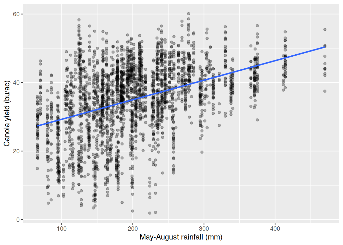
library(tidyverse)
library(janitor)

rm_weather <- read_csv("data/rm_weather.csv") |>
  clean_names()
canola <- filter(rm_weather, !is.na(canola))

##(a) look at it first
ggplot(canola, aes(x = precip_may_aug_mm, y = canola)) +
  geom_point(alpha = 0.3) +
  geom_smooth(method = "lm", se = FALSE) +
  labs(x = "May-August rainfall (mm)", y = "Canola yield (bu/ac)")

##(b) the straight line
lin <- lm(canola ~ precip_may_aug_mm, data = canola)
coef(lin)[2]
summary(lin)$adj.r.squared

##(c) the log form
logx <- lm(canola ~ log(precip_may_aug_mm), data = canola)
coef(logx)[2]
summary(logx)$adj.r.squared

##(d) The linear model says every millimetre is worth the same 0.057 bu/ac, whatever the season
## has already had. The log model says a 1% increase in rainfall is worth about 0.11 bu/ac
## (11.178/100), which means a fixed millimetre is worth less and less as the season gets wetter,
## because a millimetre is a smaller percentage increase when the base is large. The log form
## fits slightly better on adjusted R-squared, 0.1757 against 0.1705, and diminishing returns to
## water is what agronomy would predict, so it is the better description. The gap is small
## though, and the scatter plot is the more convincing evidence: the cloud bends.
> library(tidyverse)
> library(janitor)
>
> rm_weather <- read_csv("data/rm_weather.csv") |>
+ clean_names()
Rows: 2950 Columns: 19
── Column specification ────────────────────────────────────────────────────────
Delimiter: ","
chr (3): RM_Name, Census_Division, Weather_Station
dbl (16): Year, RM, Spring Wheat, Durum, Canola, Barley, Oats, Peas, Populat...
ℹ Use `spec()` to retrieve the full column specification for this data.
ℹ Specify the column types or set `show_col_types = FALSE` to quiet this message.
> canola <- filter(rm_weather, !is.na(canola))
>
> ##(a) look at it first
> ggplot(canola, aes(x = precip_may_aug_mm, y = canola)) +
+ geom_point(alpha = 0.3) +
+ geom_smooth(method = "lm", se = FALSE) +
+ labs(x = "May-August rainfall (mm)", y = "Canola yield (bu/ac)")
>
> ##(b) the straight line
> lin <- lm(canola ~ precip_may_aug_mm, data = canola)
> coef(lin)[2]
precip_may_aug_mm
0.05702737
> summary(lin)$adj.r.squared
[1] 0.1705134
>
> ##(c) the log form
> logx <- lm(canola ~ log(precip_may_aug_mm), data = canola)
> coef(logx)[2]
log(precip_may_aug_mm)
11.17818
> summary(logx)$adj.r.squared
[1] 0.1756788
>
> ##(d) The linear model says every millimetre is worth the same 0.057 bu/ac, whatever the season
> ## has already had. The log model says a 1% increase in rainfall is worth about 0.11 bu/ac
> ## (11.178/100), which means a fixed millimetre is worth less and less as the season gets wetter,
> ## because a millimetre is a smaller percentage increase when the base is large. The log form
> ## fits slightly better on adjusted R-squared, 0.1757 against 0.1705, and diminishing returns to
> ## water is what agronomy would predict, so it is the better description. The gap is small
> ## though, and the scatter plot is the more convincing evidence: the cloud bends.Question 5
This question uses barley_trial.csv, 120 fields with a nitrogen rate in kg/ha and a yield in bu/ac.
(a) Plot the two variables against each other in a scatter plot, with the response variable on the vertical axis.
(b) Run a linear model with yield as the response variable and nitrogen rate as the explanatory variable.
(c) Run a second model with yield as the response variable and the log of nitrogen rate as the explanatory variable.
(d) Interpret the coefficient of each model, and say which form fits the data better.
Answer
`geom_smooth()` using formula = 'y ~ x'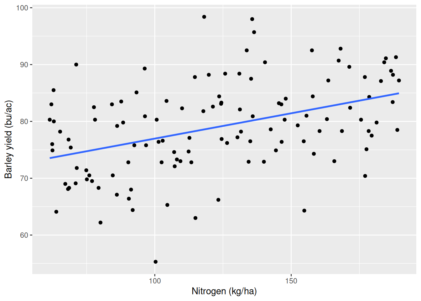
library(tidyverse)

barley <- read_csv("data/barley_trial.csv")

##(a) look at it first
ggplot(barley, aes(x = fertilizer_kg_ha, y = yield_bu_acre)) +
  geom_point() +
  geom_smooth(method = "lm", se = FALSE) +
  labs(x = "Nitrogen (kg/ha)", y = "Barley yield (bu/ac)")

##(b) the straight line
lin <- lm(yield_bu_acre ~ fertilizer_kg_ha, data = barley)
coef(lin)[2]
summary(lin)$adj.r.squared

##(c) the log form
logx <- lm(yield_bu_acre ~ log(fertilizer_kg_ha), data = barley)
coef(logx)[2]
summary(logx)$adj.r.squared

##(d) The linear model gives 0.089 bu/ac for every kilogram of nitrogen at any rate. The log model
## gives about 0.10 bu/ac for a 1% increase in nitrogen, so the gain shrinks as the rate rises.
## Here the straight line fits slightly better, 0.1711 against 0.1635 on adjusted R-squared, which
## is the opposite of the rainfall case. The trial only covers 61.5 to 189.5 kg/ha, a narrow
## range, and over a narrow range a curve and a straight line are hard to tell apart. I would
## report the linear model and say the data cannot distinguish the two forms.
> library(tidyverse)
>
> barley <- read_csv("data/barley_trial.csv")
Rows: 120 Columns: 5
── Column specification ────────────────────────────────────────────────────────
Delimiter: ","
chr (2): field_id, variety
dbl (3): fertilizer_kg_ha, rainfall_mm, yield_bu_acre
ℹ Use `spec()` to retrieve the full column specification for this data.
ℹ Specify the column types or set `show_col_types = FALSE` to quiet this message.
>
> ##(a) look at it first
> ggplot(barley, aes(x = fertilizer_kg_ha, y = yield_bu_acre)) +
+ geom_point() +
+ geom_smooth(method = "lm", se = FALSE) +
+ labs(x = "Nitrogen (kg/ha)", y = "Barley yield (bu/ac)")
>
> ##(b) the straight line
> lin <- lm(yield_bu_acre ~ fertilizer_kg_ha, data = barley)
> coef(lin)[2]
fertilizer_kg_ha
0.08906461
> summary(lin)$adj.r.squared
[1] 0.1710566
>
> ##(c) the log form
> logx <- lm(yield_bu_acre ~ log(fertilizer_kg_ha), data = barley)
> coef(logx)[2]
log(fertilizer_kg_ha)
10.06253
> summary(logx)$adj.r.squared
[1] 0.1634659
>
> ##(d) The linear model gives 0.089 bu/ac for every kilogram of nitrogen at any rate. The log model
> ## gives about 0.10 bu/ac for a 1% increase in nitrogen, so the gain shrinks as the rate rises.
> ## Here the straight line fits slightly better, 0.1711 against 0.1635 on adjusted R-squared, which
> ## is the opposite of the rainfall case. The trial only covers 61.5 to 189.5 kg/ha, a narrow
> ## range, and over a narrow range a curve and a straight line are hard to tell apart. I would
> ## report the linear model and say the data cannot distinguish the two forms.