24Modelling the Relationship Between Two Variables
24.1 What is a model
Much of the job of a data analyst is constructing a model of how the world works. These models are deliberate simplifications of reality. For example, we might model the relationship between yields and fertilizer, not accounting for anything else. This model might tell us that on average yields increase by 0.13 bu/ac with every additional kg/ha of fertilizer. But yields obviously depend on much more than fertilizer – and the model does not try to claim otherwise. Most models also return an average association. The effect of fertilizer on yield varies depending on soil moisture – in dry environments the impact might be less than what our model shows, and in wetter environments it may be greater (we will later learn how to condition our estimates on these other covariates).
We should evaluate a model based on how well it does the job we have set out for it. If we want to know the average effect of fertilizer on yield, a model that accounts for nothing else may be perfectly adequate. If we want to predict the yield of a specific field, we will need a more complex model that accounts for other factors.
24.2 Response and Explanatory Variables
The variable you want to explain or predict is called the response or dependent variable. The variables you use to explain or predict it are called explanatory or independent variables. In the trial data, yield is the response variable, while nitrogen rate, rainfall, and variety are explanatory variables.
As the data modeller, you choose these roles based on the question you want to answer. The data alone do not determine which variables are response or explanatory variables.
24.3 Prediction and Explanation
We can generally think of a model as achieving two goals: prediction and explanation.
Prediction tries to predict the value of the response variable for new observations. For example, an insurer may want to predict yields based on a given combination of rainfall and management practices. They do not really care why the model works, only whether its predictions are accurate. A great example of this is large language models, such as ChatGPT and Claude. Their goal is to predict the next word in a sentence, not to understand why certain words follow others.
Explanation tries to understand the relationship between the response and explanatory variables. For example, we might want to know by how much yield increases with additional fertilizer and rainfall. We are not so much interested in predicting yield, but in understanding the relationship between yield and the explanatory variables. In this case, we want to know why the model works.
In our models in this chapter, we will be interested in both prediction and explanation.
24.4 Regression as a line of best fit
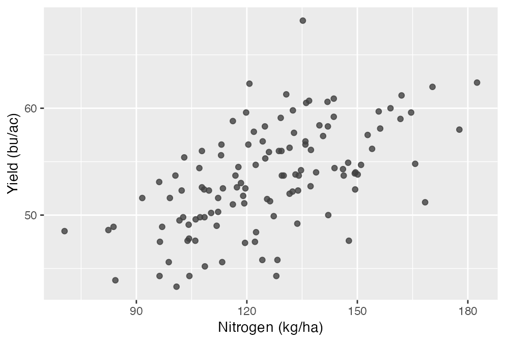
Suppose we have the following data on canola yield and nitrogen rate across 120 fields:
Figure 24.1: Canola yield against nitrogen rate across 120 trial fields.
We might want to know two things:
By how much does yield increase with additional nitrogen?
What would yield be at a nitrogen rate of 100 kg/ha.
To answer both questions we can fit a line through the data. This line can be thought of as our prediction of yield at any given nitrogen rate:
\(\beta_0\) is the intercept, where the line crosses at a nitrogen rate of zero.
\(\beta_1\) is the slope, how much predicted yield changes per extra kg/ha of nitrogen.
Together, these two parameters define the line of best fit.
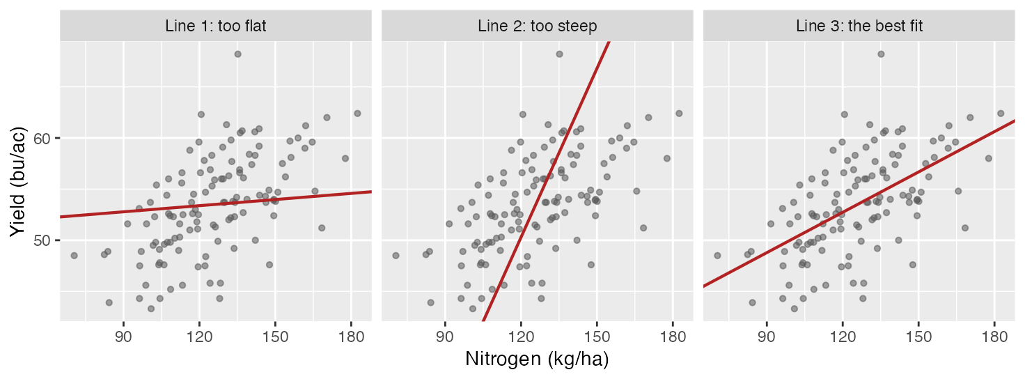
Of course, the question is how to draw this line. Evidently, in the diagrams below we can see that the third line is a better fit for the data than the first two. This is because the third line sits closest to the data overall – the vertical gaps between the points and the line are smaller than for the other two.
Figure 24.2: Three lines through the same 120 fields. All three pass through the middle of the data; what differs is the angle.
But drawing a line and just eyeballing that it is a good fit is not very scientific. We need a more formal way to define a line of “best” fit. To do so, define our error terms as the difference between the actual yield and the predicted yield:
\[
e_i = y_i - \hat{y}_i
\]
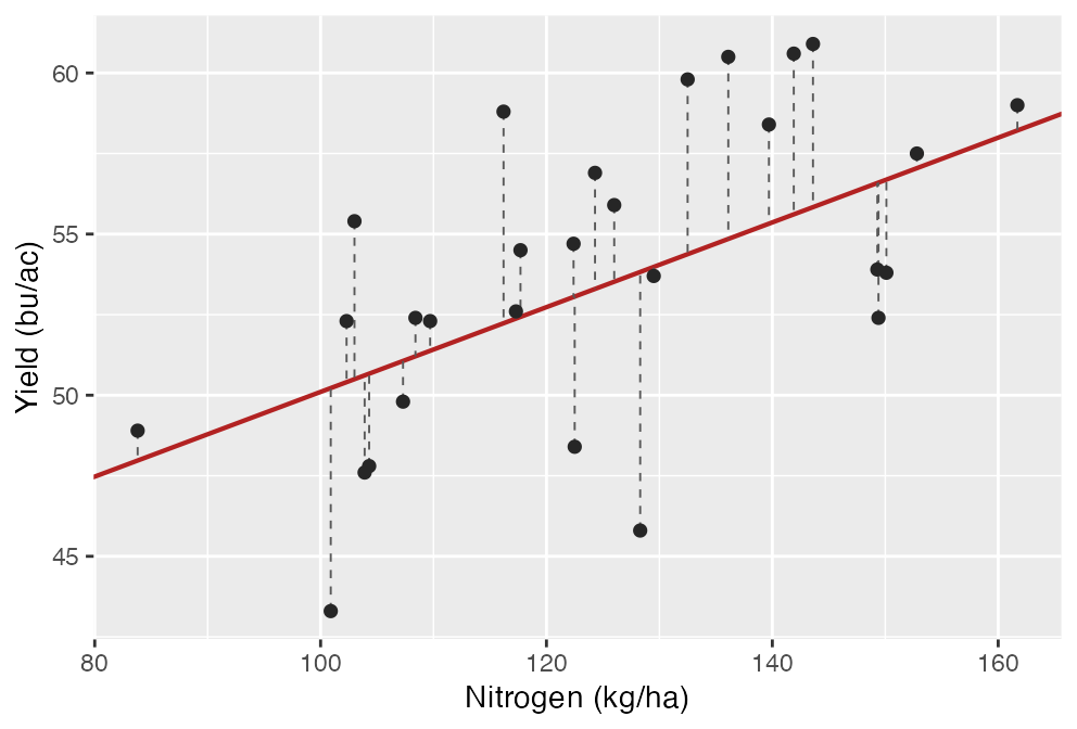
Each error is the vertical distance from a point to the line, as in Figure 24.3.
Figure 24.3: Each error is the vertical gap between an observed field and the line.
Some of our errors will be positive and some will be negative. Intuitively, we want to make the absolute value of the errors as small as possible. So we might think a good way to draw a line of best fit is to pick a value of \(b_0\) and \(b_1\) in order to minimize the sum of the absolute value of the errors across all observations. This is called least absolute deviations regression. Mathematically, it would look like this:
where \(n\) is the number of observations. We can read this as “choose the values of \(\beta_0\) and \(\beta_1\) that minimize the sum of the absolute value of the errors across all observations.” This is a perfectly reasonable way to fit a line, and it is used in some applications. However, the most common way is least squares regression, which chooses the line that minimizes the sum of the squared errors:
There are technical reasons why least squares is preferred. In practice, the two methods usually give very similar results unless there are large outliers in the data.
Of course, calculating the line of best fit would be very difficult by hand. Fortunately, computers can do this very quickly. In R, the command for a linear model is lm(). In the following code we fit a linear model of yield as a function of nitrogen rate, and then use summary() to report the results.
# fit yield as a function of nitrogen ratemodel <-lm(yield_bu_acre ~ fertilizer_kg_ha, data = trial)summary(model)
> # fit yield as a function of nitrogen rate
> model <- lm(yield_bu_acre ~ fertilizer_kg_ha, data = trial)
> summary(model)

Call:
lm(formula = yield_bu_acre ~ fertilizer_kg_ha, data = trial)

Residuals:
    Min      1Q  Median      3Q     Max
-9.4843 -2.2724 -0.1433  2.3019 13.4690

Coefficients:
                 Estimate Std. Error t value Pr(>|t|)
(Intercept)      36.95365    2.16446   17.07  < 2e-16 ***
fertilizer_kg_ha  0.13149    0.01697    7.75 3.56e-12 ***
---
Signif. codes:  0 '***' 0.001 '**' 0.01 '*' 0.05 '.' 0.1 ' ' 1

Residual standard error: 3.927 on 118 degrees of freedom
Multiple R-squared:  0.3373,	Adjusted R-squared:  0.3317
F-statistic: 60.06 on 1 and 118 DF,  p-value: 3.559e-12
The two numbers we want are in the Estimate column. The output tells us that \(\beta_0\) or (Intercept) is 36.95 and \(\beta_1\) or fertilizer_kg_ha is 0.131. This means that for each additional kg/ha of nitrogen, we expect yield to increase by 0.131 bu/ac.
Taken literally, the intercept is the predicted yield when no nitrogen is applied, 36.95 bu/ac. But you probably shouldn’t take it literally: the lowest fertilizer rate observed in the trial is 70.5 kg/ha. So the intercept is estimated by extending our line of best fit well past the data rather than something the trial measured.
We can then use the model to predict yield at any nitrogen rate, by using the command predict(). For example, at a nitrogen rate of 100 kg/ha, we would predict a yield of 50.1 bu/ac.
# predict for a field at 100 kg/hapredict(model, newdata =data.frame(fertilizer_kg_ha =100))
> # predict for a field at 100 kg/ha
> predict(model, newdata = data.frame(fertilizer_kg_ha = 100))
      1
50.1026
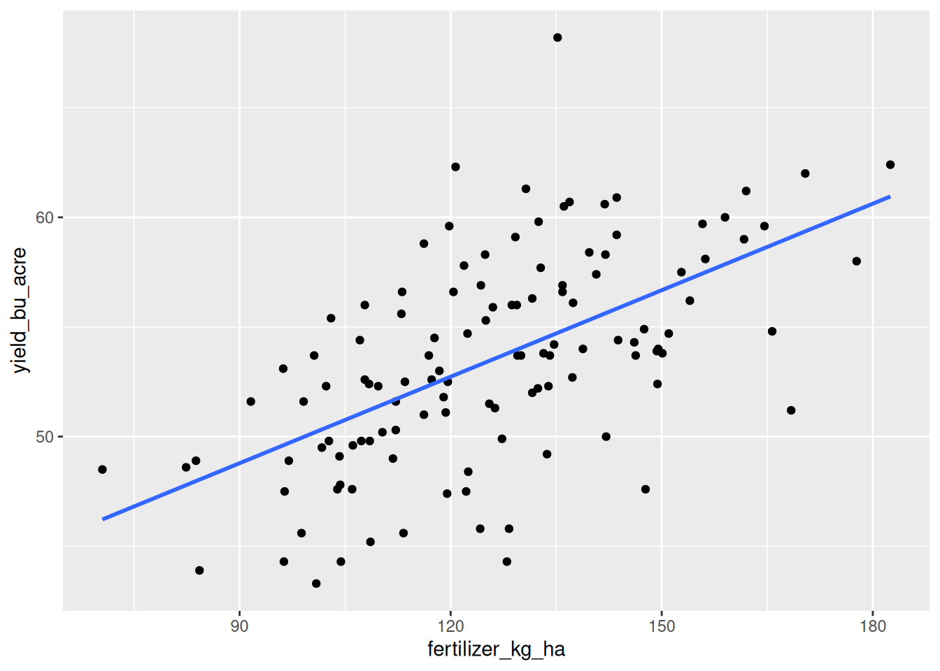
We can also plot the data with our line of best fit. geom_smooth() with method = "lm" fits the same line lm() just reported and draws it on top of the points. se = FALSE turns off the shaded band around the line, which is a measure of uncertainty we leave to AREC 262.
ggplot(trial, aes(x = fertilizer_kg_ha, y = yield_bu_acre)) +geom_point() +geom_smooth(method ="lm", se =FALSE)
`geom_smooth()` using formula = 'y ~ x'
Figure 24.4: The trial data with the least-squares line through it.
24.5\(R^2\): How Well Does the Line Fit?
The regression line is the “best” line in the least-squares sense, but “best” does not always mean “good.” A dataset where the points are scattered all over the place still has a best line; the question is whether the line explains any meaningful fraction of the variation.
\(R^2\) (pronounced “R squared”) measures the fraction of the variance in \(Y\) that is explained by the regression. If our \(R^2\) is high then our explanatory variable accounts for most of the variation in \(y\). If it is low, then there are other variables that explain the variation in \(y\) that we have not accounted for.
In our canola trial, we find that \(R^2\) is 0.34, which means that about 34% of the variation in yield across these fields is accounted for by nitrogen rate. The remaining 66% of the variation is due to other factors, such as rainfall, soil type, and management practices.
summary(model) reports it as Multiple R-squared, with Adjusted R-squared beside it – that distinction matters once a model has more than one predictor.
There is no single threshold that makes an \(R^2\) “good” – it depends on the nature of your model. If you are trying to use the model for prediction, then it may be important to have a high \(R^2\). If you are trying to understand the relationship between two variables, then a low \(R^2\) may be fine. For example, if we are looking at the impact of a nitrogen inhibitor on yield, we will likely get a very small \(R^2\) because we know that weather and other management practices will likely have a bigger impact on yields.
24.6 Assumptions of Linear Regression
For a linear regression to estimate the true relationship between the response and explanatory variables, there are four assumptions that must be met:
The true relationship is approximately linear. As with correlation, a linear model can capture a linear relationship. Chapter 25 examines how to fit non-linear relationships.
The model captures the causal nature of the relationship. It makes sense to have yields as our prediction variable and rainfall as our explanatory variable, but not vice-versa. As higher yields cannot cause greater rainfall.
The explanatory variables are not corrleated with other factors that affect the response variable. This is an extremely important assumption!! And one that it is important to understand: our explanatory variable cannot be correlated with other factors that affect the rsponse variable.
To see why this is, let’s recall our example about students attending an extra help session. If I use a student’s grade in the class as the predictor variable and whether they attended the help session as the response variable, I may find a negative relationship. But this is not because attending the help session causes lower grades, but because students who are struggling are more likely to attend the help session. In this case, the explanatory variable (grade) is correlated with other factors that affect the response variable (attending the help session). This is called omitted variable bias.
To give an agricultural example, suppose we are trying to estimate the effect of nitrogen on yield using data from across the province with no data on soil mositure. It is likely that farmers in dry areas might apply less nitrogen, because the crop is not able to use it in drier areas. In this case, nitrogen application is alwo a proxy for greater soil moisture. So yields will be higher when there is more nitrogen, both becasue of the effect of nitrogen itself and becasue of the effect of soil moisture. In this case, soil moisture is the omitted variable that is biasing our estimate of the effect of nitrogen on yield.
The data is a random or representative sample of the population. Our explanatory variable could have different impacts on different subgroups of the population. To return to our yield and nitrogen example, the effect of nitrogen on yield may be different in dry areas than in wet areas. If we only have data from dry areas, our estimate of the effect of nitrogen on yield will not be representative of the entire population.
There are other selection issues that can be even worse. For example, suppose that we want to know the impact of a support program on farm incomes. If this support program helps struggling farmers stay in business, then a year later we might only observe struggling farmers if they were in the program – those struggling farmers who were not in the program may have gone out of business. This creates a survivorship bias that makes the program look like it has a negative effect.
24.7 Statistical inference
When we summarize our linear model we get much more than just the slope and intercept. We get a regression table with four columns:
Estimate: the estimated value of the parameter, which is what we have been discussing so far.
Standard error: the standard deviation of the sampling distribution of the parameter.
T-value: the estimate divided by the standard error, which tells us how many standard errors away from zero the estimate is.
P-value: the probability of observing a t-value as extreme as the one we observed, under the null hypothesis that the true parameter is zero.
You will learn all about these concepts in AREC 262. For now, I will just teach you about the p-value.
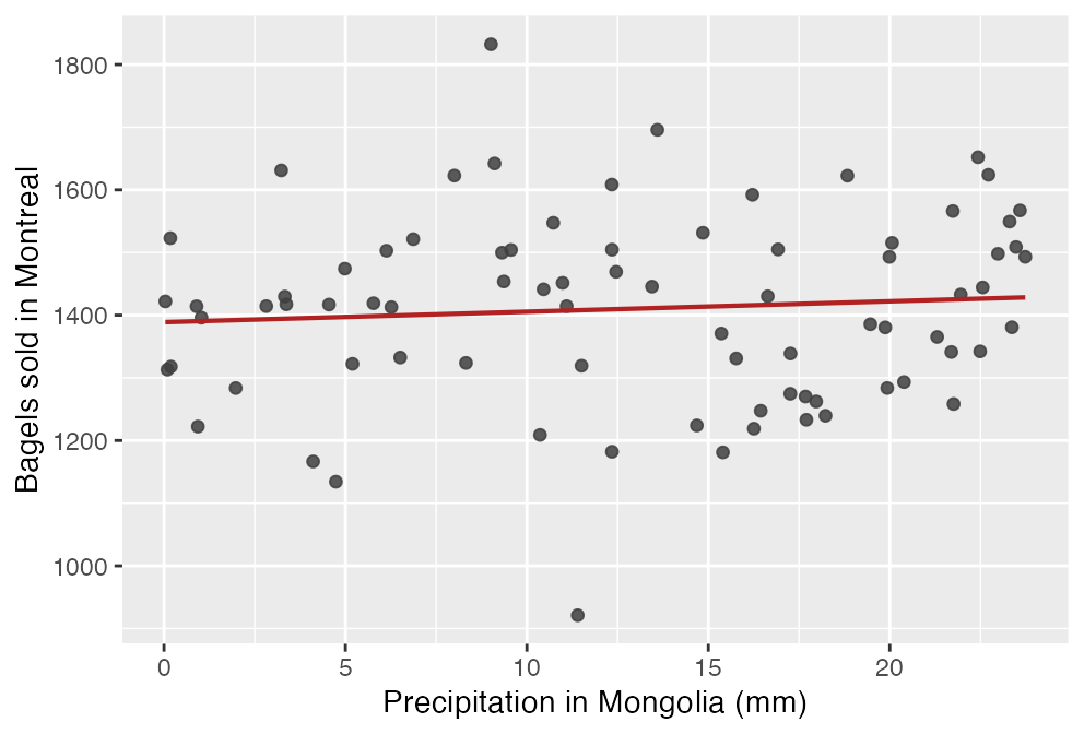
To understand the p-value imagine that we have two variables that really have no relationship with each other. Something like the amount of precipitation in Mongolia on a given day and the number of bagels sold in Montreal. I’ve plotted this made-up data on the graph below. When we eyeball the data, we can see that there is really no relationship there. But if we fit a linear model, the slope term (which tells us how rainfall in Mongolia affects bagel sales in Montreal) will never be exactly zero.
Figure 24.5: Made-up data for two variables with no relationship. The fitted line still has a slope – here 1.7 bagels per mm, with a p-value of 0.47.
The line in Figure 24.5 slopes very slightly upward, and taken at face value it says each extra millimetre of Mongolian rain sells about 1.7 more bagels in Montreal. We drew the two columns independently of each other, so we know the true slope is zero and that number is entirely noise.
In the above example, we should know that this small relationship is just due to noise – there is no true relationship between these variables. But other times we might not be so sure. For example, what if we test the effect of a nitrogen inhibitor on yield. We might find a very small effect – but one that might make it worth applying the inhibitor if that effect was real. But it is so small that it could be caused by random noise.
The p-value tells us the following:
NoteThe p-value
If the true coefficient is zero and the model’s testing assumptions hold, what is the probability of getting a t-statistic at least as far from zero as the one we actually got – in either direction?
Let’s think about the p-value this way. Suppose that we estimate the effect of the nitrogen inhibitor using 100 fields, and find a coefficient of 0.1 bu/ac with a p-value of 12% or 0.12.
That p-value means the following. If the true coefficient were zero and the model’s testing assumptions held, and we repeated the whole process 1,000 times – sampling 100 different farms, observing their yields and inhibitor use, and estimating the coefficient each time – we would expect a t-statistic at least this far from zero in about 120 of those 1,000 samples.
So the lower the p-value is, the stronger the evidence against a true effect of zero. In statistics we often use a threshold of 5% or 0.05 to decide whether to call a coefficient statistically significant. However, we should be clear that 5% is an arbitrary number.
Two things the p-value does not tell us. It is not the probability that the true effect is zero – it is calculated by assuming that and asking how surprising our data would be. And a small p-value says nothing about whether the effect is large enough to matter, or whether it is causal: with enough data, an effect too small to be worth acting on will still be significant.
We should also note that for our p-values to be valid we require an additional set of assumptions about the data, notably that there is no heteroskedasticity. We won’t worry about this assumption yet – that will be addressed in AREC 262.
24.8 Reading regression output
To get comfortable reading regression output, let’s consider the following two examples. Both use data you can download and run yourself. An RM is a rural municipality, and an RM-year is one municipality observed in one year, so the same RM appears up to ten times.
library(tidyverse)# the two examples below use these four filesrm_weather <-read_csv("data/rm_yields_2015_2024.csv") |>left_join(read_csv("data/rm_lookup.csv"), by =c("RM"="RM_Number")) |>left_join(read_csv("data/station_weather.csv"),by =c("Weather_Station"="Station", "Year"="Year"))wheat_fields <-read_csv("data/sask_wheat_2025.csv") |>filter(!is.na(yield_bu_ac))
Example 1: effect of precipitation on canola yield
rm_weather joins reported canola yields for Saskatchewan RMs from 2015 to 2024 to May-August precipitation at the nearest weather station. That gives 2,904 RM-years. Unlike the trial, nobody randomized anything here – this is observational data, and every one of the assumptions above is worth worrying about.
Two of those assumptions are already strained. The same RM appears in ten different years and the 295 RMs share only 16 weather stations, so these are not 2,904 independent observations; and the records are the RM-years where a yield was actually reported, not a documented census of the province. The slope is still the best line through the data. The p-value beside it is calculated as though every row were a fresh draw, so read it as a rough guide rather than an exact probability.
# canola yield against growing-season precipitation, 2904 RM-yearsrain_model <-lm(Canola ~ Precip_May_Aug_mm, data = rm_weather)summary(rain_model)
> # canola yield against growing-season precipitation, 2904 RM-years
> rain_model <- lm(Canola ~ Precip_May_Aug_mm, data = rm_weather)
> summary(rain_model)

Call:
lm(formula = Canola ~ Precip_May_Aug_mm, data = rm_weather)

Residuals:
    Min      1Q  Median      3Q     Max
-34.698  -5.647   0.680   6.768  27.638

Coefficients:
                   Estimate Std. Error t value Pr(>|t|)
(Intercept)       23.573471   0.501642   46.99   <2e-16 ***
Precip_May_Aug_mm  0.057027   0.002332   24.45   <2e-16 ***
---
Signif. codes:  0 '***' 0.001 '**' 0.01 '*' 0.05 '.' 0.1 ' ' 1

Residual standard error: 9.562 on 2902 degrees of freedom
Multiple R-squared:  0.1708,	Adjusted R-squared:  0.1705
F-statistic: 597.8 on 1 and 2902 DF,  p-value: < 2.2e-16
Reading it the same way as before:
The intercept is 23.57. A growing season with no rain at all is outside anything in this data (the driest RM-year had 65.8 mm), so do not read it as a yield forecast.
The slope on Precip_May_Aug_mm is 0.057, so an extra 10 mm of growing-season rain goes with about 0.57 bu/ac more canola.
Multiple R-squared is 0.171. Rain accounts for about 17% of the variation in RM yields, which leaves most of it to everything else – soil, management, heat, hail, variety.
The slope is smaller than the trial’s nitrogen slope and the \(R^2\) is lower, but neither of those makes it a worse model. They are different questions asked of different data. What matters is whether the model answers the question you asked, and with observational data like this the honest answer is that 0.057 is an association rather than the causal effect of rain.
We should always question whether the model is appropriate. Let’s consider our four assumptions in turn:
Linearity: This assumption is likely violated – the true relationship between rainfall and yield is likely non-linear. In drought conditions an extra mm of rain will do a lot of good, not so much in wetter conditions.
Direction of relationship: We can be confident that rainfall impacts yields, not vice-versa.
Exogeneity: This one is tricky. Rainfall is random, so we might think it should be uncorrelated with the other variables that impact yields. But it might be the case that farmers in drier areas apply less nitrogen, which would make rainfall correlated with nitrogen application.
Random sampling: These are the available RM-year records, not a documented census or a random sample of all possible growing seasons. Repeated RMs and shared weather stations also mean the observations are not independent.
Example 2: effect of seeding rate on wheat yield
The first example used 2,904 RM-years of weather. This one uses sask_wheat_2025.csv, 150 simulated wheat fields, each with its soil zone, variety, seeding rate and yield. The question is whether sowing more seed per acre raises yield.
Because the data is simulated we know the answer, which is what makes it useful here: the file was built with a seeding-rate effect of 0.04 bu/ac per lb/ac. Everything below can be checked against that number.
# wheat yield against seeding rate, 146 fields with a recorded yieldseed_model <-lm(yield_bu_ac ~ seeded_rate_lb_ac, data = wheat_fields)summary(seed_model)
> # wheat yield against seeding rate, 146 fields with a recorded yield
> seed_model <- lm(yield_bu_ac ~ seeded_rate_lb_ac, data = wheat_fields)
> summary(seed_model)

Call:
lm(formula = yield_bu_ac ~ seeded_rate_lb_ac, data = wheat_fields)

Residuals:
     Min       1Q   Median       3Q      Max
-16.1126  -5.0473  -0.3139   5.2161  21.4365

Coefficients:
                  Estimate Std. Error t value Pr(>|t|)
(Intercept)       34.90591    4.74579   7.355 1.33e-11 ***
seeded_rate_lb_ac  0.08982    0.04056   2.214   0.0284 *
---
Signif. codes:  0 '***' 0.001 '**' 0.01 '*' 0.05 '.' 0.1 ' ' 1

Residual standard error: 7.239 on 144 degrees of freedom
Multiple R-squared:  0.03293,	Adjusted R-squared:  0.02621
F-statistic: 4.903 on 1 and 144 DF,  p-value: 0.02838
Reading it the same way:
The intercept is 34.91 bu/ac, the predicted yield at a seeding rate of zero. No field was sown at zero, so this is the line extended past the data rather than a claim about unsown fields.
The slope is 0.0898, so a field sown 10 lb/ac heavier yields about 0.9 bu/ac more. Across the whole range in the data, 90 to 140 lb/ac, that is 4.5 bu/ac.
The p-value on the slope is 0.028. The rainfall model’s p-value was printed in scientific notation as <2e-16, meaning smaller than 0.0000000000000002; this one is an ordinary decimal. If the population slope were zero, about 3% of samples of 146 fields would produce a t-statistic at least this far from zero.
Multiple R-squared is 0.033. Seeding rate accounts for about 3% of the variation in yield.
Those last two numbers point in different directions, and both are correct. The p-value says this data gives evidence against a zero slope. The \(R^2\) says that knowing a field’s seeding rate tells you almost nothing about its yield – these fields vary by 7.3 bu/ac about their mean and the model removes almost none of that. A relationship can be real and still be nearly useless for prediction. Significance asks whether the data can distinguish the slope from zero; \(R^2\) asks how much of the outcome it accounts for.
Now consider the four assumptions for this simulated example.
Linearity: Seeding rate could plausibly show diminishing returns – past some point more seed just means plants competing with each other. Adding a squared term gives it a p-value of 0.45, so there is no curvature this data can detect. Over the 90-140 lb/ac range actually sown, a straight line is defensible.
Direction of relationship: Seeding rate is set before the crop grows and yield is measured after harvest, so the harvest cannot have changed the rate. Ordering helps but does not settle the question on its own: a grower who expects a good year may seed more heavily because of that expectation, and the expectation is formed before seeding.
Exogeneity: The simulation assigns seeding rates independently of soil zone, so there is no systematic confounding by soil zone. The groups can still differ by chance in this sample:
# seeding rate and yield by soil zonewheat_fields |>group_by(soil_zone) |>summarise(fields =n(),mean_rate =round(mean(seeded_rate_lb_ac), 1),mean_yield =round(mean(yield_bu_ac), 1))
> # seeding rate and yield by soil zone
> wheat_fields |>
+   group_by(soil_zone) |>
+   summarise(fields = n(),
+             mean_rate  = round(mean(seeded_rate_lb_ac), 1),
+             mean_yield = round(mean(yield_bu_ac), 1))
# A tibble: 3 × 4
  soil_zone  fields mean_rate mean_yield
  <chr>       <int>     <dbl>      <dbl>
1 Black          42      120.       53
2 Brown          46      116.       38.6
3 Dark Brown     58      114.       45.2
Black soil fields are seeded about 4 lb/ac heavier than Brown ones and yield about 14 bu/ac more. Most of that yield gap is the soil, not the seed, so part of the 0.0898 is soil zone arriving under the seeding-rate coefficient. Put soil zone in the model and the slope falls to 0.0496, close to the 0.04 the data was built with:
# the same slope, holding soil zone fixedlm(yield_bu_ac ~ seeded_rate_lb_ac + soil_zone, data = wheat_fields) |>coef()
> # the same slope, holding soil zone fixed
> lm(yield_bu_ac ~ seeded_rate_lb_ac + soil_zone, data = wheat_fields) |> coef()
        (Intercept)   seeded_rate_lb_ac      soil_zoneBrown soil_zoneDark Brown
        47.01637695          0.04962424        -14.17187306         -7.50288922
With real data, soil zone would be a confounder if growers chose seeding rates according to their soil, and unmeasured things like drainage or last year’s crop could do the same. Module 8 takes up models with more than one explanatory variable.
Random sampling: These are simulated fields, so the question is not whether they represent Saskatchewan – they do not represent anywhere. With real data you would ask how the fields were chosen. If they came from growers who volunteer yield data, that is not a random sample of Saskatchewan wheat, and a slope estimated on them need not hold for the province.